Components / overlay
Tooltip builder
A themed help surface.
A builder is RenderOnce. Construct and mount it in one expression.

use gpui_kit::overlay::Tooltip;Reviewed in tooltip.
Construct
new(ident: impl Into<Ident>, text: impl Into<SharedString>) -> SelfOptions
Chain onto the value.
describes(control: impl Into<SharedString>) -> Self
view(cx: &mut App) -> AnyView
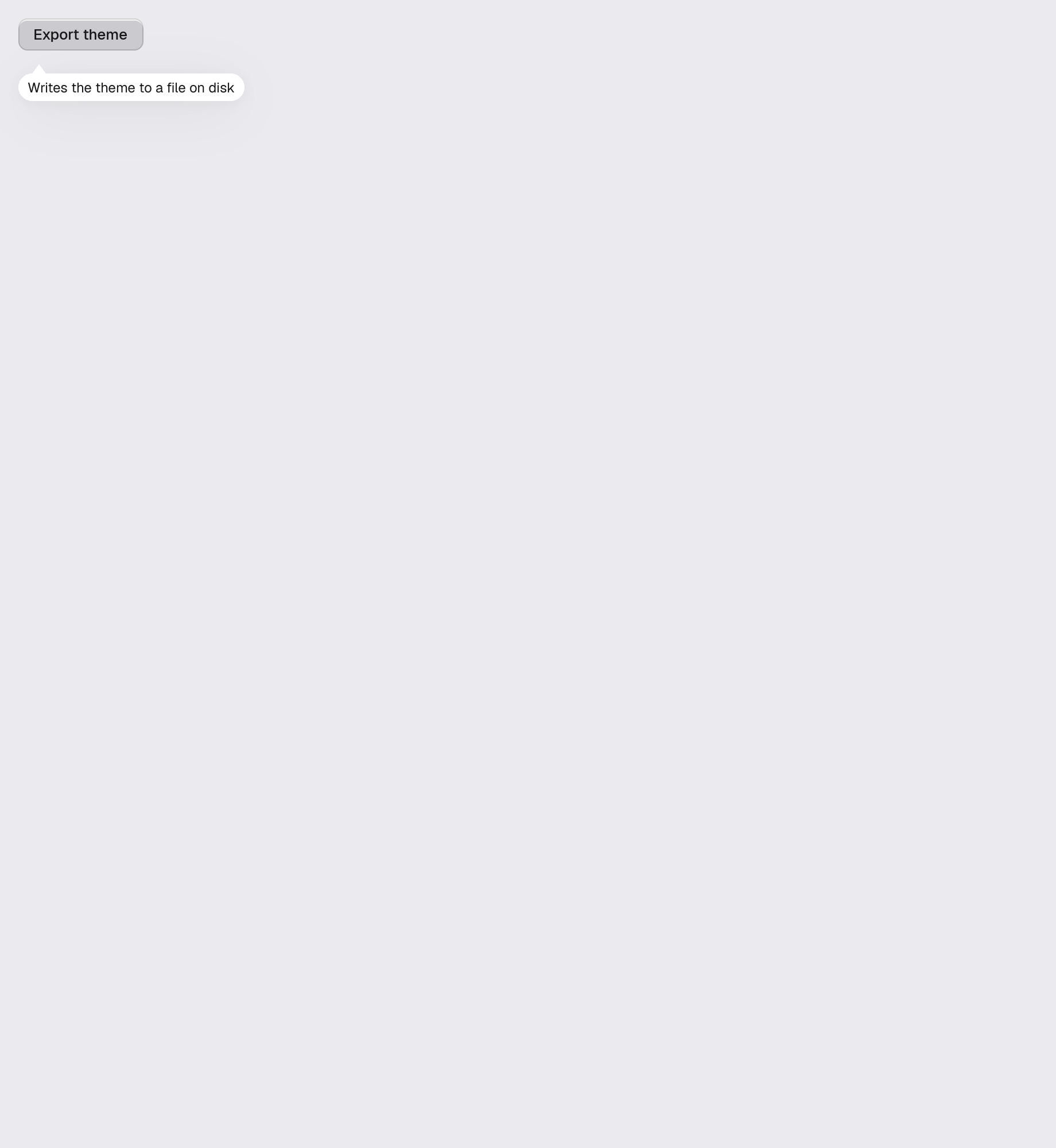
Example · tooltip
fn tooltip(_window: &mut Window, cx: &mut App) -> AnyElement {
    let theme = cx.theme().clone();
    stack(&theme)
        .child(
            row(&theme).child(
                div()
                    .id("scene.tooltip.host")
                    .tip("scene.tooltip.export", "Writes the theme to a file on disk")
                    .child(
                        Button::new("scene.tooltip.export")
                            .label("Export theme")
                            .accessible_description("Writes the theme to a file on disk")
                            .secondary()
                            .on_click(|_, _| {}),
                    ),
            ),
        )
        // Hover help only exists while a pointer rests on the control, so the
        // surface itself is also shown outright, where it can be reviewed.
        .child(
            row(&theme).child(
                Tooltip::new("scene.tooltip.help", "Writes the theme to a file on disk")
                    .describes("scene.tooltip.export"),
            ),
        )
        .into_any_element()
}