Components / display
Icon builder
A glyph from the bundled catalog.
A builder is RenderOnce. Construct and mount it in one expression.
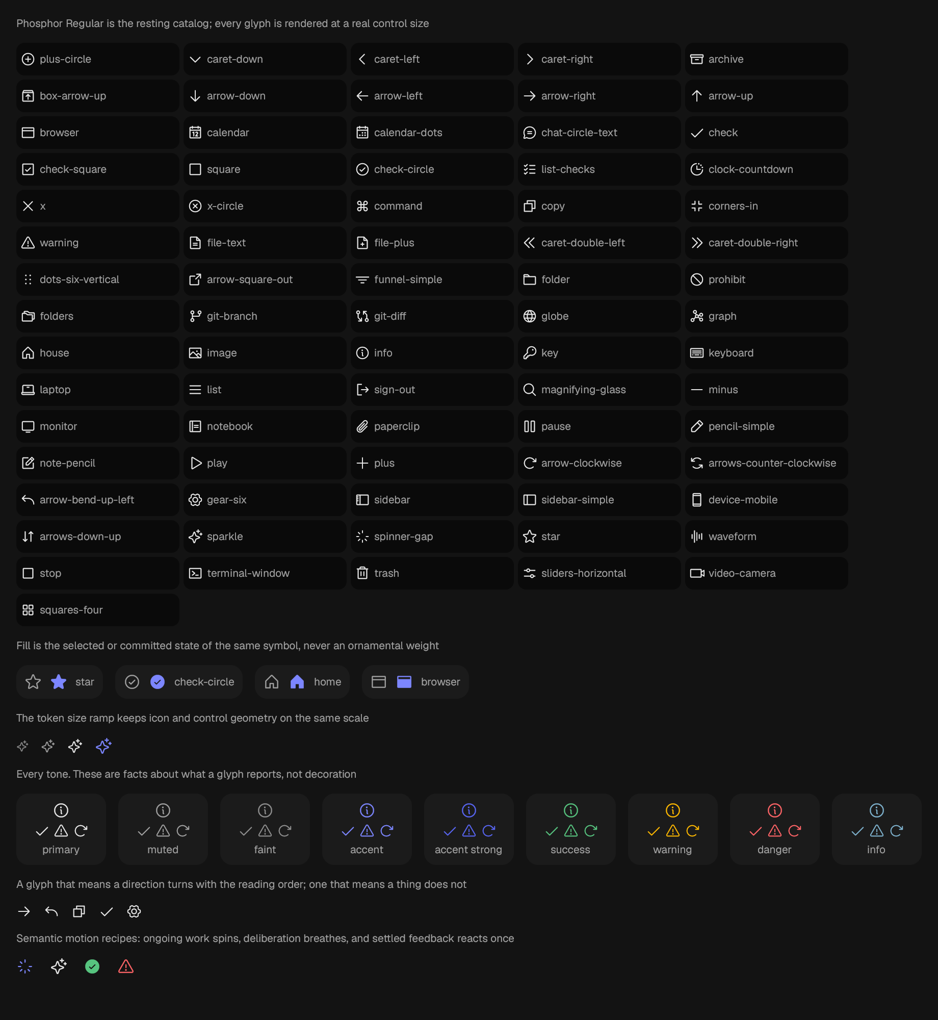
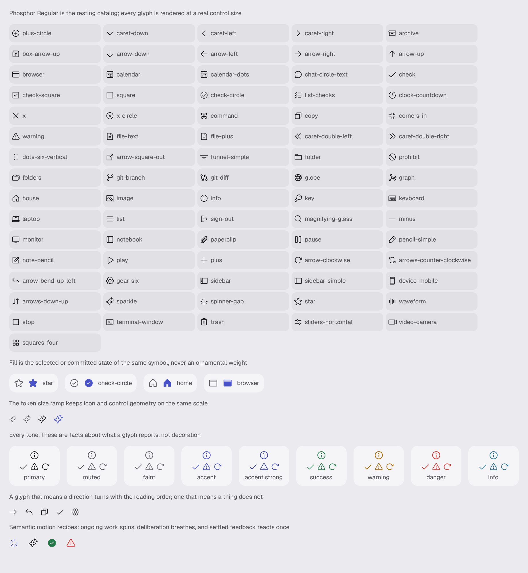
use gpui_kit::display::icon::Icon;Reviewed in icon.
Also drawn by reading-direction, which arranges components rather than reviewing them.
Construct
new(glyph: Glyph) -> Self
named(ident: impl Into<Ident>, glyph: Glyph, name: impl Into<SharedString>) -> Self
Options
Chain onto the value.
spinning(ident: impl Into<Ident>) -> Self
breathing(ident: impl Into<Ident>) -> Self
reacting(ident: impl Into<Ident>, reaction: motion::Micro) -> Self
tone(tone: IconTone) -> Self
muted() -> Self
faint() -> Self
on_accent() -> Self
accent() -> Self
danger() -> Self
warning() -> Self
success() -> Self
info() -> Self
follow_direction(follow: bool) -> Self
Queries
Only answer; they change nothing.
resolved_size(theme: &Theme) -> f32
resolved_color(theme: &Theme) -> Hsla
flips_in(direction: LayoutDirection) -> bool
Example · icon
fn icon(_window: &mut Window, cx: &mut App) -> AnyElement {
    let theme = cx.theme().clone();
    let tones = [
        ("primary", IconTone::Primary),
        ("muted", IconTone::Muted),
        ("faint", IconTone::Faint),
        ("accent", IconTone::Accent),
        ("accent strong", IconTone::AccentStrong),
        ("success", IconTone::Success),
        ("warning", IconTone::Warning),
        ("danger", IconTone::Danger),
        ("info", IconTone::Info),
    ];

    stack(&theme)
        .child(caption(
            &theme,
            "Phosphor Regular is the resting catalog; every glyph is rendered at a real control size",
        ))
        .child(
            row(&theme)
                .gap(px(theme.space(Space::Xs)))
                .children(Icon::ALL.iter().map(|glyph| {
                    let name = glyph.name().source_name();
                    div()
                        .row()
                        .items_center()
                        .gap(px(theme.space(Space::Xs)))
                        .w(px(160.0))
                        .h(px(32.0))
                        .px(px(theme.space(Space::Xs)))
                        .radius(&theme, Radius::Control)
                        .well(&theme)
                        .child(IconView::named(
                            format!("scene.icon.glyph.{name}"),
                            *glyph,
                            name,
                        ))
                        .child(
                            crate::foundation::text(&theme, TypeScale::Caption, name)
                                .text_tone(&theme, TextTone::Muted)
                                .text_ellipsis(),
                        )
                        .into_any_element()
                })),
        )
        .child(caption(
            &theme,
            "Fill is the selected or committed state of the same symbol, never an ornamental weight",
        ))
        .child(
            row(&theme).gap(px(theme.space(Space::Md))).children(
                [
                    (Icon::Star, "star"),
                    (Icon::CheckCircle, "check-circle"),
                    (Icon::Home, "home"),
                    (Icon::Browser, "browser"),
                ]
                .map(|(glyph, label)| {
                    div()
                        .row()
                        .items_center()
                        .gap(px(theme.space(Space::Sm)))
                        .p(px(theme.space(Space::Sm)))
                        .radius(&theme, Radius::Card)
                        .surface(&theme, Surface::Panel)
                        .child(IconView::new(glyph).large().muted())
                        .child(IconView::new(glyph.filled()).large().accent())
                        .child(
                            crate::foundation::text(&theme, TypeScale::Caption, label)
                                .text_tone(&theme, TextTone::Muted),
                        )
                        .into_any_element()
                }),
            ),
        )
        .child(caption(
            &theme,
            "The token size ramp keeps icon and control geometry on the same scale",
        ))
        .child(
            row(&theme)
                .gap(px(theme.space(Space::Md)))
                .child(IconView::new(Icon::Sparkle).xs().faint())
                .child(IconView::new(Icon::Sparkle).small().muted())
                .child(IconView::new(Icon::Sparkle).medium())
                .child(IconView::new(Icon::Sparkle).large().accent()),
        )
        .child(caption(
            &theme,
            "Every tone. These are facts about what a glyph reports, not decoration",
        ))
        // At the size a glyph is actually drawn, a stroke two steps apart on
        // the text ramp is a few pixels of difference nobody can hold side by
        // side. Each tone is shown once large enough to be compared and once
        // at the size it is used, on a panel so the comparison is against one
        // ground rather than against the canvas at three different insets.
        .child(
            row(&theme)
                .gap(px(theme.space(Space::Md)))
                .children(tones.map(|(label, tone)| {
                    div()
                        .column()
                        .items_center()
                        .gap(px(theme.space(Space::Xs)))
                        .w(px(88.0))
                        .p(px(theme.space(Space::Sm)))
                        .radius(&theme, Radius::Card)
                        .surface(&theme, Surface::Panel)
                        .child(
                            IconView::named(format!("scene.icon.tone.{label}"), Icon::Info, label)
                                .tone(tone)
                                .large(),
                        )
                        .child(
                            div()
                                .row()
                                .gap(px(theme.space(Space::Xs)))
                                .child(IconView::new(Icon::Check).tone(tone))
                                .child(IconView::new(Icon::Danger).tone(tone))
                                .child(IconView::new(Icon::Refresh).tone(tone)),
                        )
                        .child(
                            crate::foundation::text(&theme, TypeScale::Caption, label)
                                .text_tone(&theme, TextTone::Muted),
                        )
                        .into_any_element()
                })),
        )
        .child(caption(
            &theme,
            "A glyph that means a direction turns with the reading order; one that \
             means a thing does not",
        ))
        .child(
            row(&theme).gap(px(theme.space(Space::Md))).children(
                [
                    (Icon::ArrowRight, "arrow-right"),
                    (Icon::Return, "return"),
                    (Icon::Copy, "copy"),
                    (Icon::Check, "check"),
                    (Icon::Settings, "settings"),
                ]
                .map(|(glyph, name)| {
                    IconView::named(format!("scene.icon.direction.{name}"), glyph, name)
                        .follow_direction(true)
                        .into_any_element()
                }),
            ),
        )
        .child(caption(
            &theme,
            "Semantic motion recipes: ongoing work spins, deliberation breathes, and settled feedback reacts once",
        ))
        .child(
            row(&theme)
                .gap(px(theme.space(Space::Lg)))
                .child(
                    IconView::named("scene.icon.motion.working", Icon::Spinner, "Working")
                        .large()
                        .accent()
                        .spinning("scene.icon.motion.working.spin"),
                )
                .child(
                    IconView::named(
                        "scene.icon.motion.deliberating",
                        Icon::Sparkle,
                        "Deliberating",
                    )
                    .large()
                    .breathing("scene.icon.motion.deliberating.breathe"),
                )
                .child(
                    IconView::named(
                        "scene.icon.motion.success",
                        Icon::CheckCircle.filled(),
                        "Succeeded",
                    )
                    .large()
                    .success()
                    .reacting("scene.icon.motion.success.pop", crate::motion::Micro::Pop),
                )
                .child(
                    IconView::named("scene.icon.motion.error", Icon::Danger, "Failed")
                        .large()
                        .danger()
                        .reacting("scene.icon.motion.error.wobble", crate::motion::Micro::Wobble),
                ),
        )
        .into_any_element()
}