Components
A builder is RenderOnce: construct and
mount it in one expression. A view survives a frame, so it is held
in an Entity. Both report an intent and apply nothing.
Nothing matches.
agent
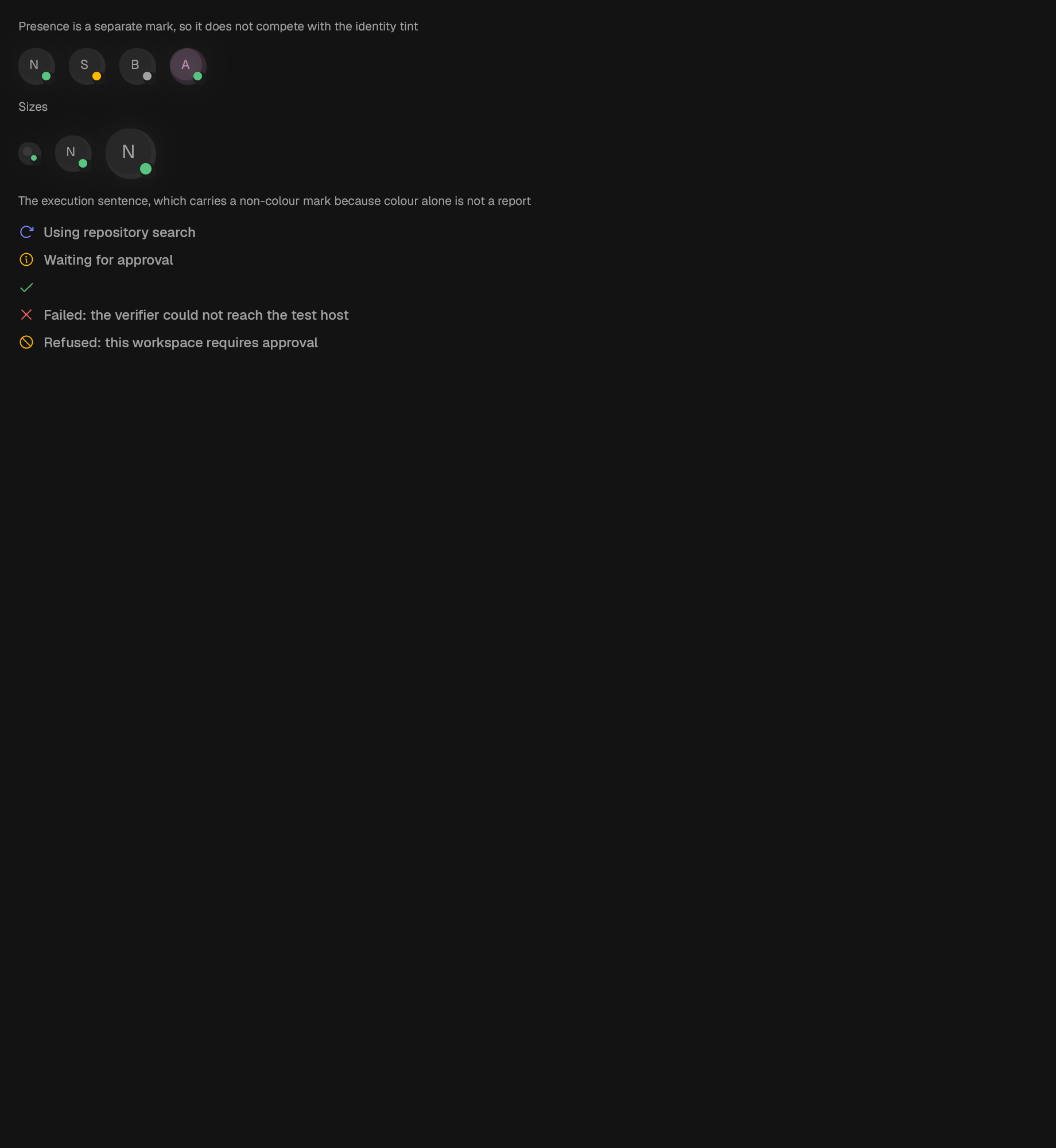
The localized execution sentence and its non-colour status mark.
A status-coloured agent identity with a separate presence mark.
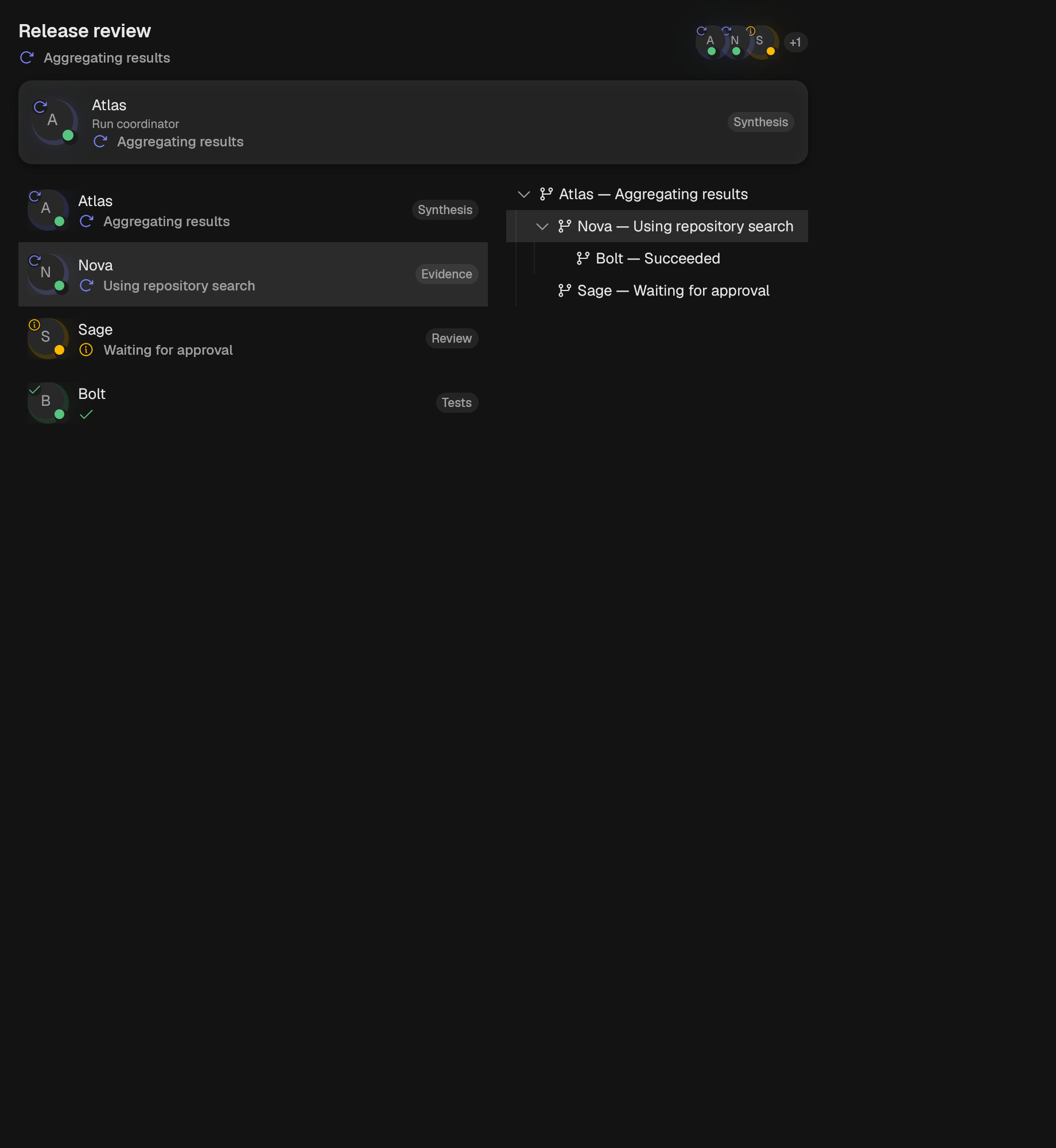
A complete summary of one agent and its current caller-owned task.
A compact overlapping group of agent identities with an overflow count.
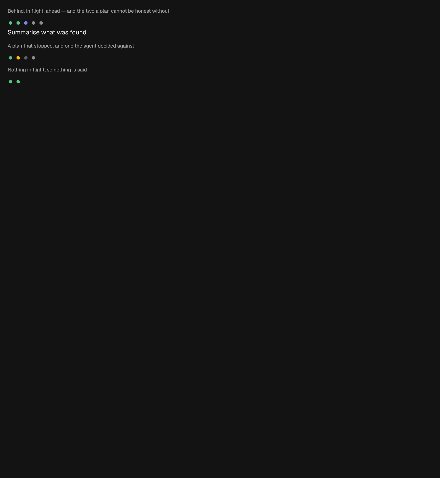
A plan, as a run of marks and one line about the item in flight.
A virtualized list of agents with standard identity and activity rows.
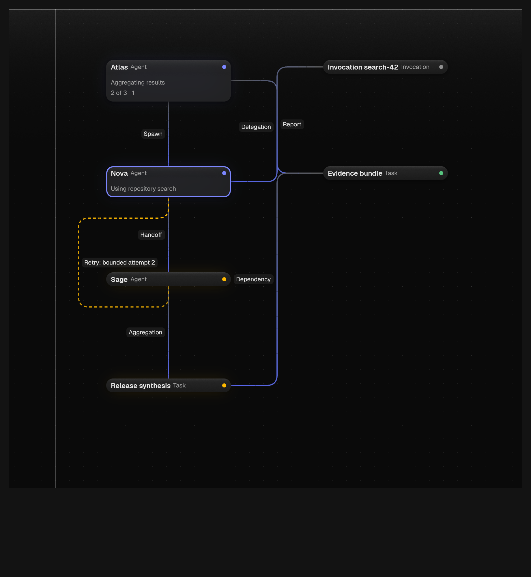
A typed, read-mostly view of an AgentRunSnapshot on a node canvas.
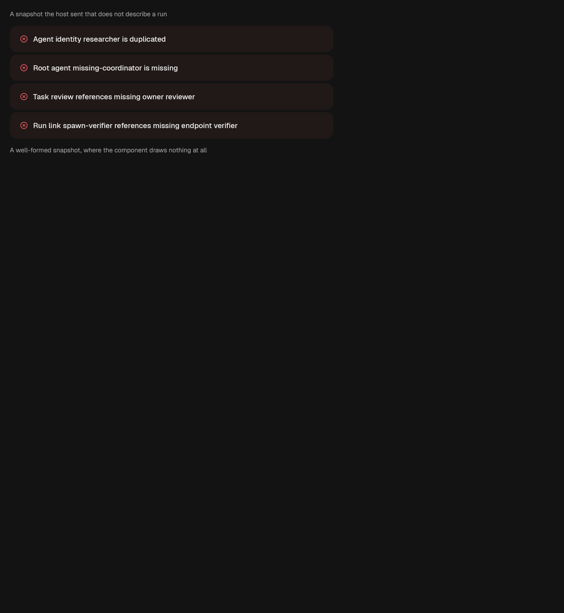
A single truthful notice for malformed multi-agent snapshot structure.
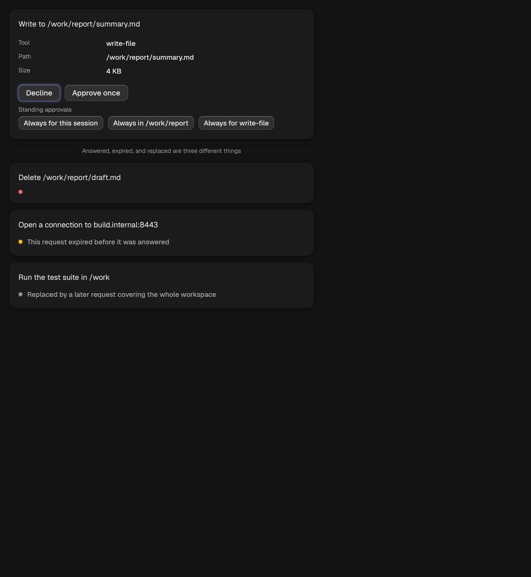
One request for permission, with the answer left to the caller.
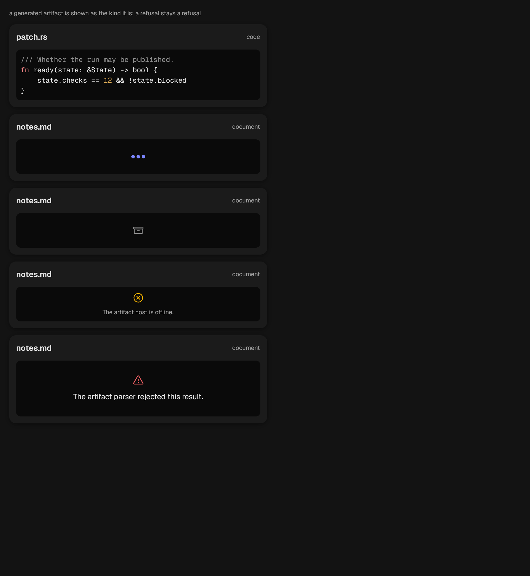
A titled pane for a generated artifact.
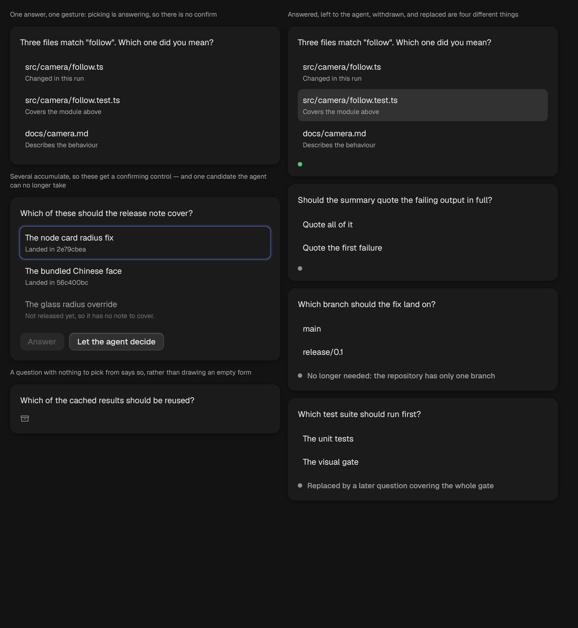
One clarifying question, with the answer left to the caller.
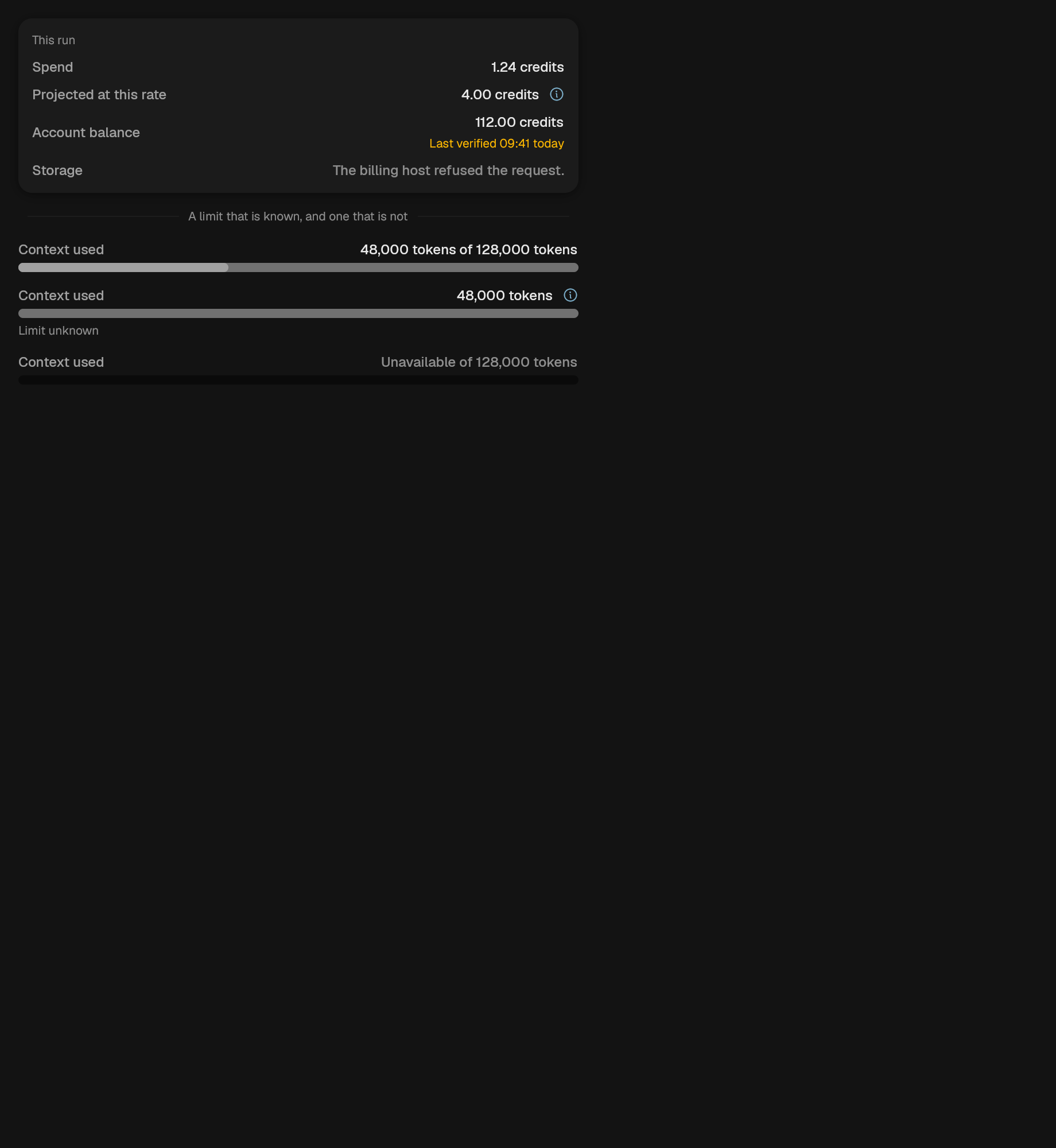
How much of a context window a run has used.
What a run has cost so far, line by line.
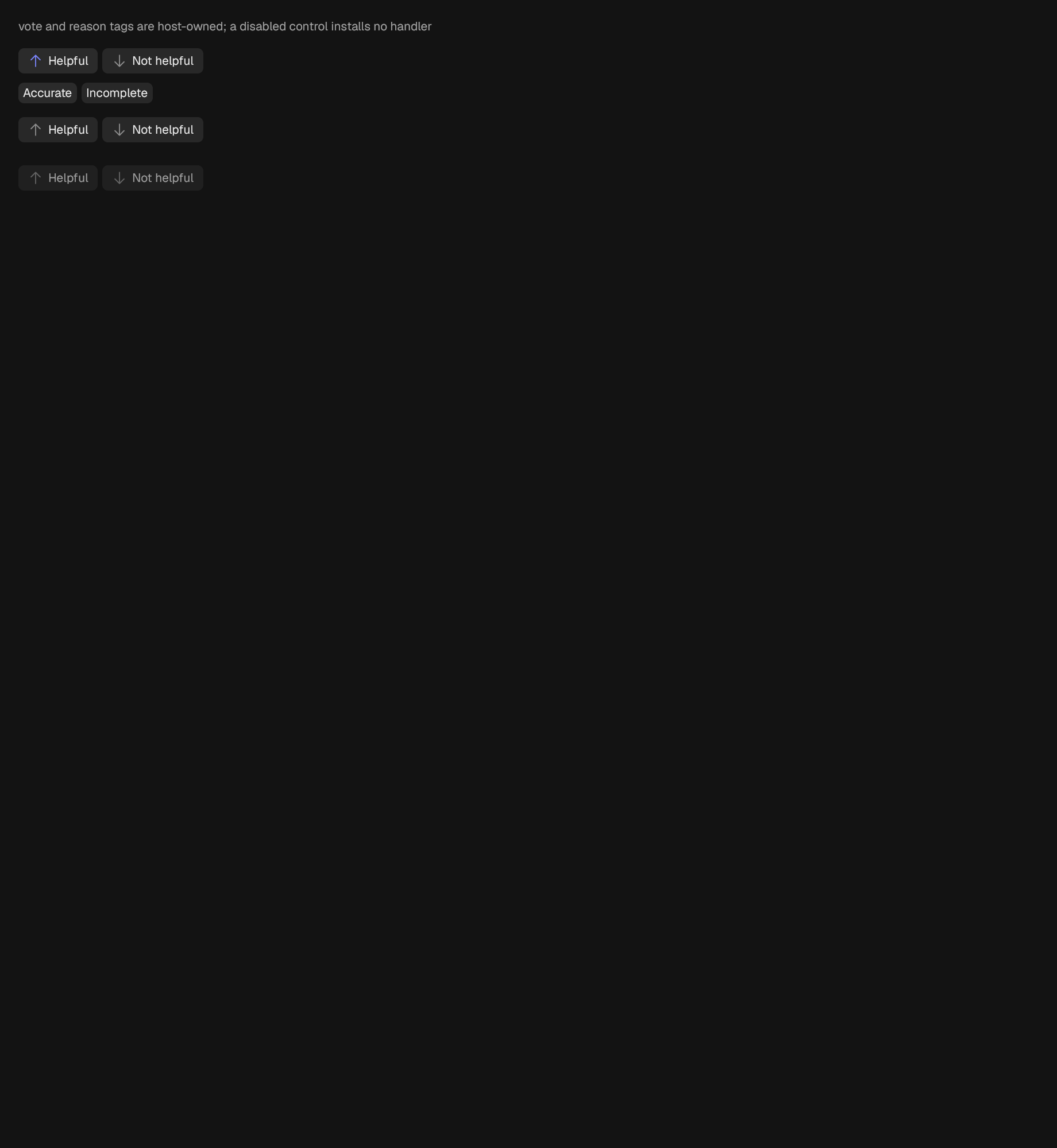
A helpful / not-helpful control with optional host-owned reason tags.
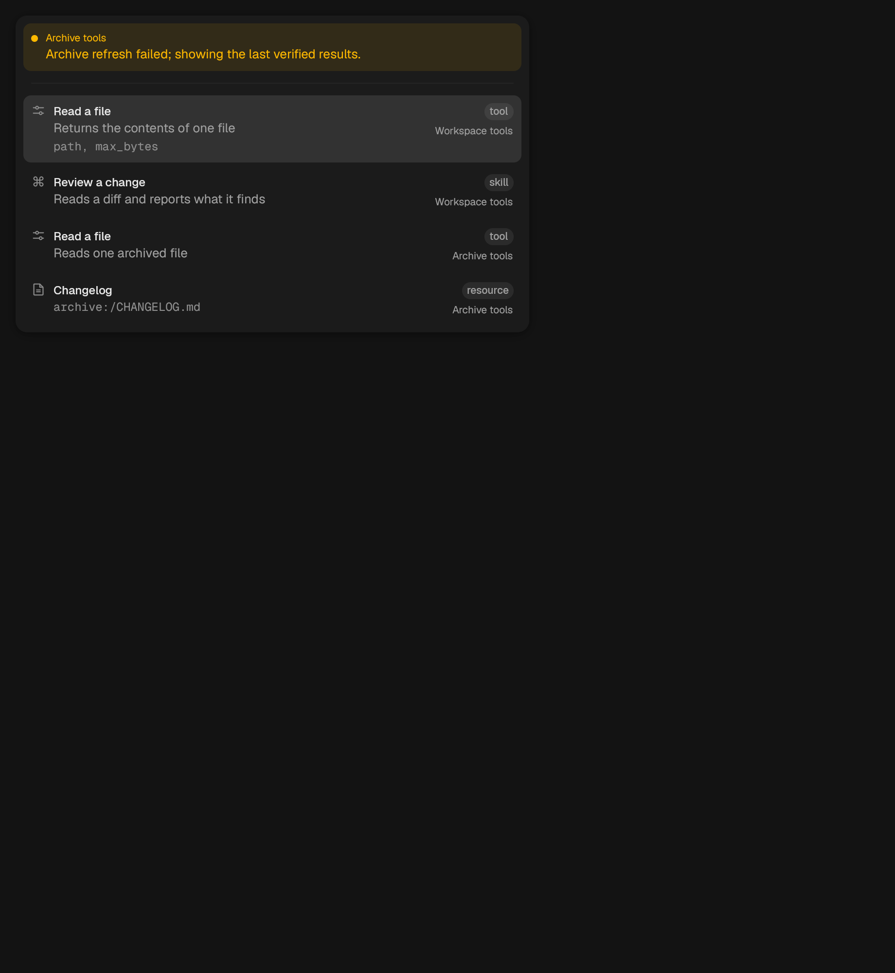
A searchable, kind-filterable catalog of offerings from multiple servers.
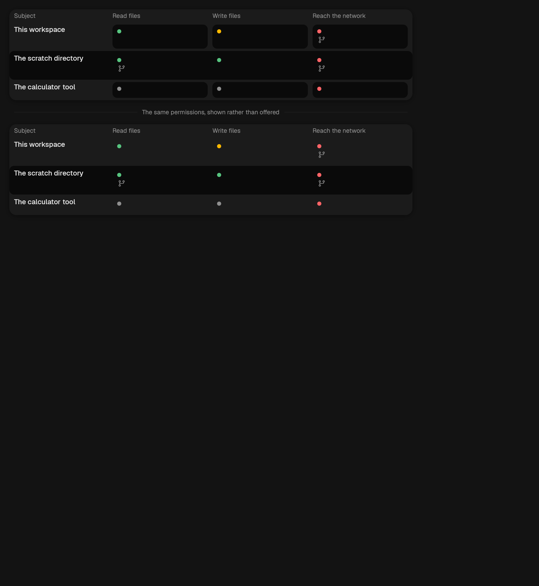
A grid of subjects against actions.
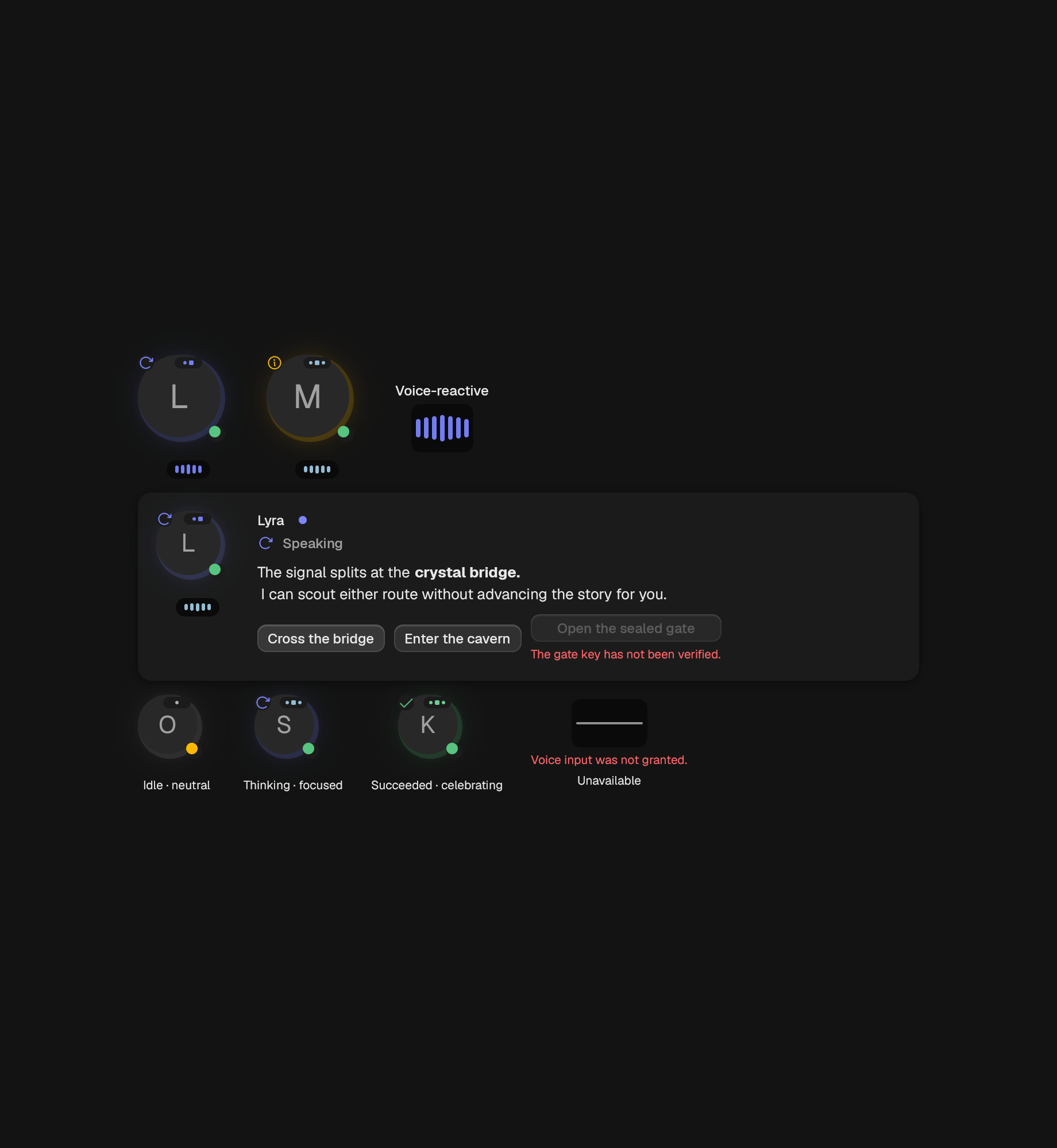
Persona-aware dialogue over the safe Markdown renderer.
A large expressive portrait built on the standard AgentAvatar.
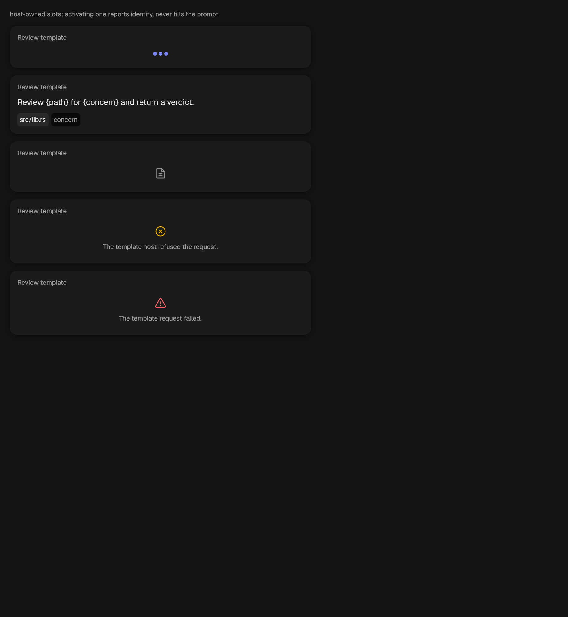
A template with host-owned slots.
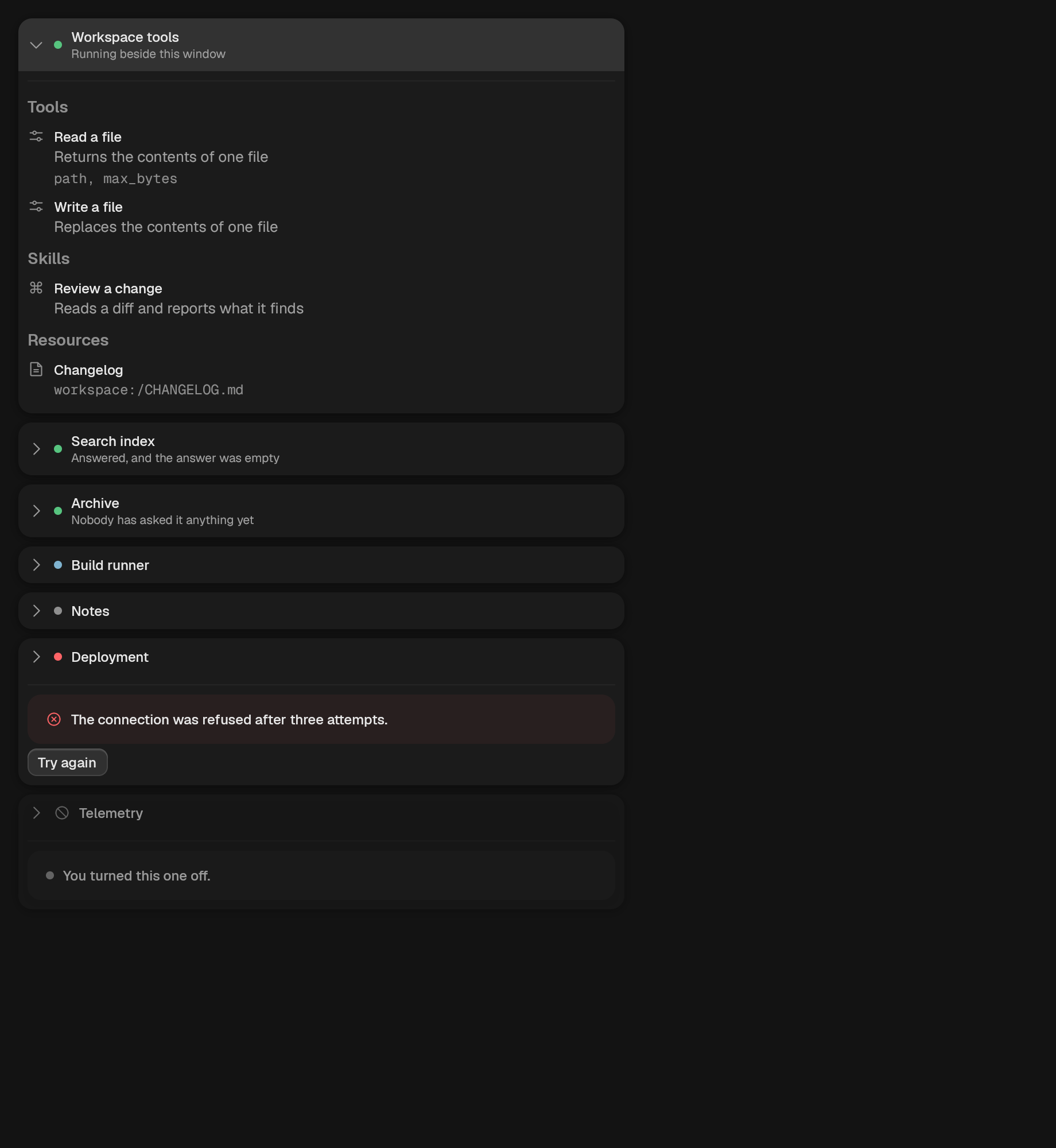
The connections an application holds, and what each one offers.
A caller-controlled hierarchy derived from Spawn links in a run.
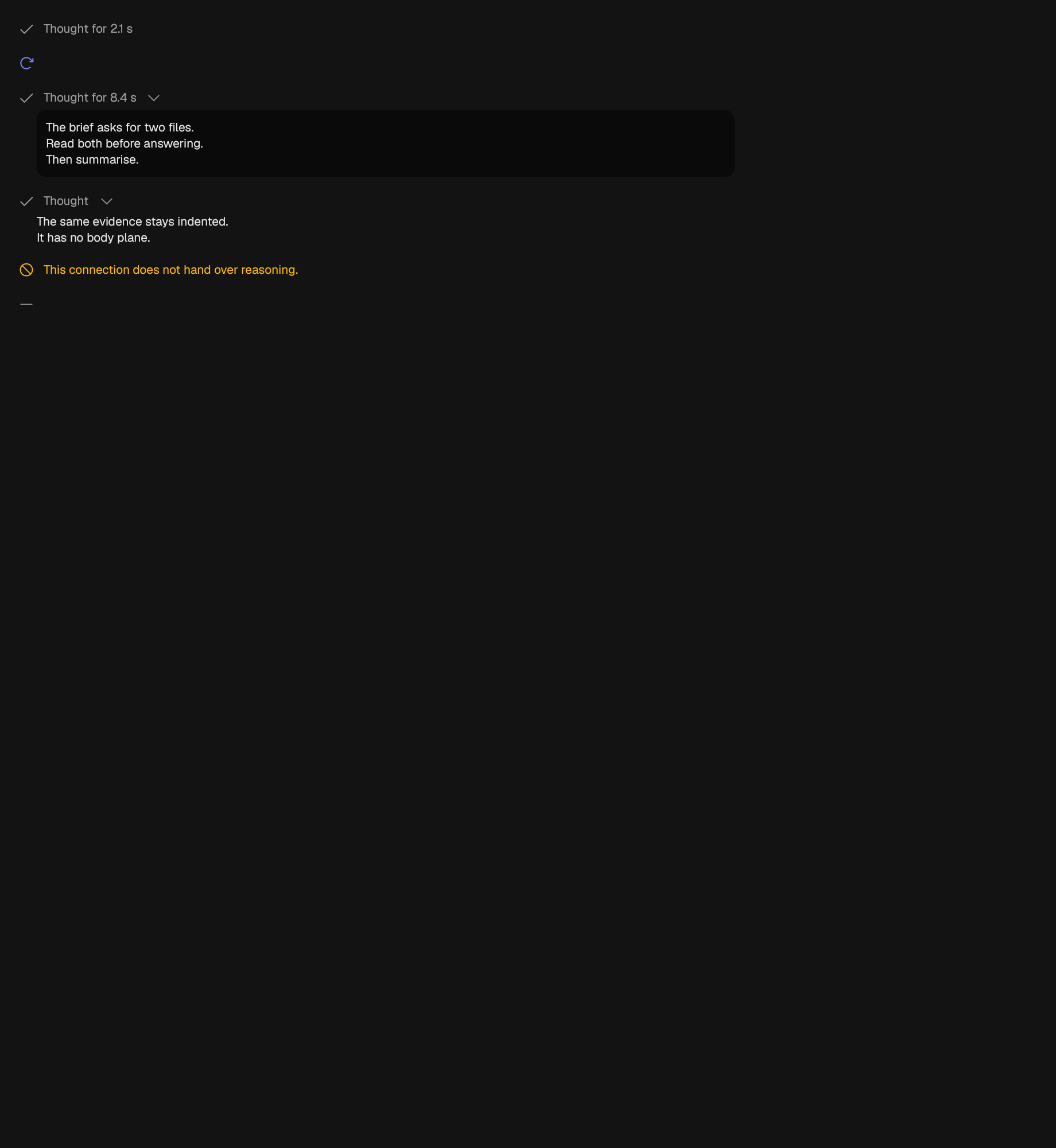
A collapsed block of model reasoning.
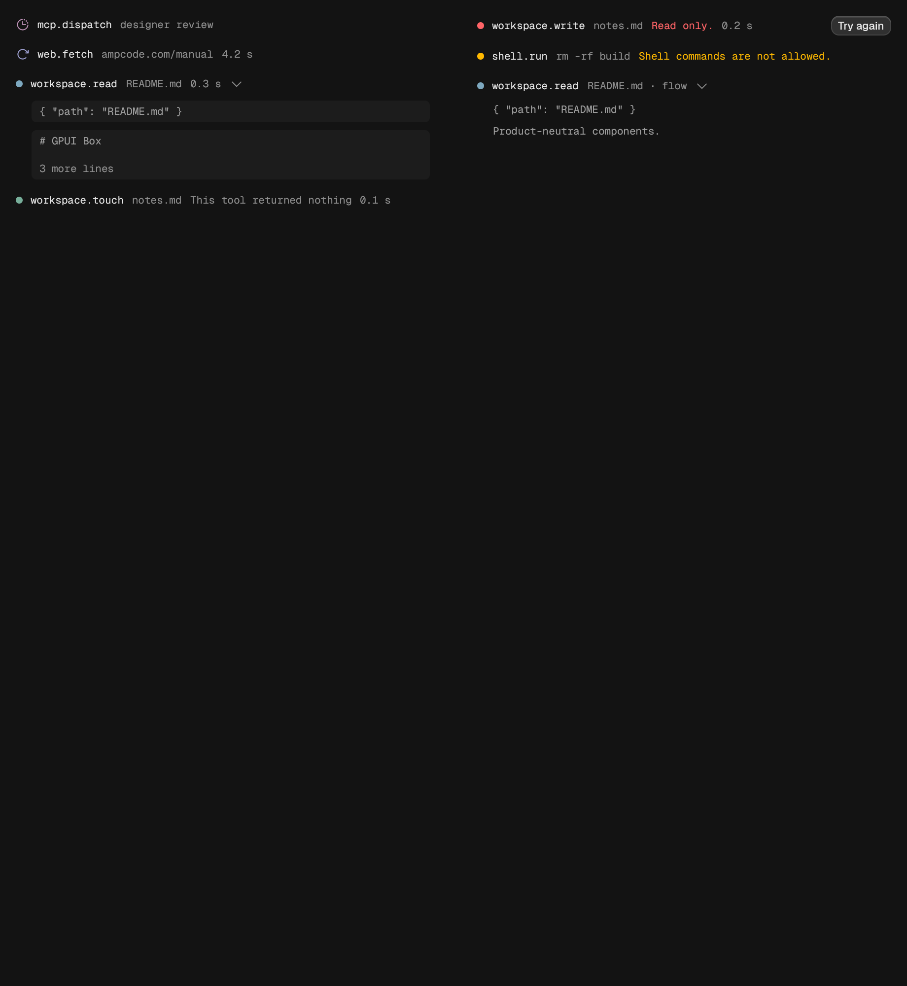
One quiet evidence row for a tool invocation.
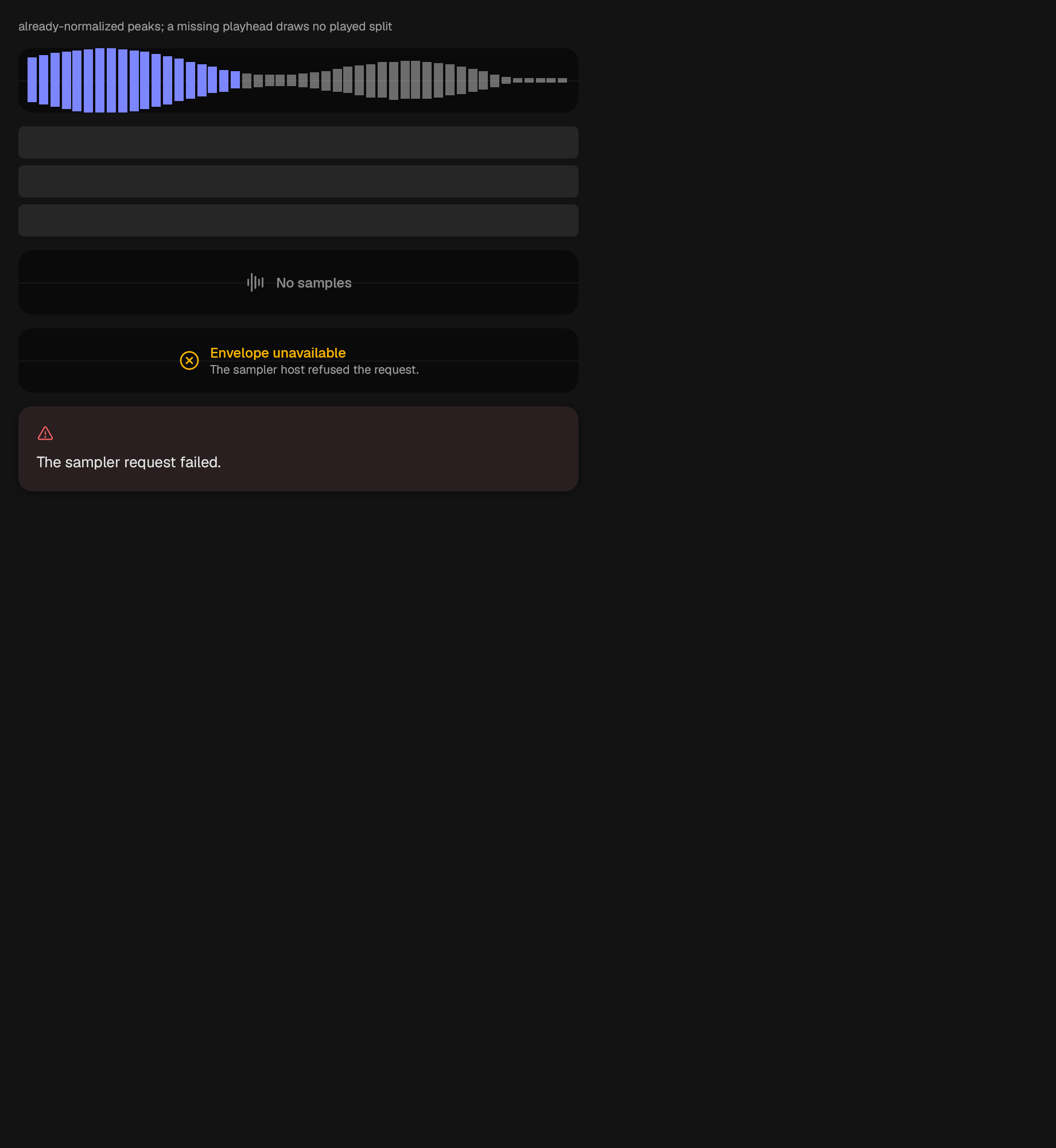
A standard voice-reactive visualization from a normalized host sample.
canvas
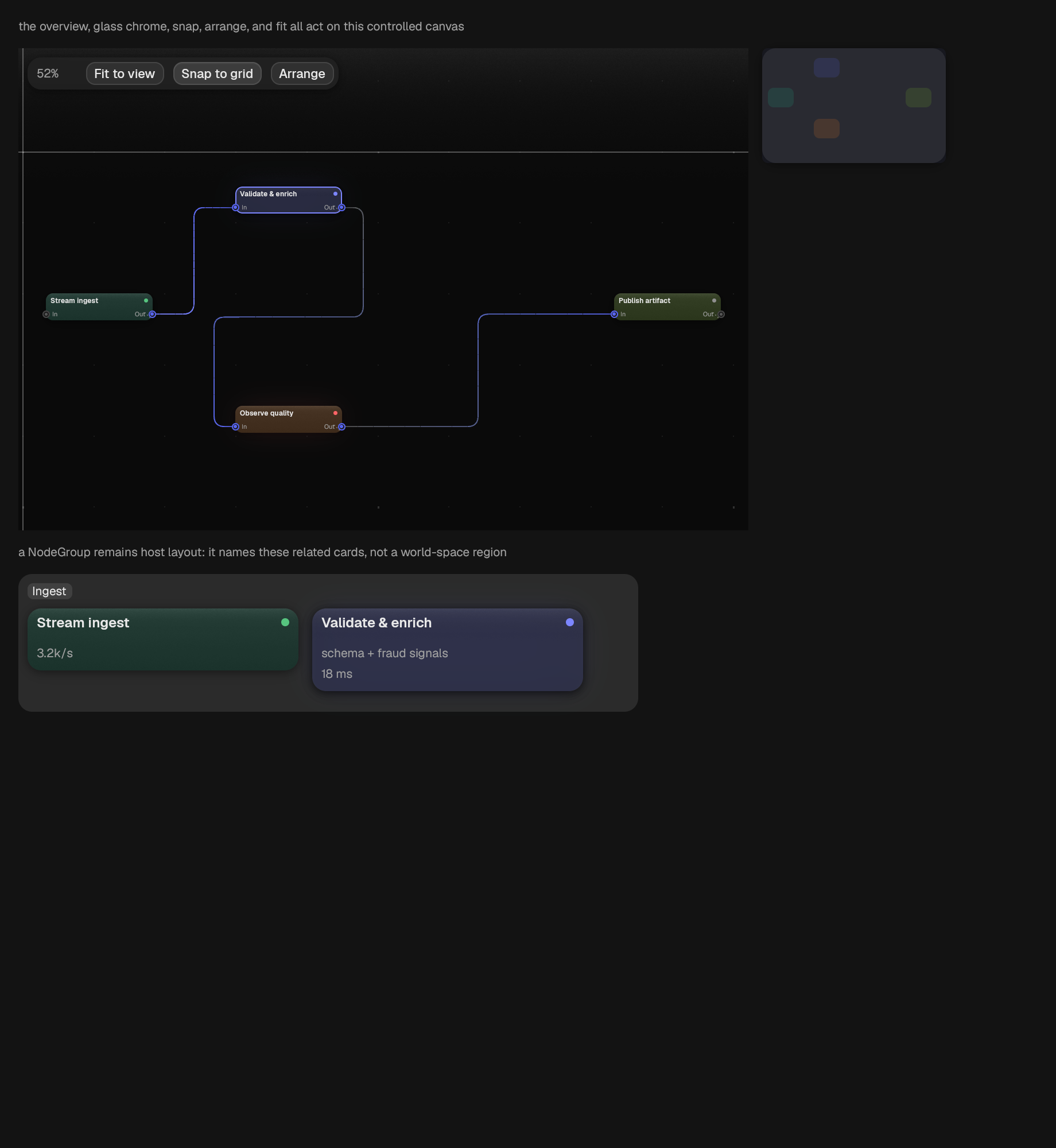
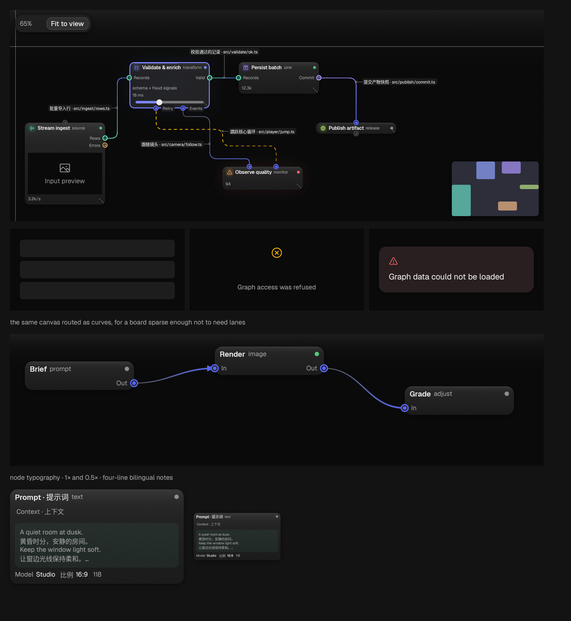
content
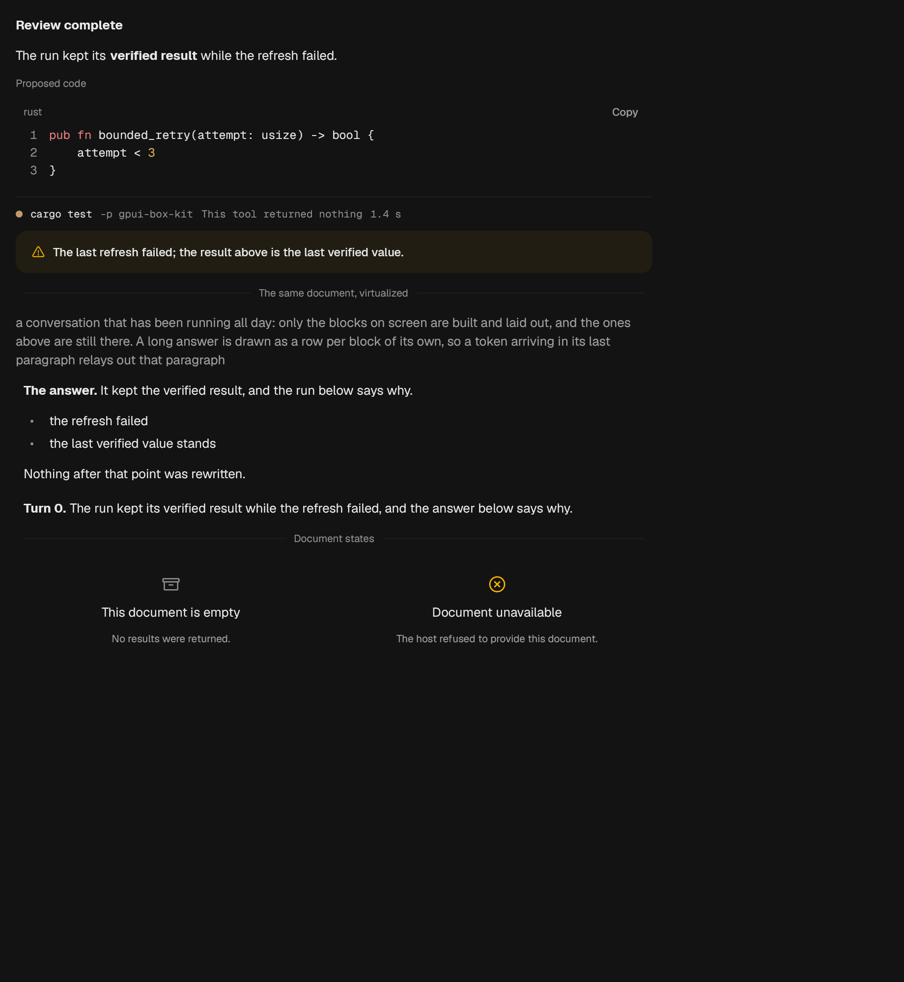
A read-only sequence of typed agent output blocks.
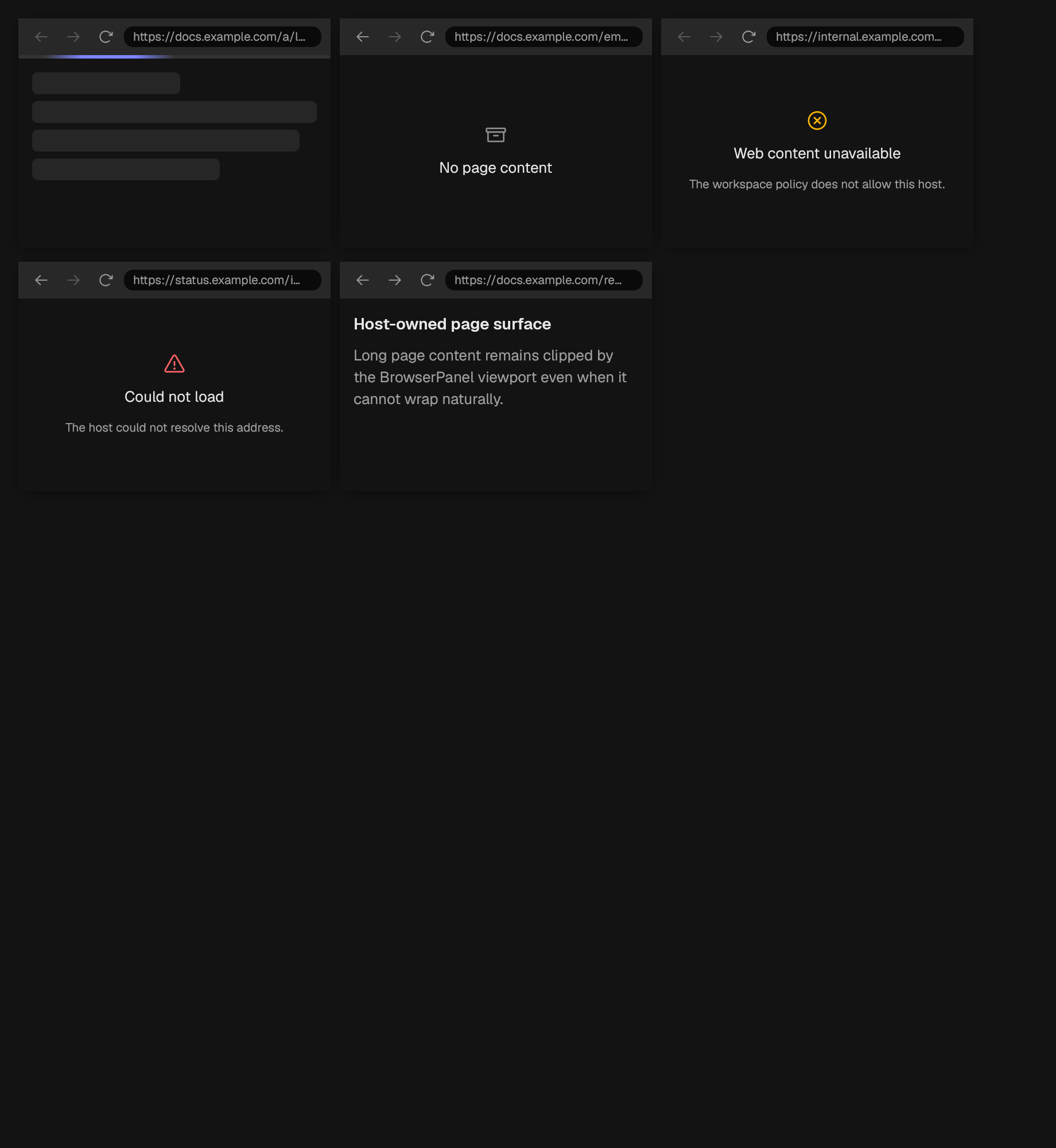
A framed web view: address, controls, and the rectangle a page goes in.
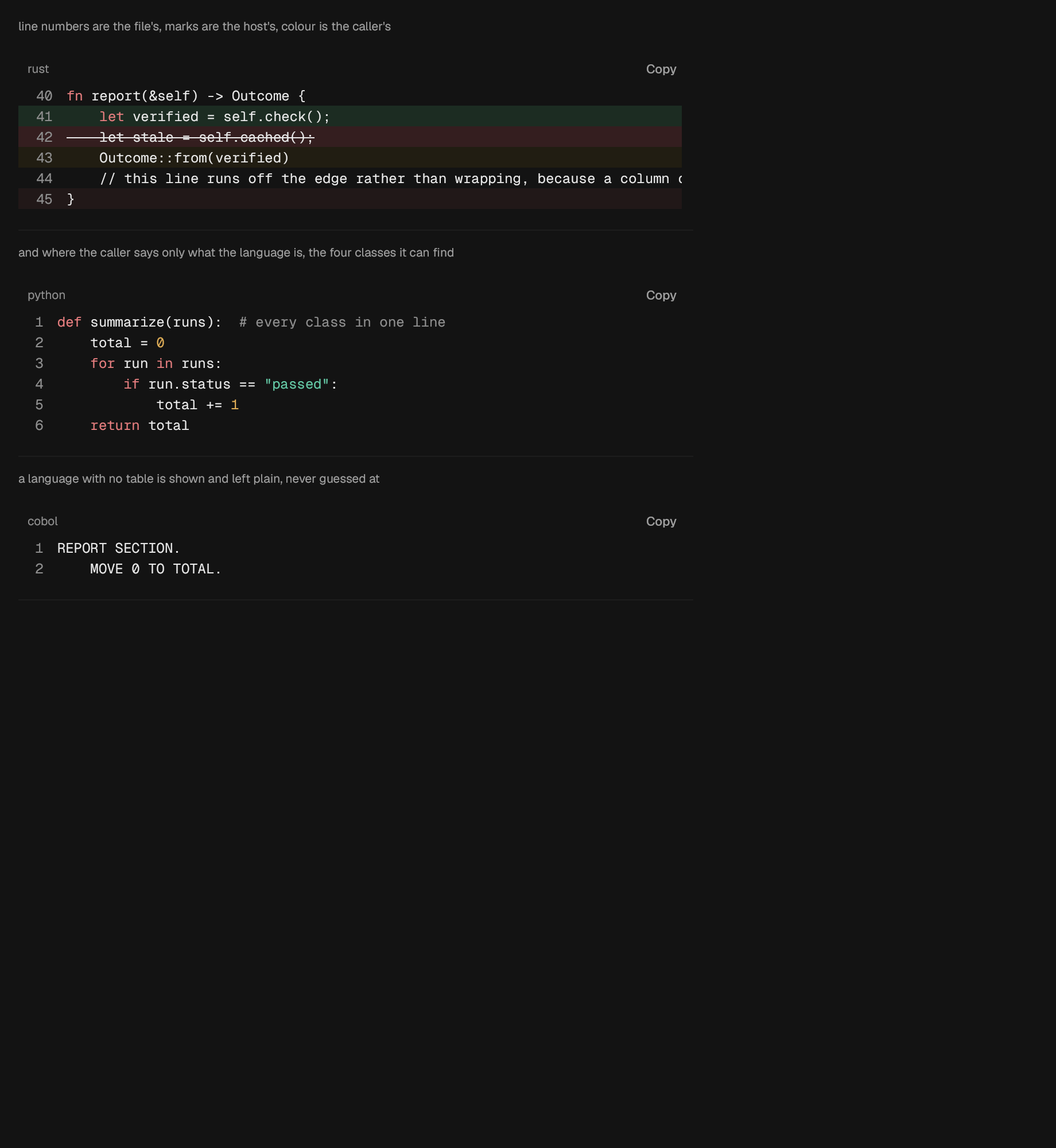
Read-only code with a gutter.
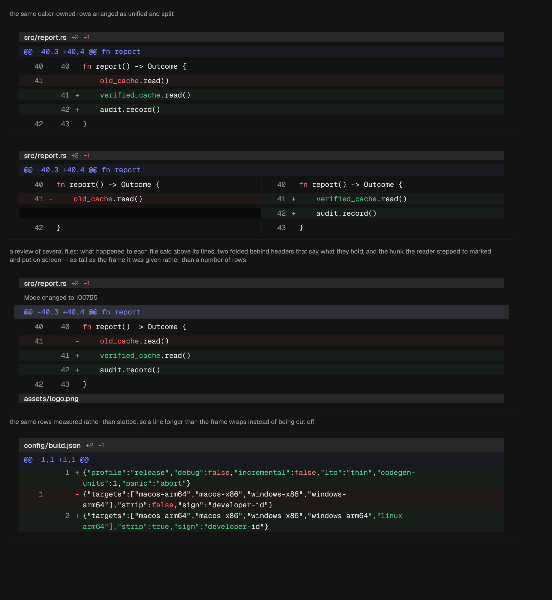
A virtualized, read-only diff presentation.
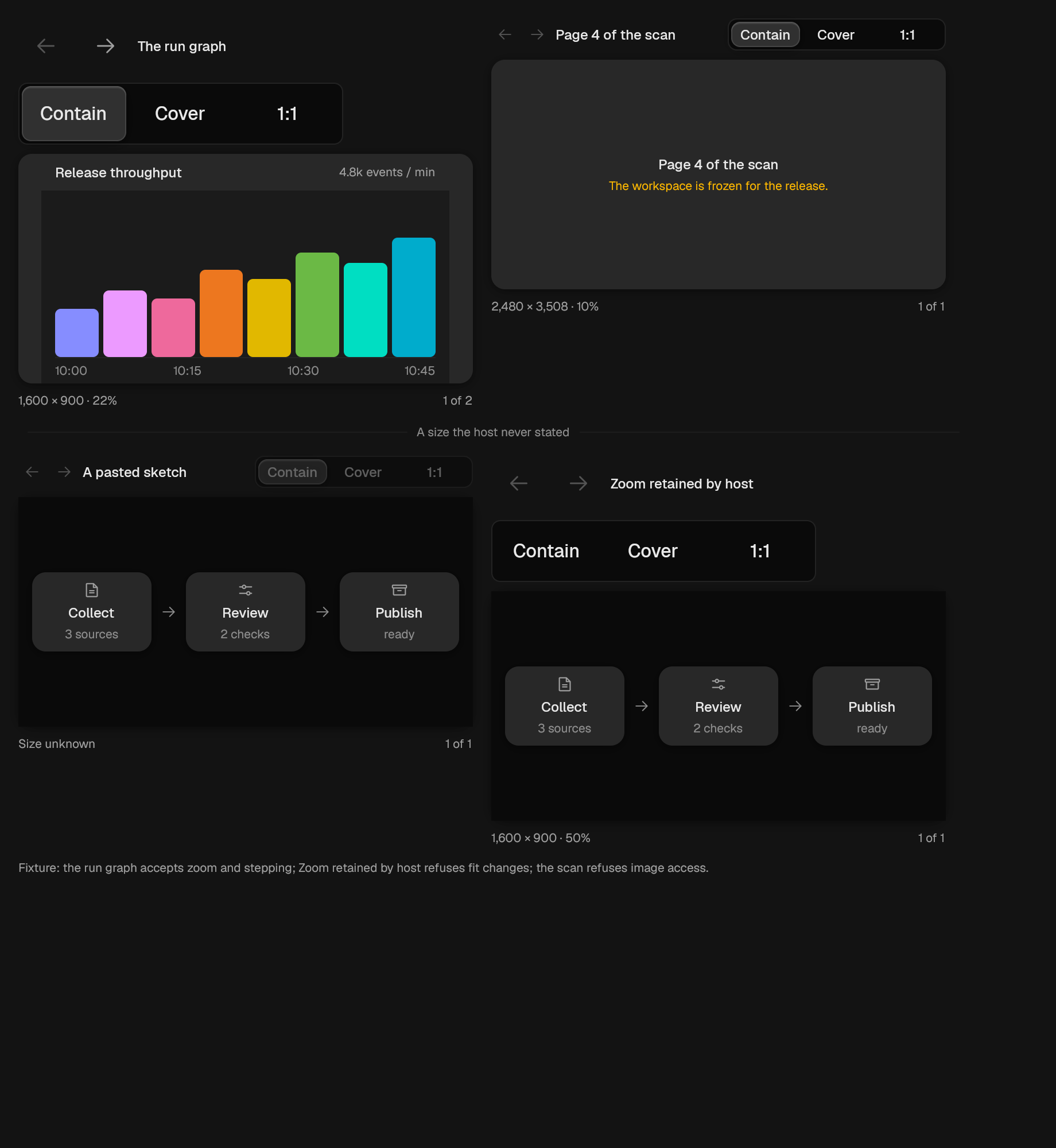
A framed viewer for one image at a time.
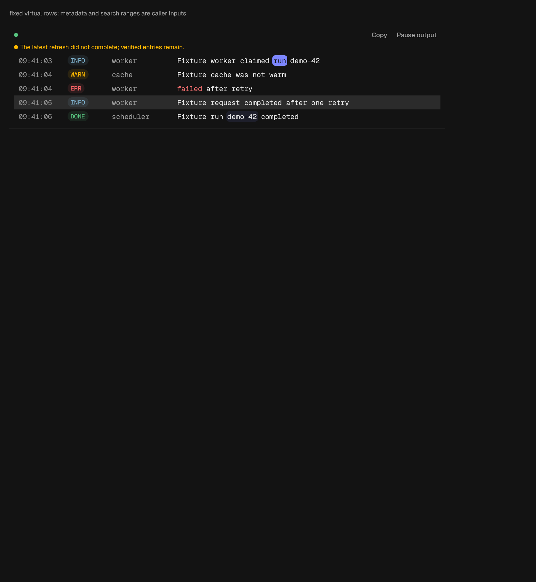
A virtualized, read-only log presentation.
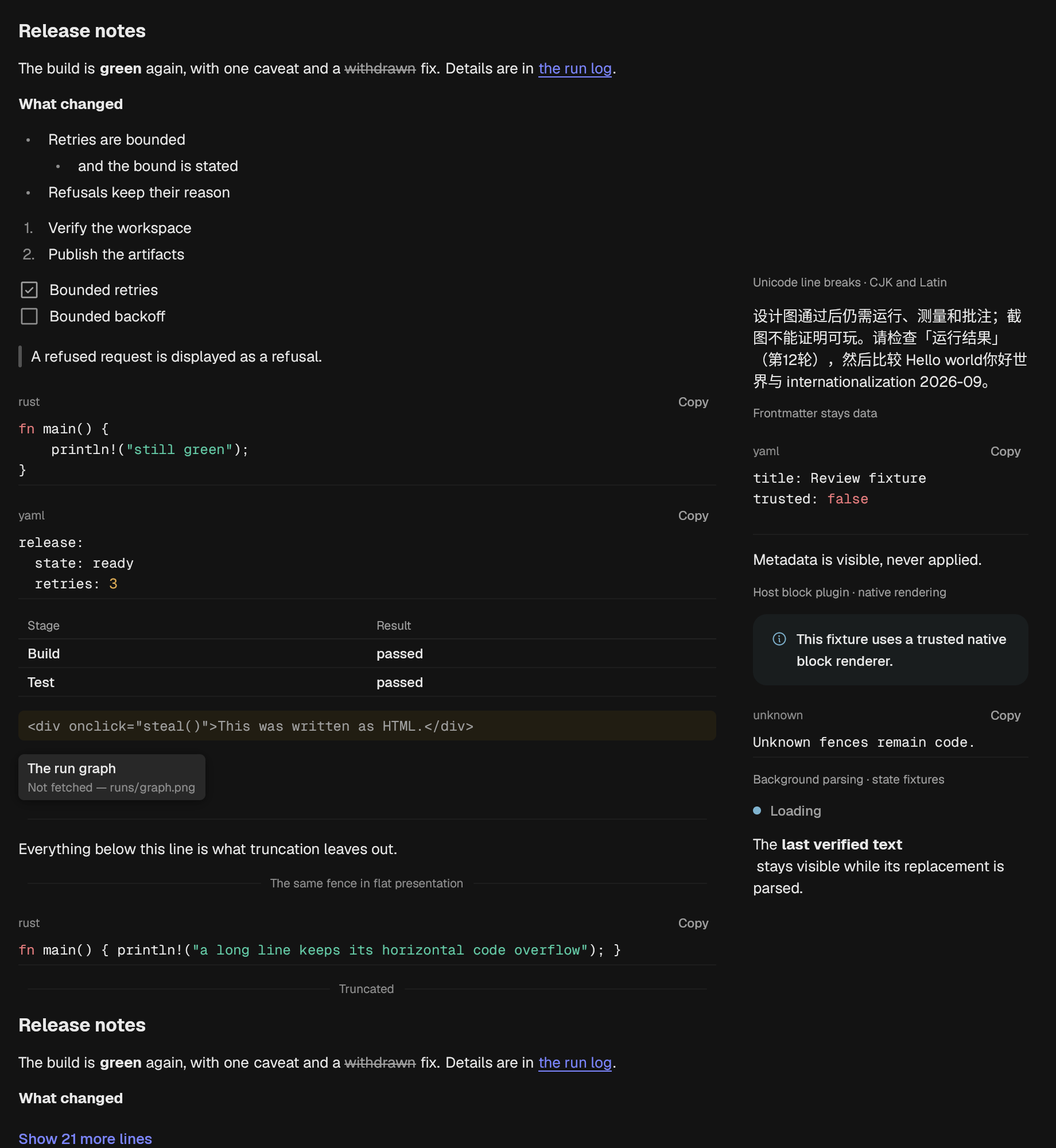
A rendered Markdown document.
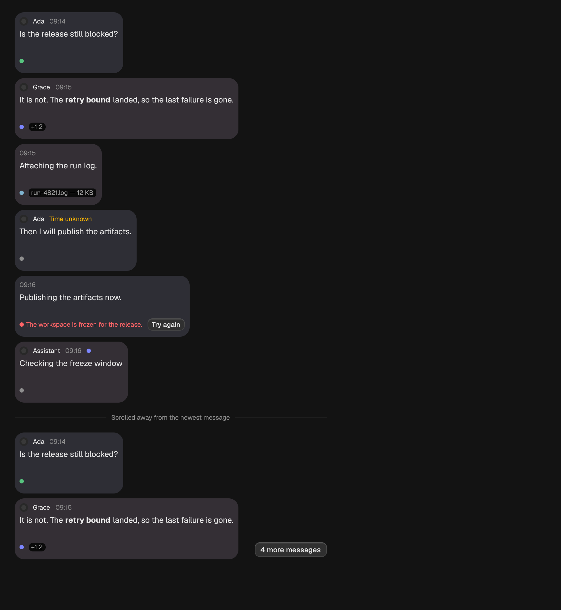
A conversation.
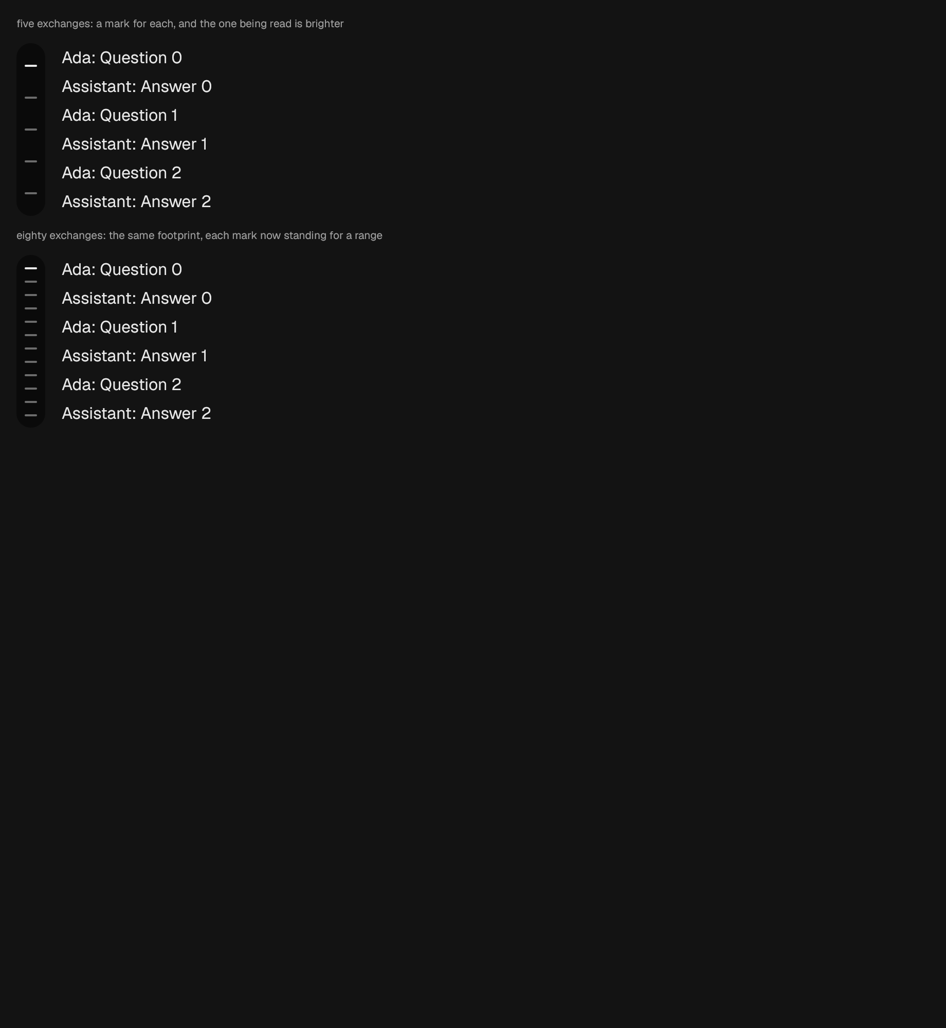
The outline of a long surface. Reports the mark that was chosen, and travels there.
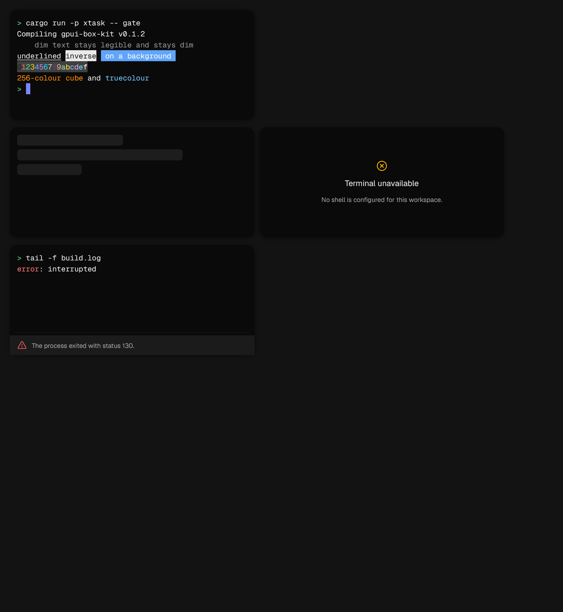
A terminal grid.
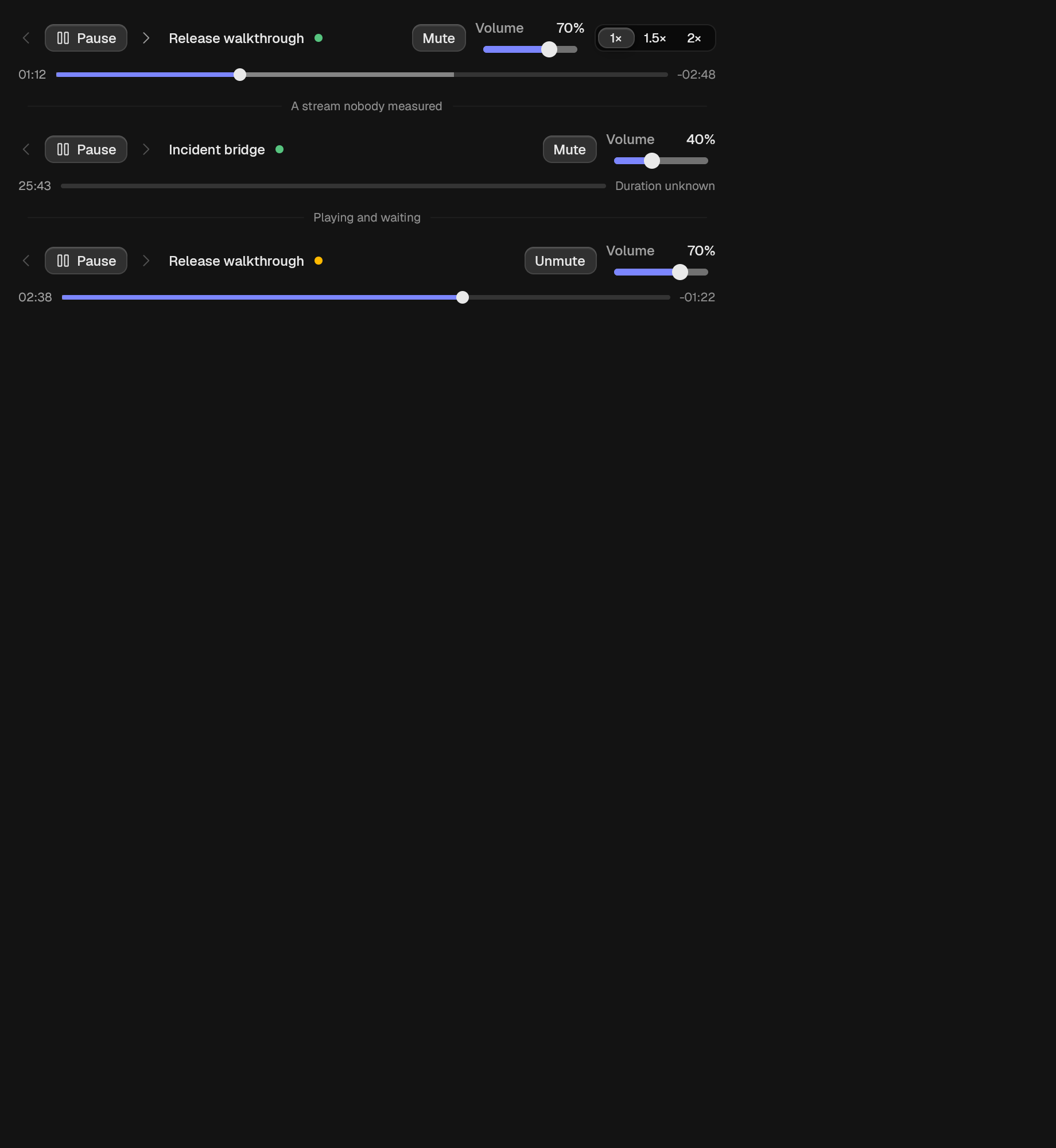
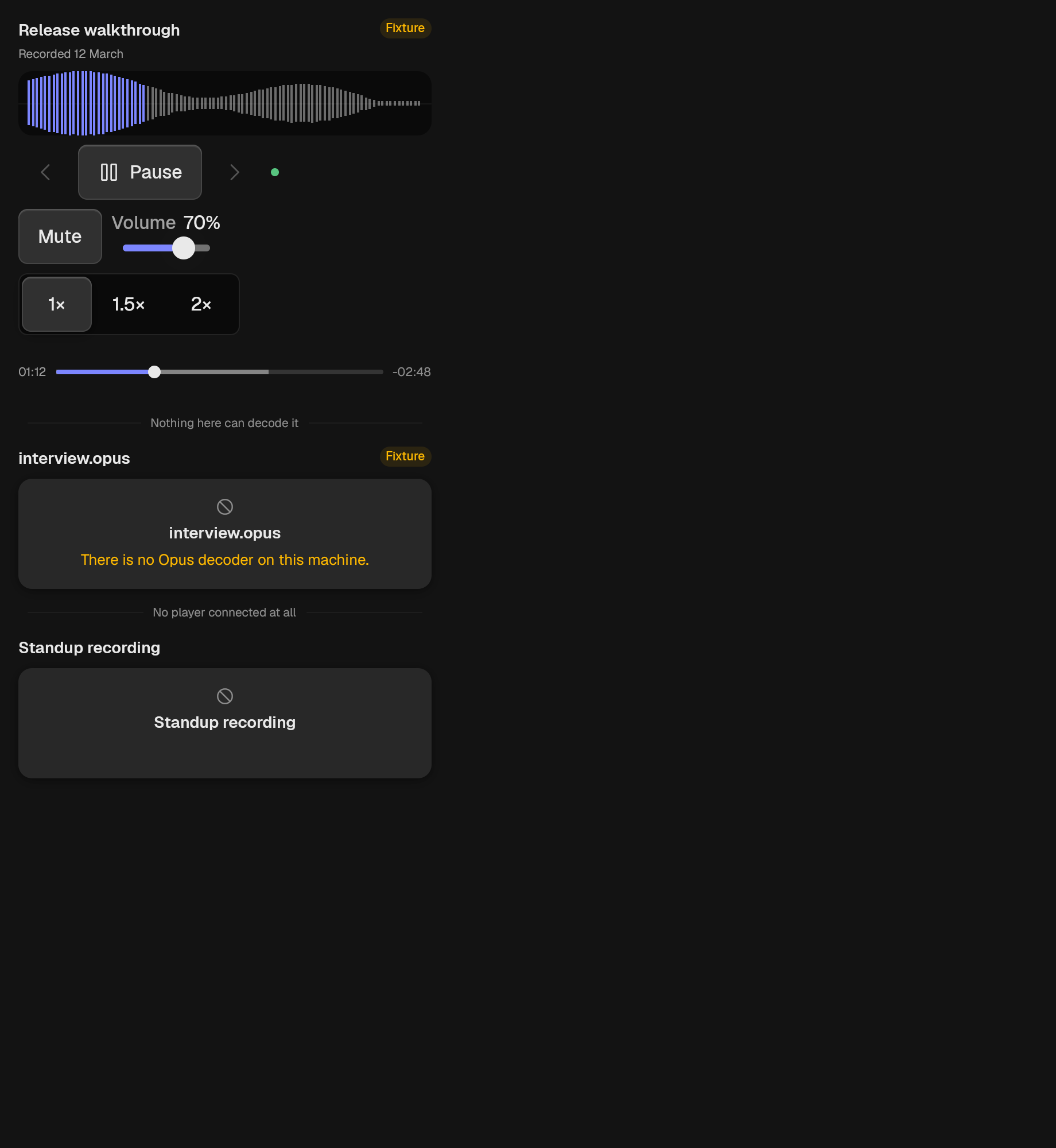
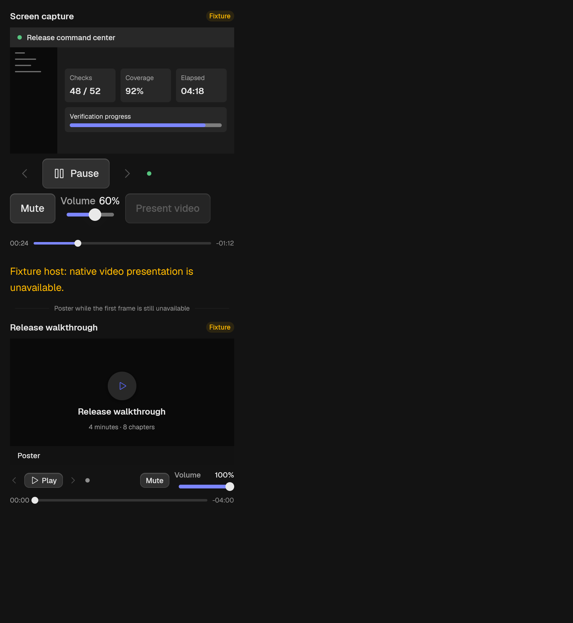
A transport for one piece of media.
controls
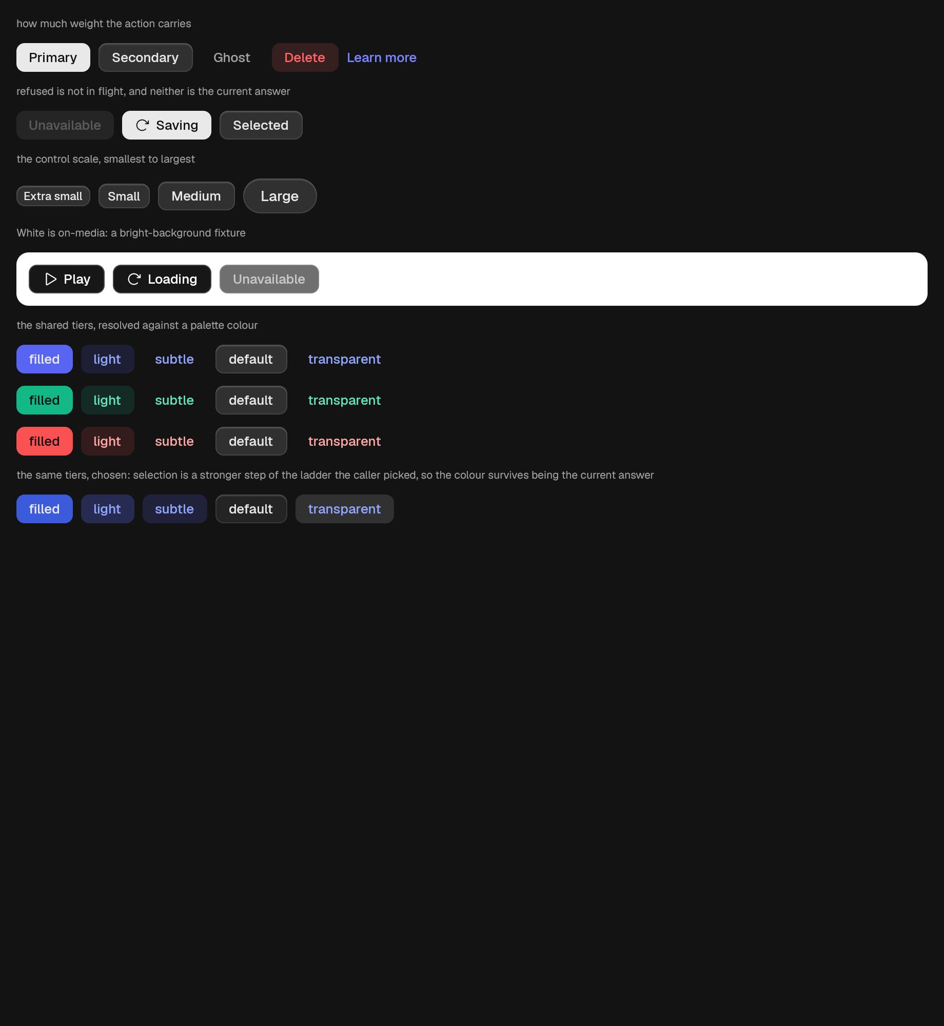
A labeled action.
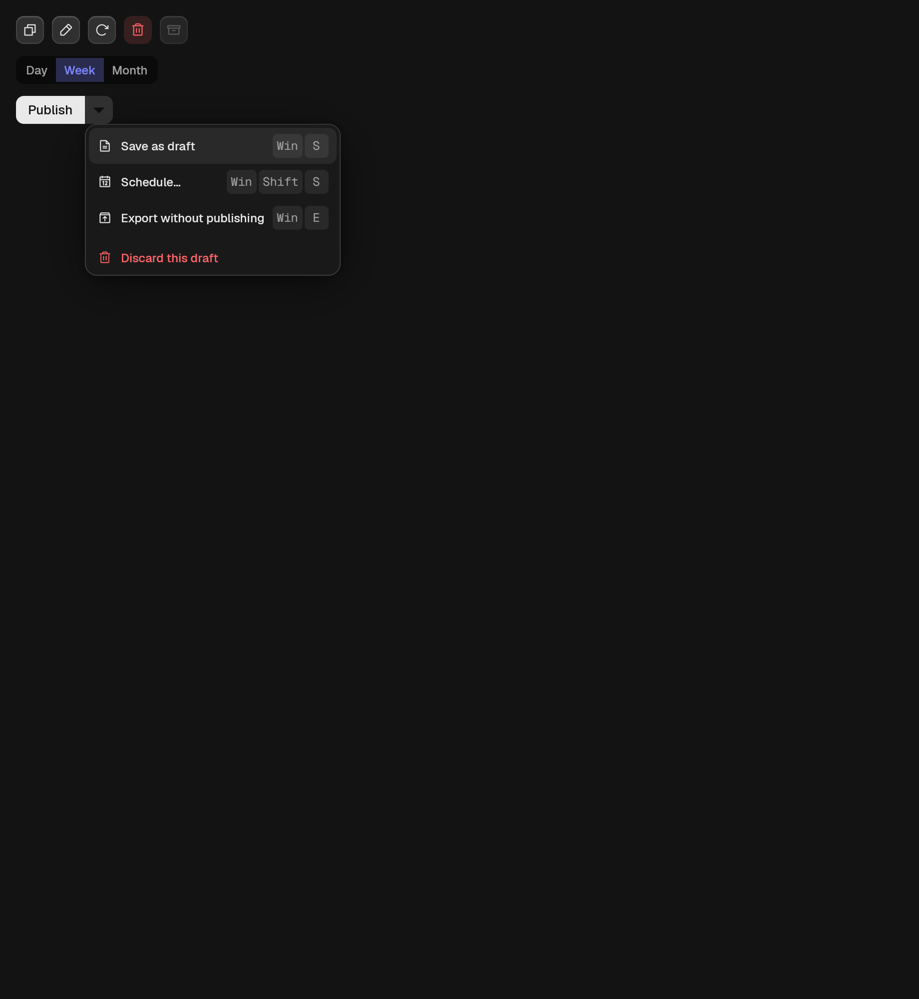
Adjacent related actions sharing one frame.
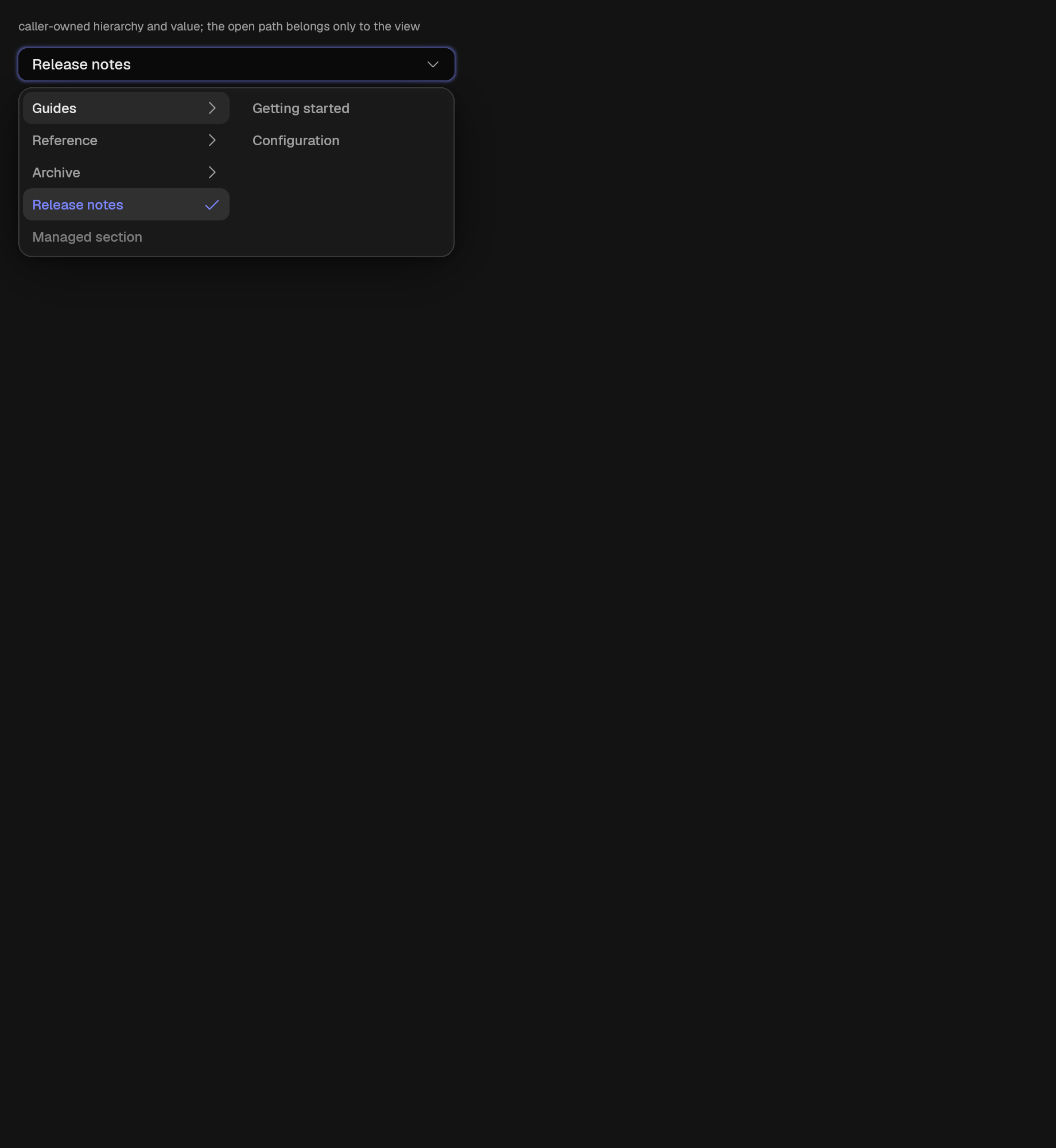
A menu of progressively revealed caller-owned option columns.
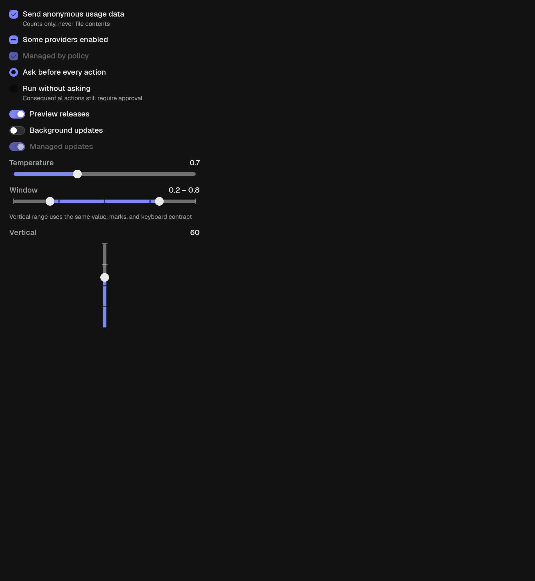
A box that reports one of on, off, or partly on.
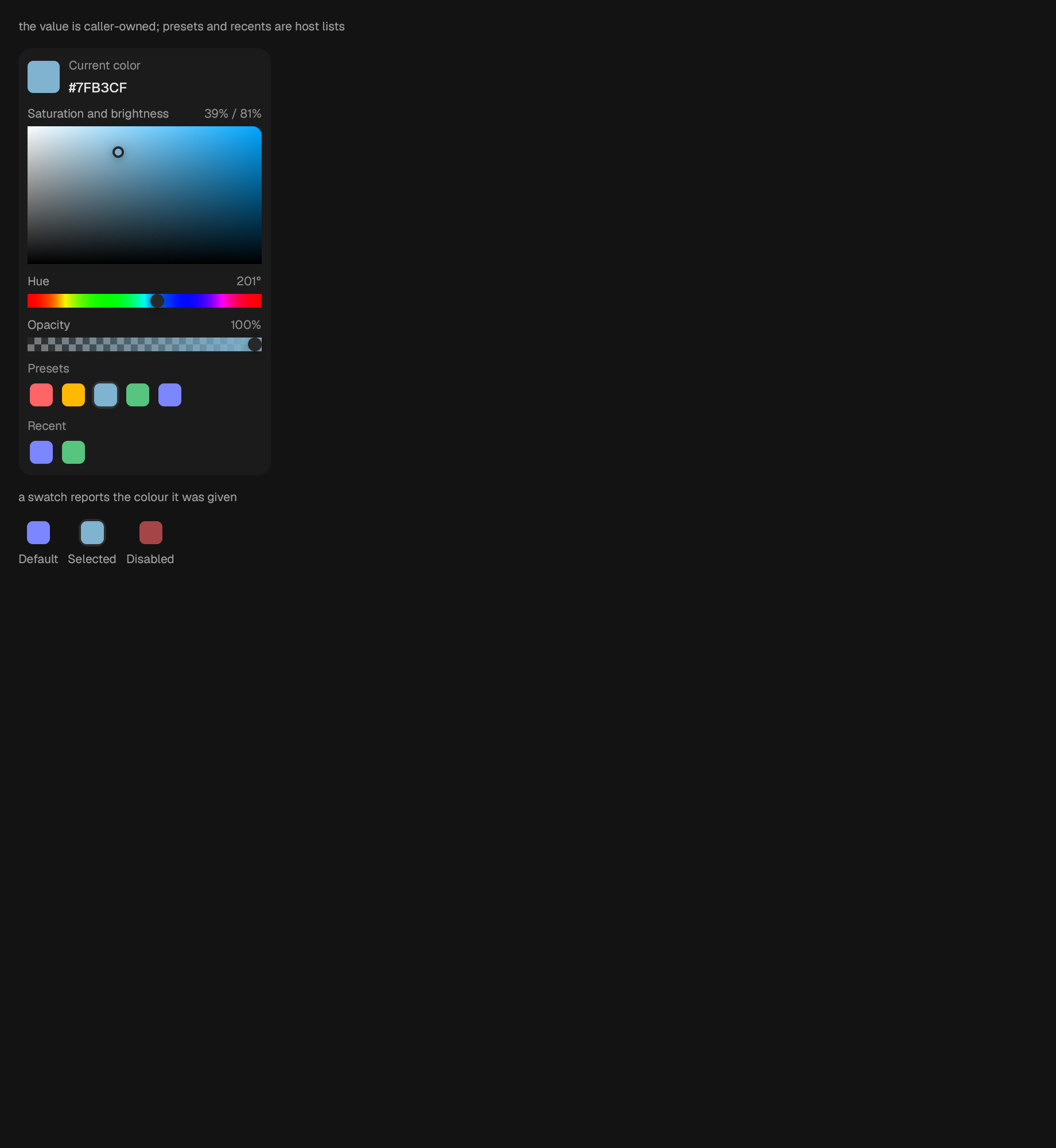
Hue, saturation-brightness, optional opacity, and host-owned swatches.
A clickable colour chip. Reports the colour it was given; applies nothing.
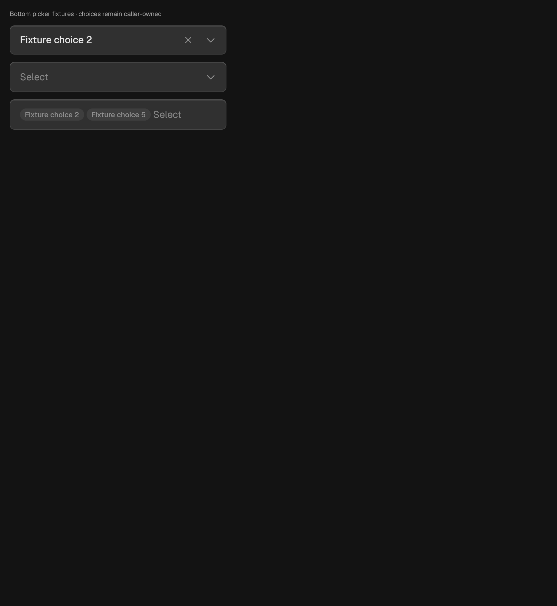
A Select you can type into.
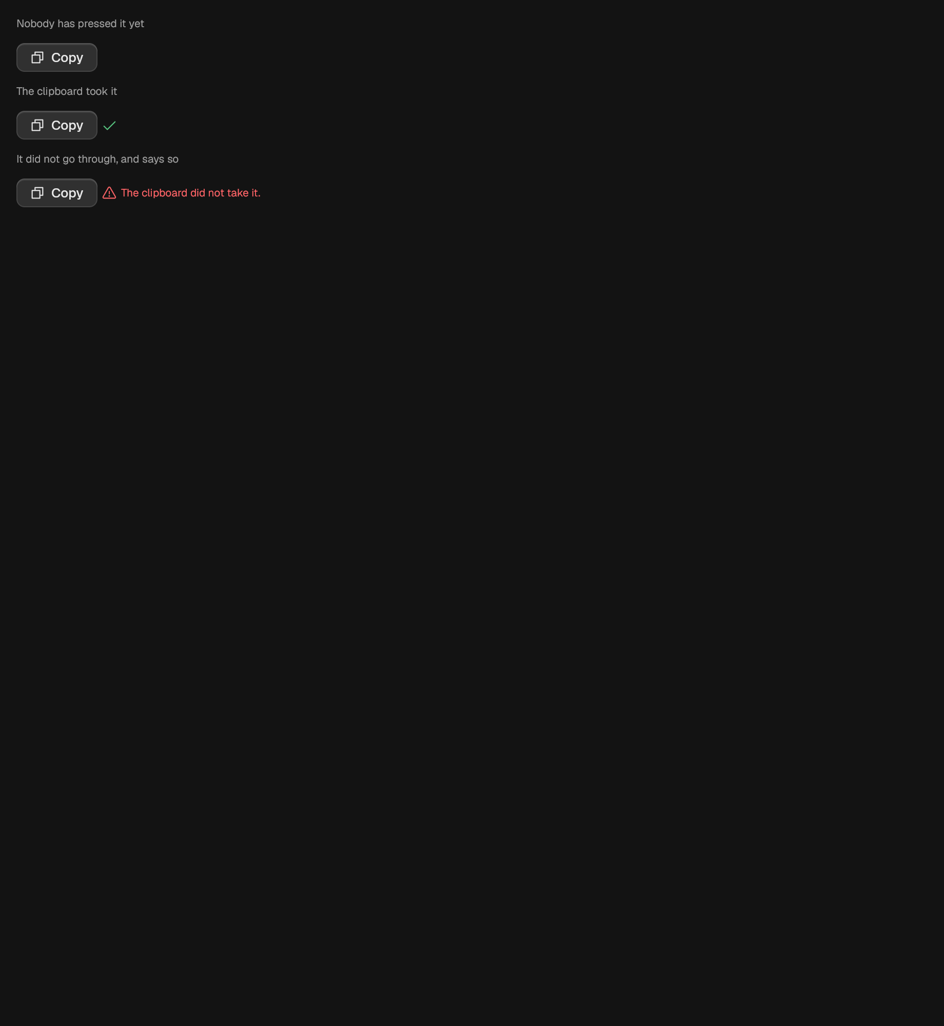
A button that copies caller-supplied text and confirms what happened.
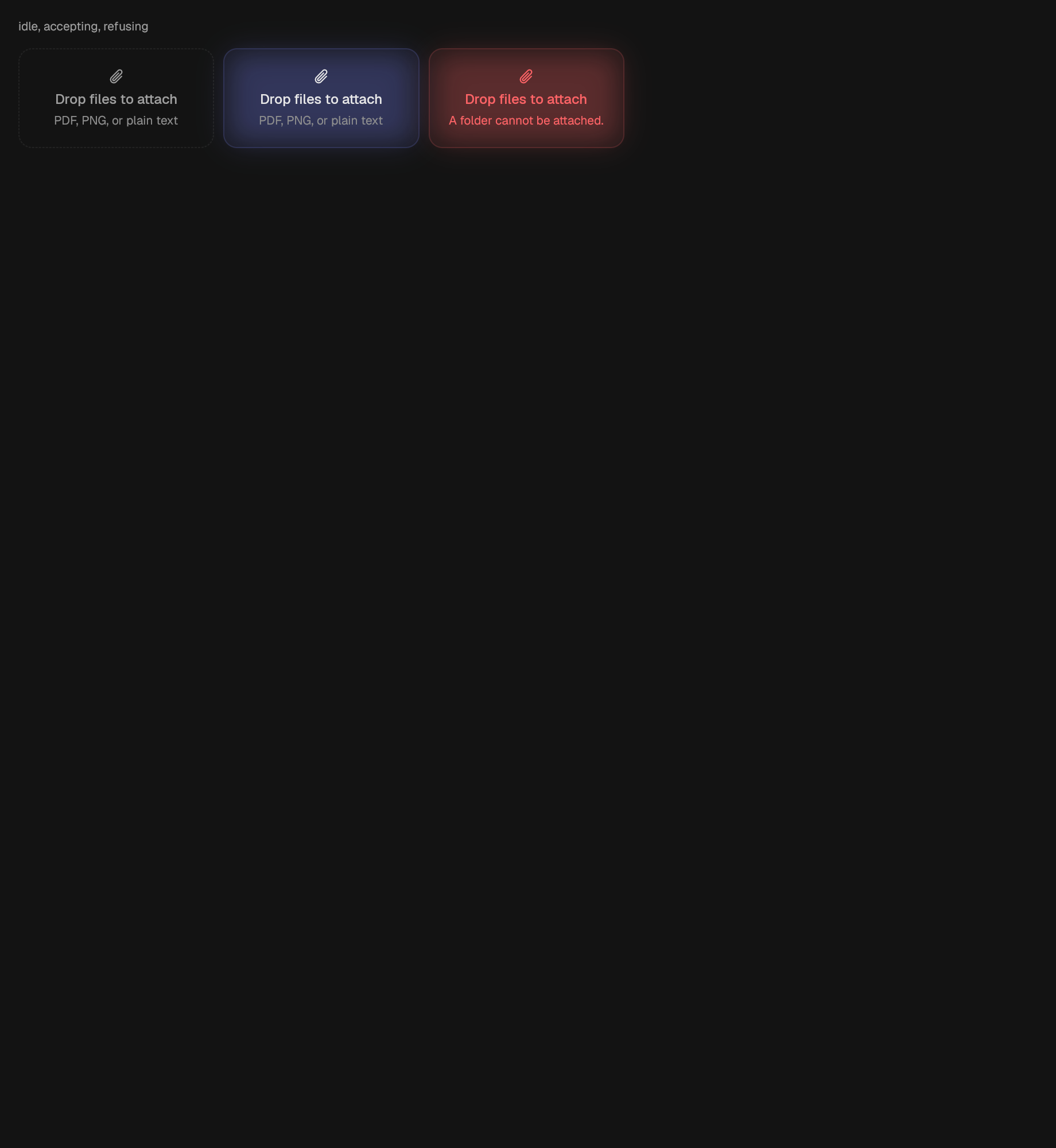
An area that accepts a drop.
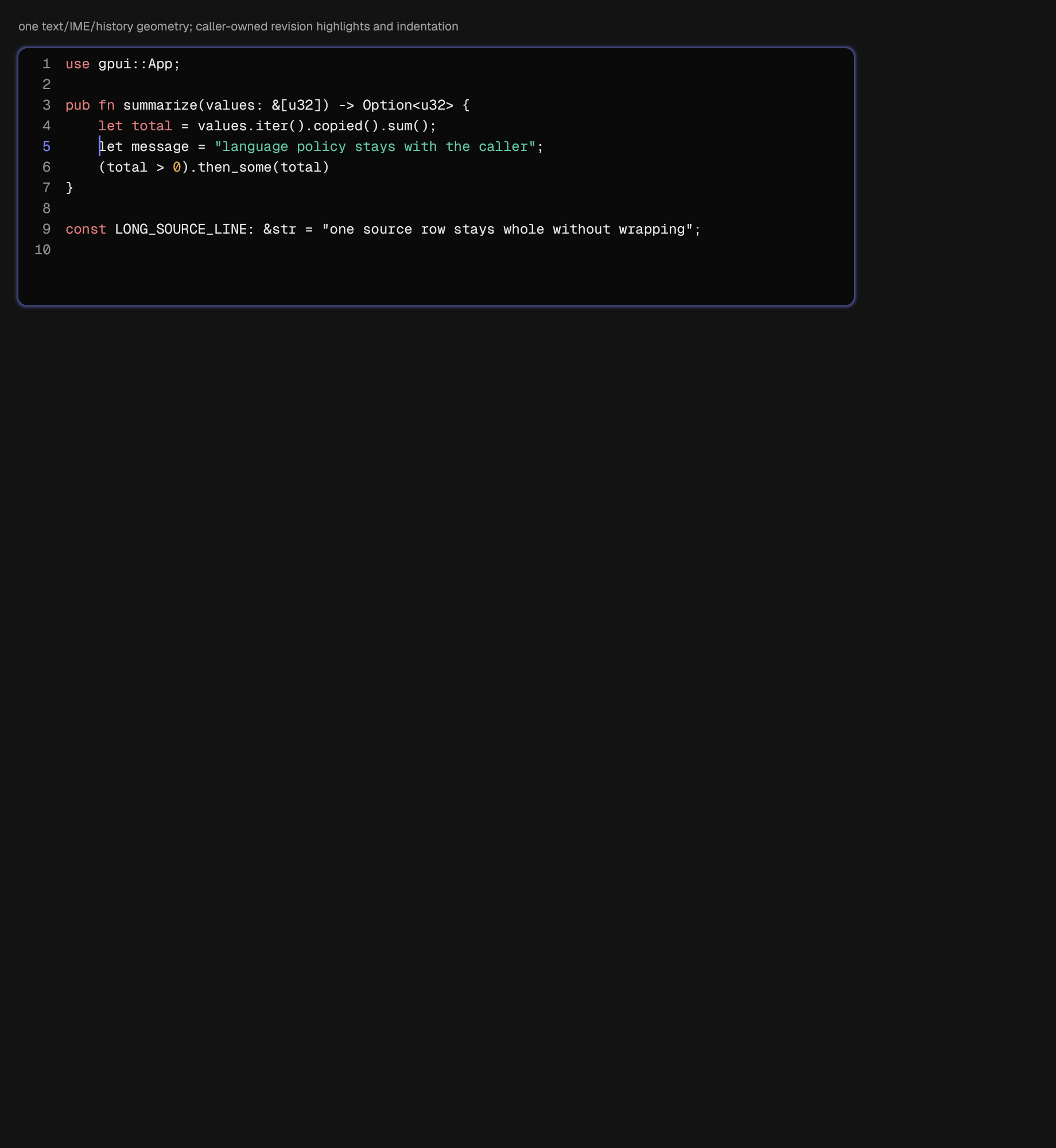
Plain source editing with caller-owned language policy.
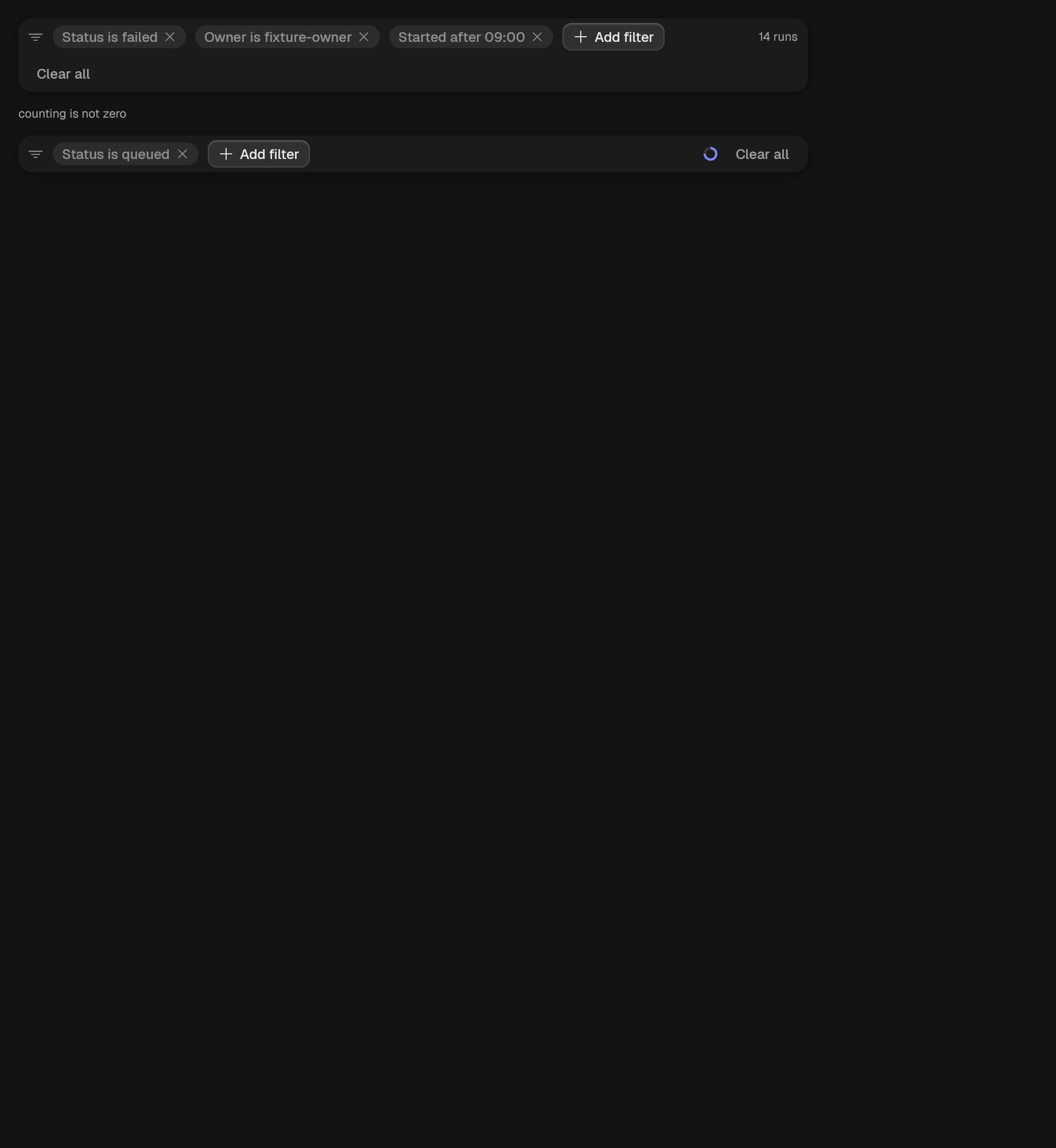
A row of active conditions, a way to add one, a clear-all, and the count.
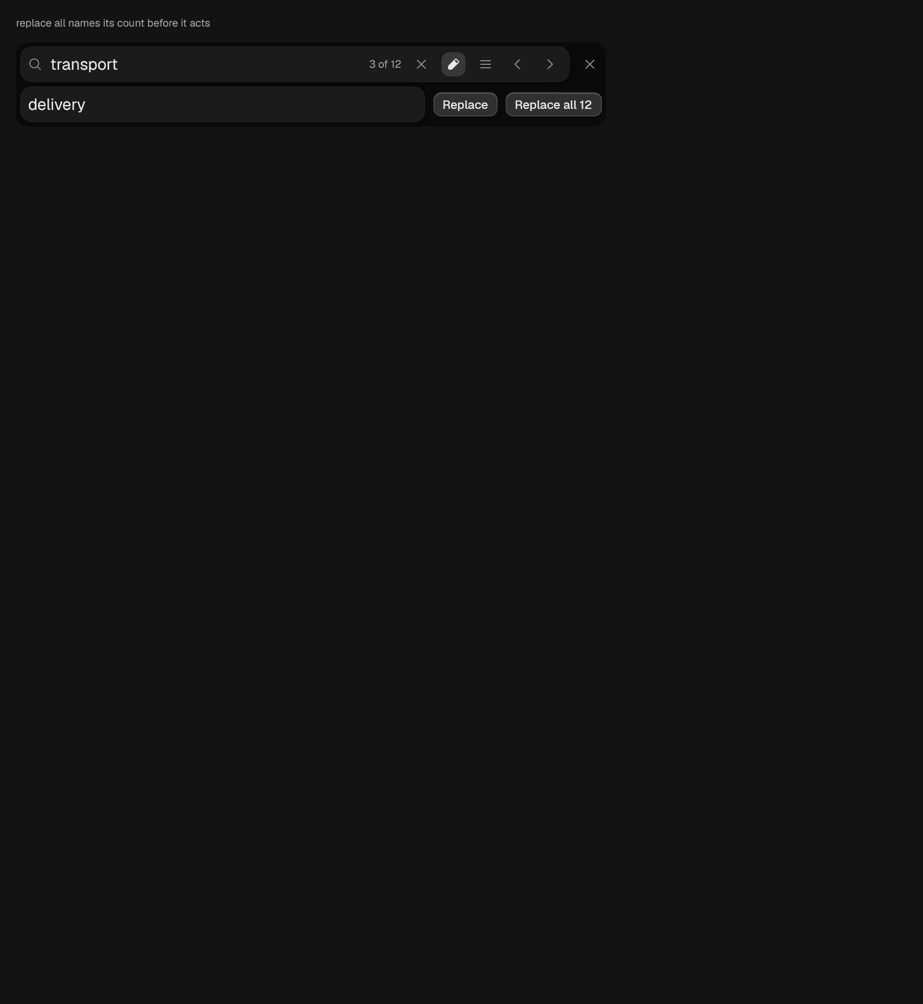
A SearchField with a replacement field and the two replace actions.
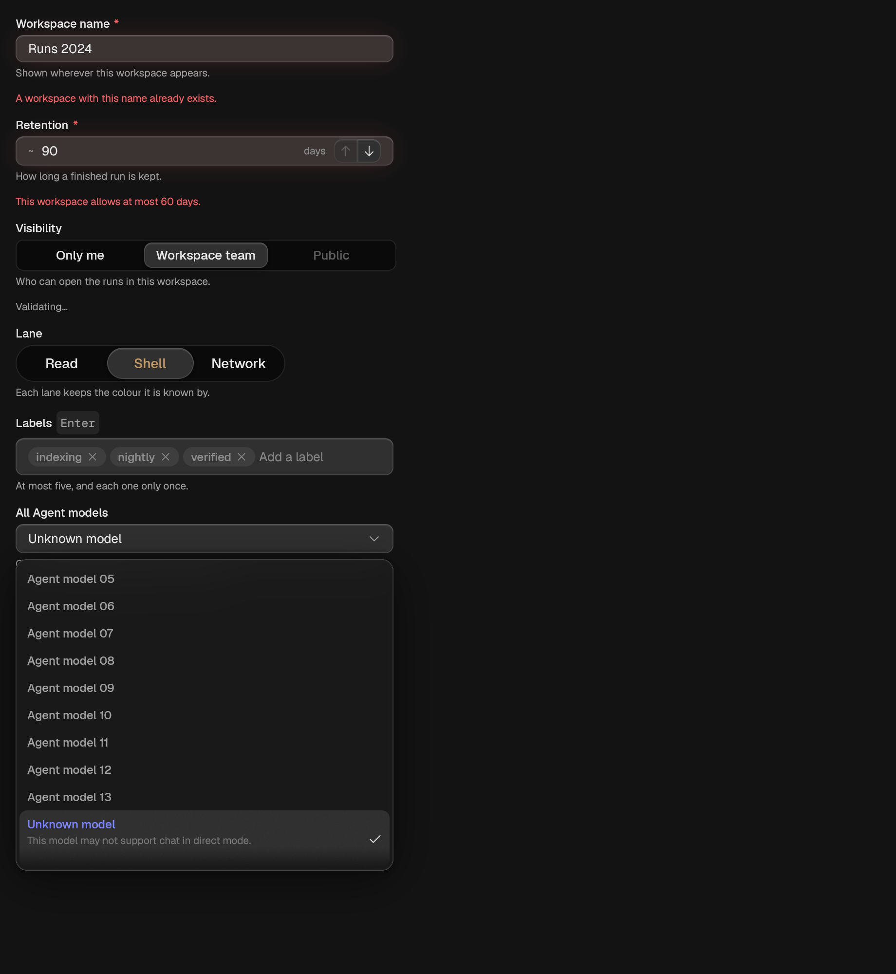
A labelled control, with the secondary text a typist needs around it.
An action carried by a glyph alone.
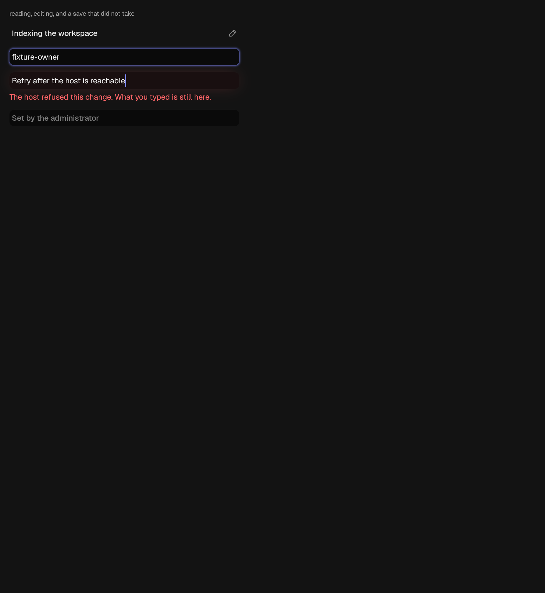
Text that a click or enter turns into a field.
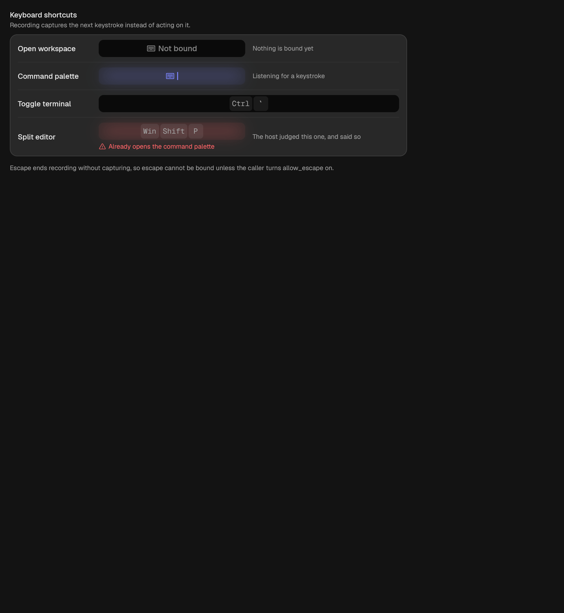
A field that records one keystroke.
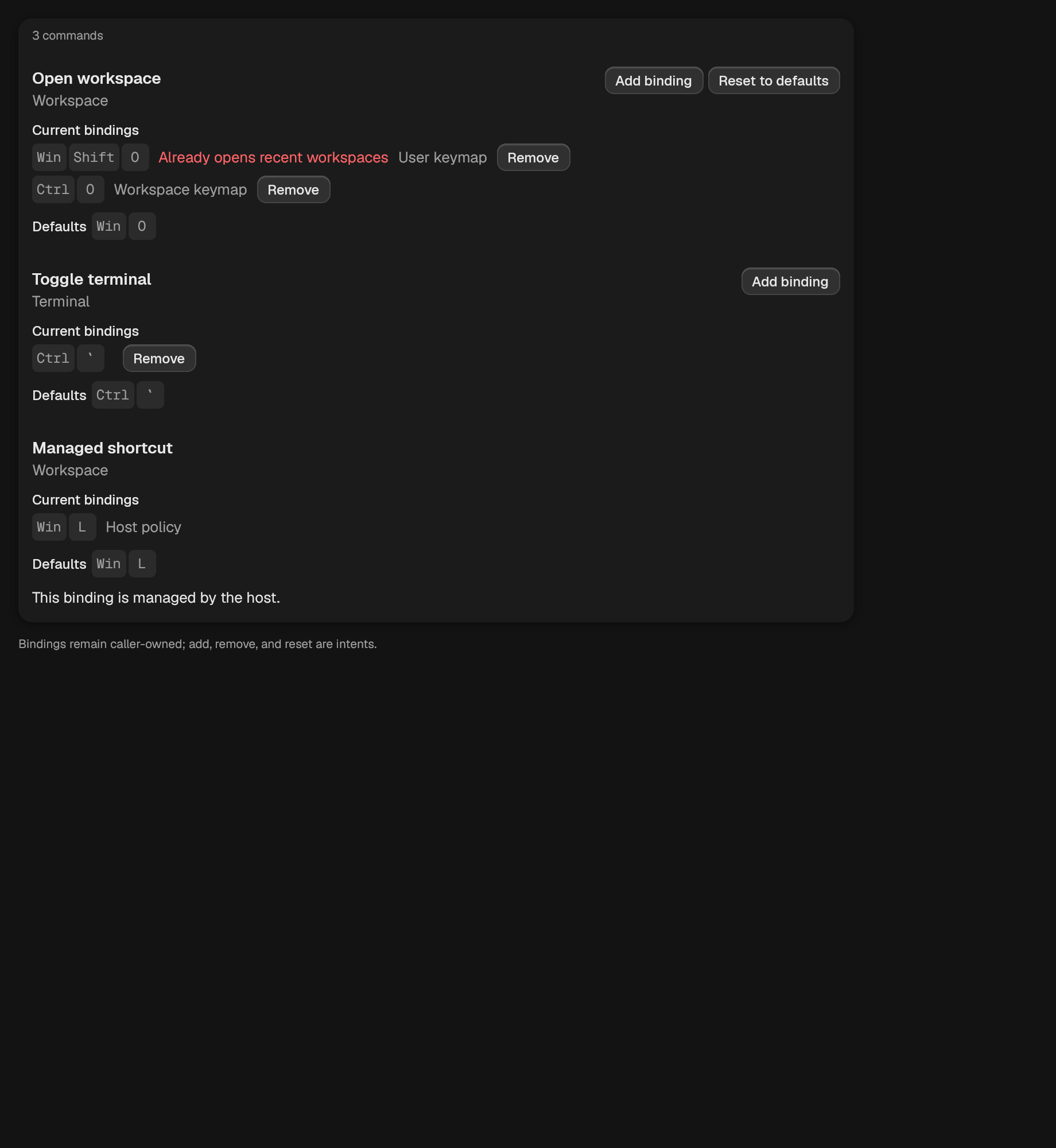
Coordinates one recorder over caller-owned keymap rows; it never applies a binding.
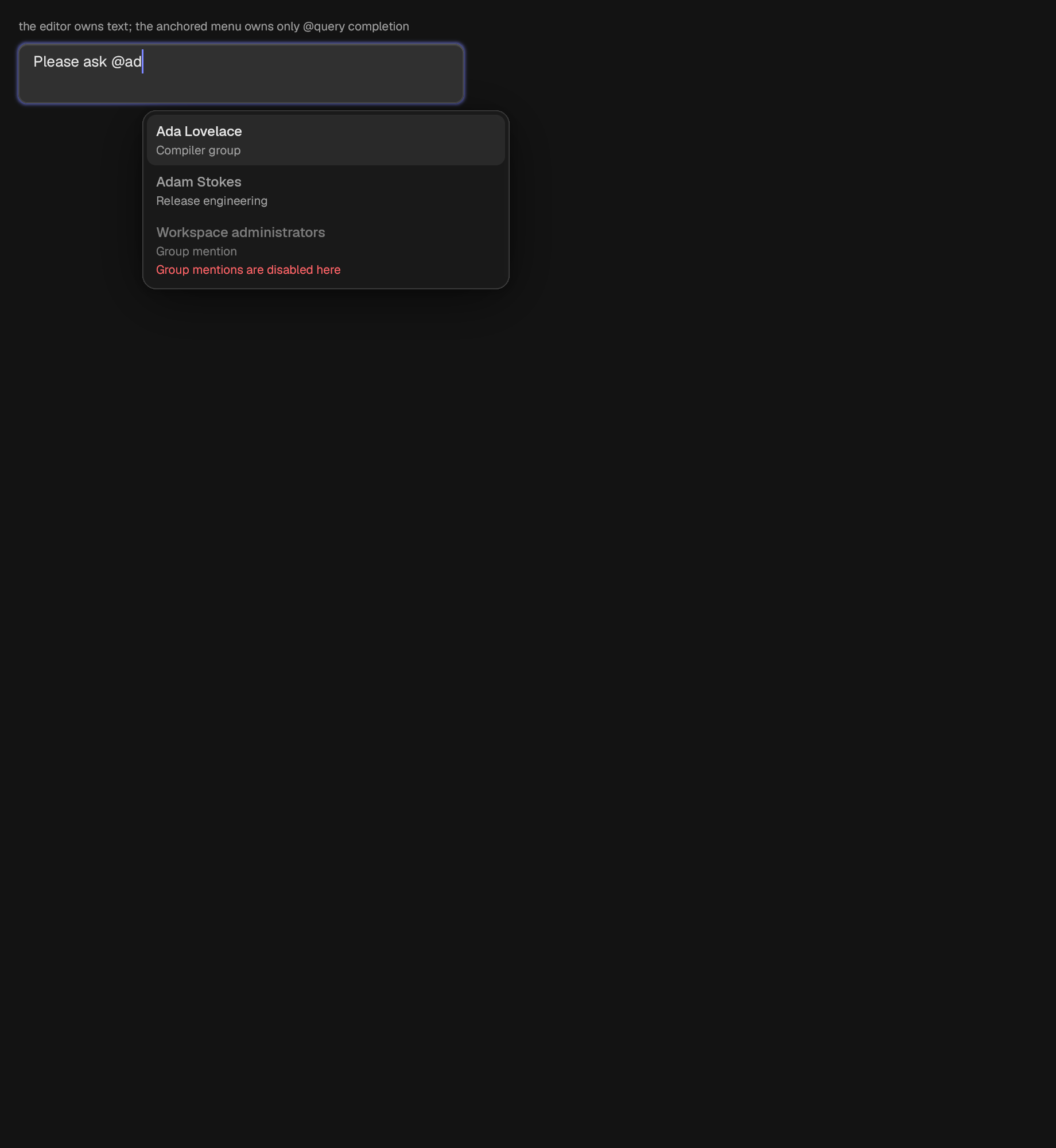
A multiline editor with one caret-anchored mention completion surface.
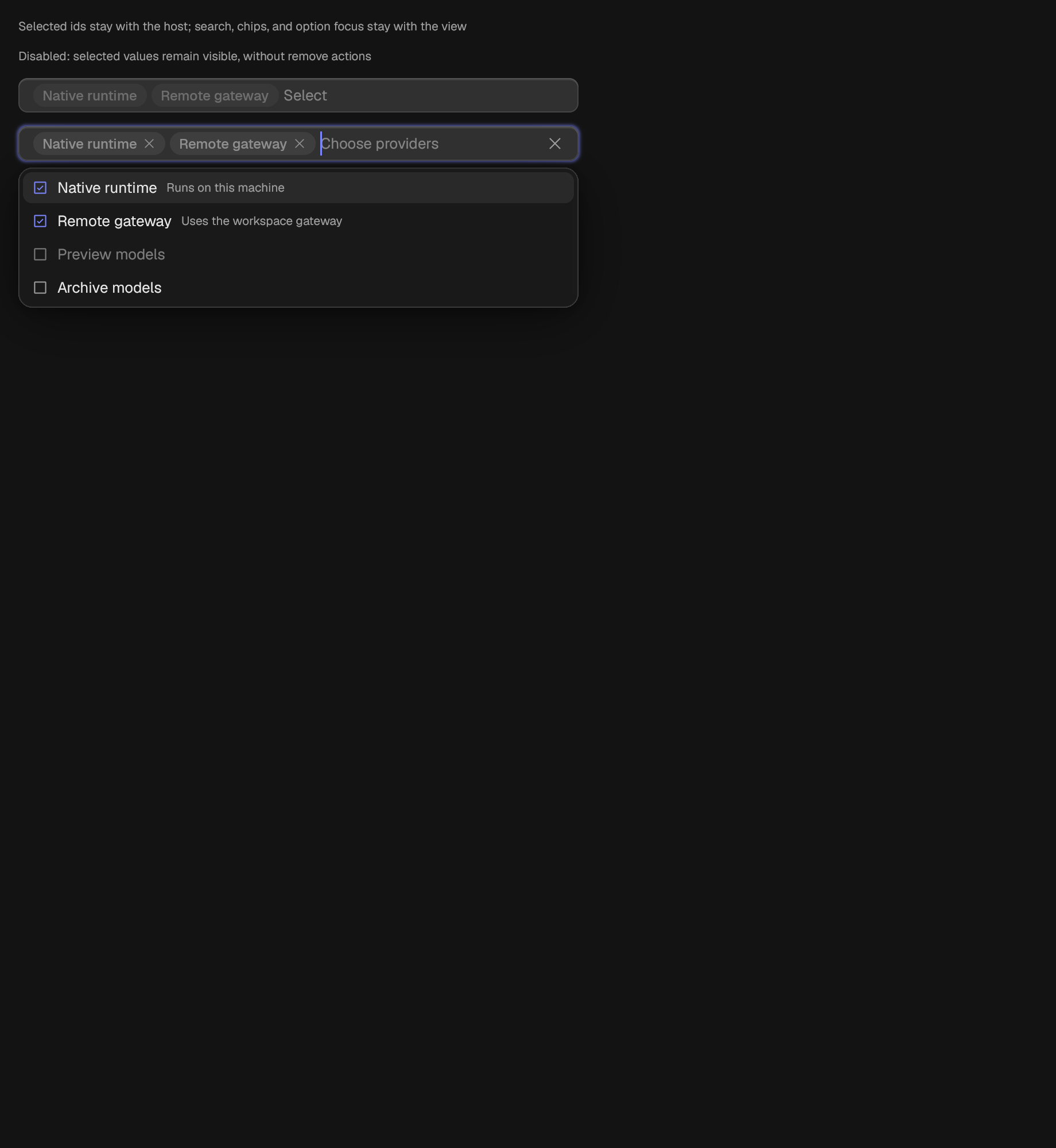
A selectable option set with search, chips, and listbox semantics.
A number field with a step grid and, optionally, a range.
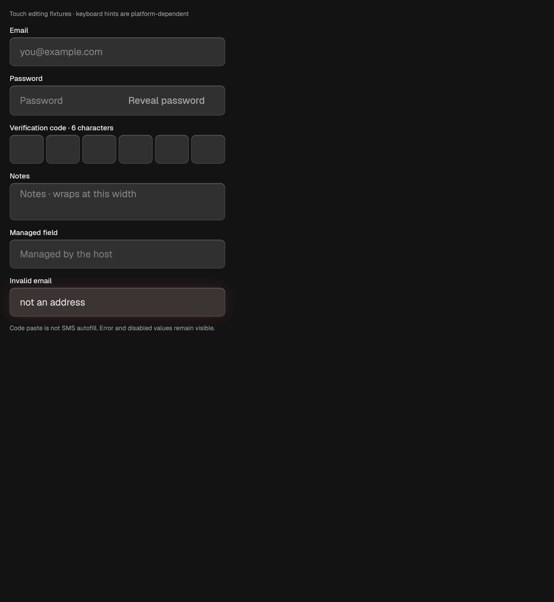
One sensitive editor presented as a bounded run of visual slots.
One sensitive password editor with a visual reveal action.
One option in a set where exactly one can hold.
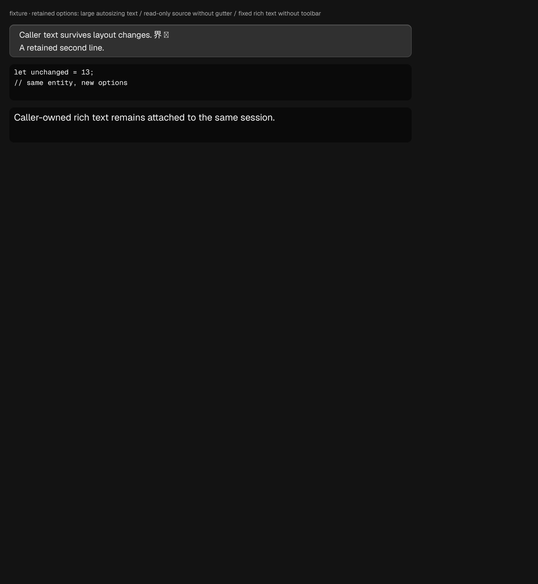
The visible projection over a caller-owned rich-text editing session.
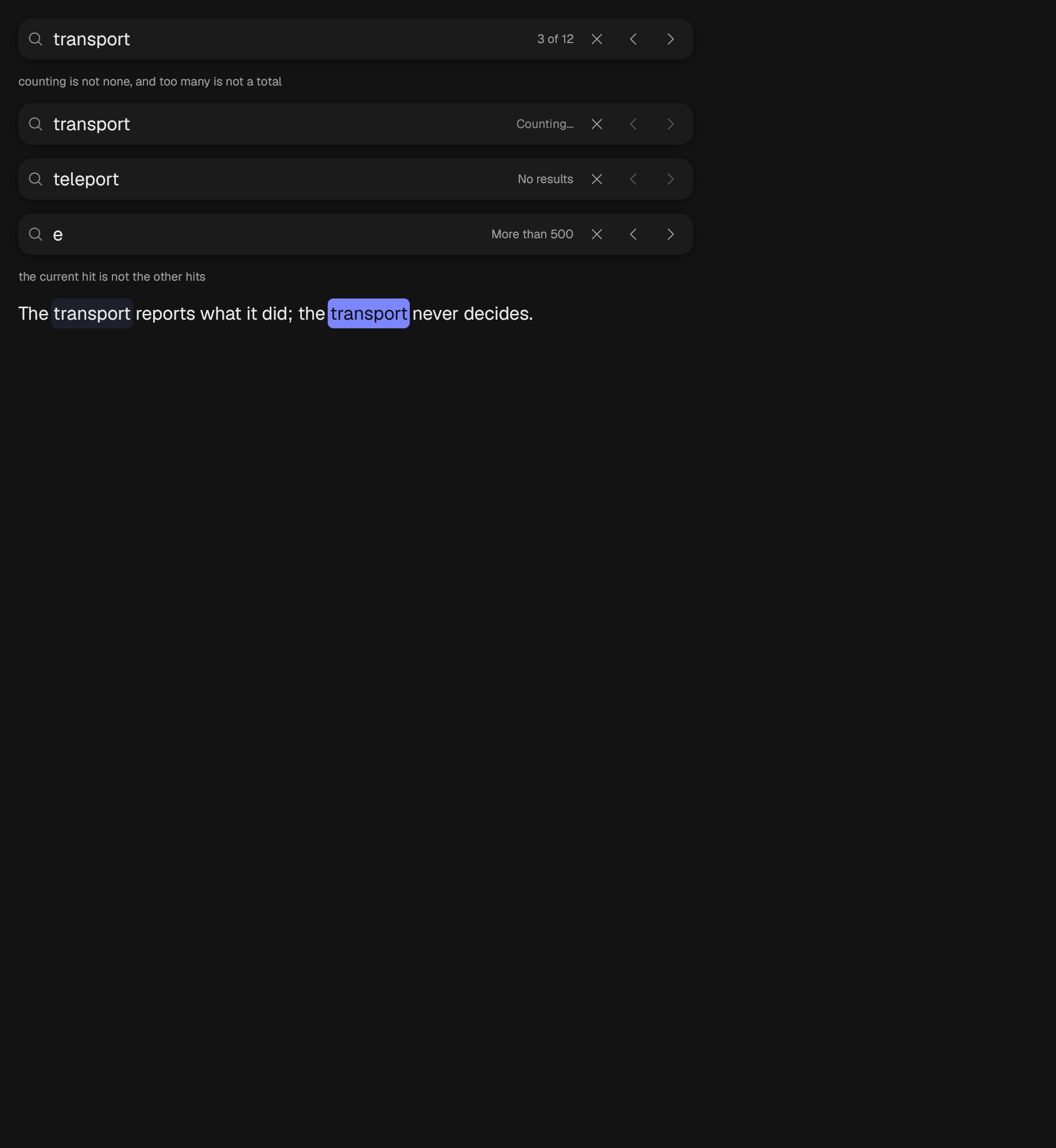
A query field, a hit count, and next and previous.
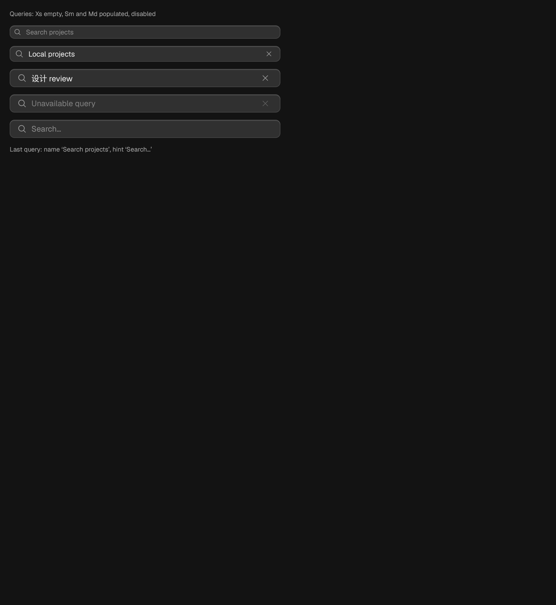
An in-content query with a magnifier and a clear action when nonempty.
A strip where exactly one segment holds.
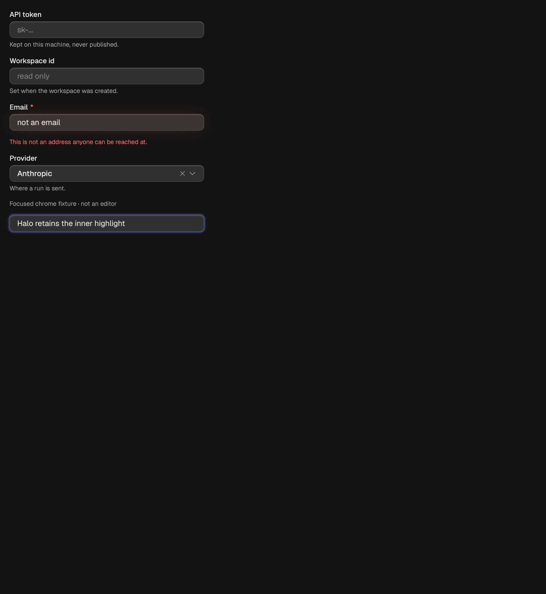
A closed list of options with one answer.
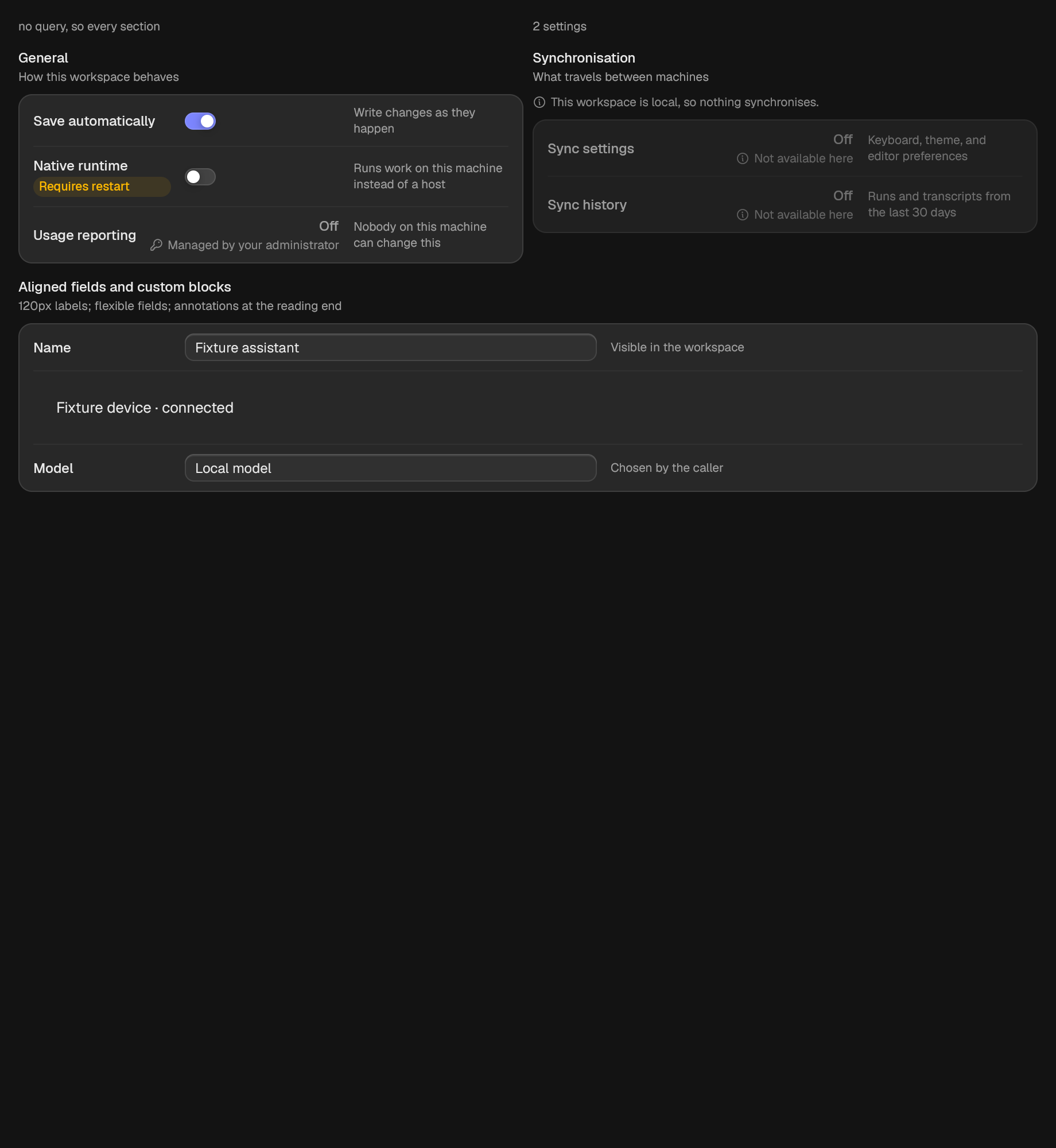
Settings sections filtered by one caller-owned query.
One setting: what it is called on the left, what it is set to on the right.
A headed group of settings rows.
A track with one or two handles.
One action, plus the ones it stands in for.
A control that takes effect the moment it is flipped.
A field that collects a set of short tokens.
Wrapped, multi-line editable text.
One line of editable text.
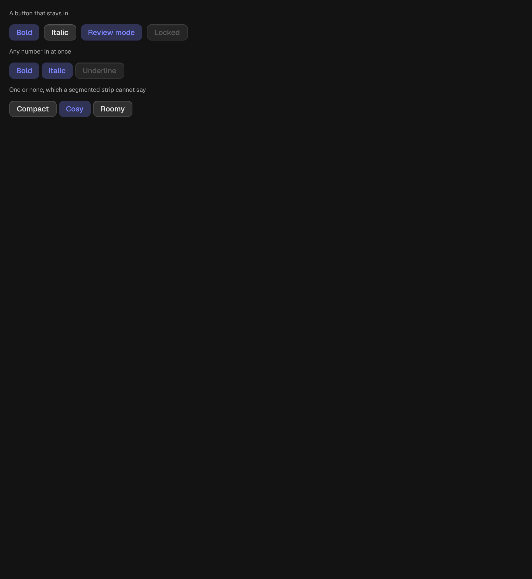
A button that stays in.
A run of toggles where none, one, or several may be in.
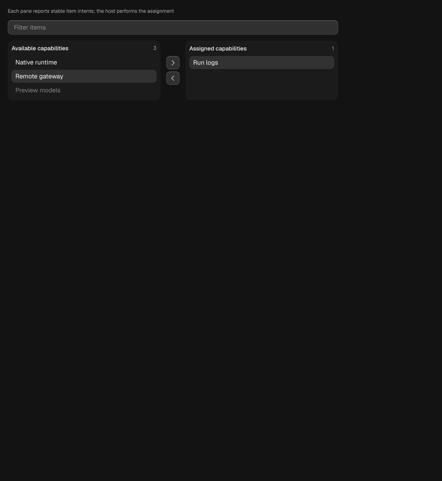
A controlled source/target assignment control.
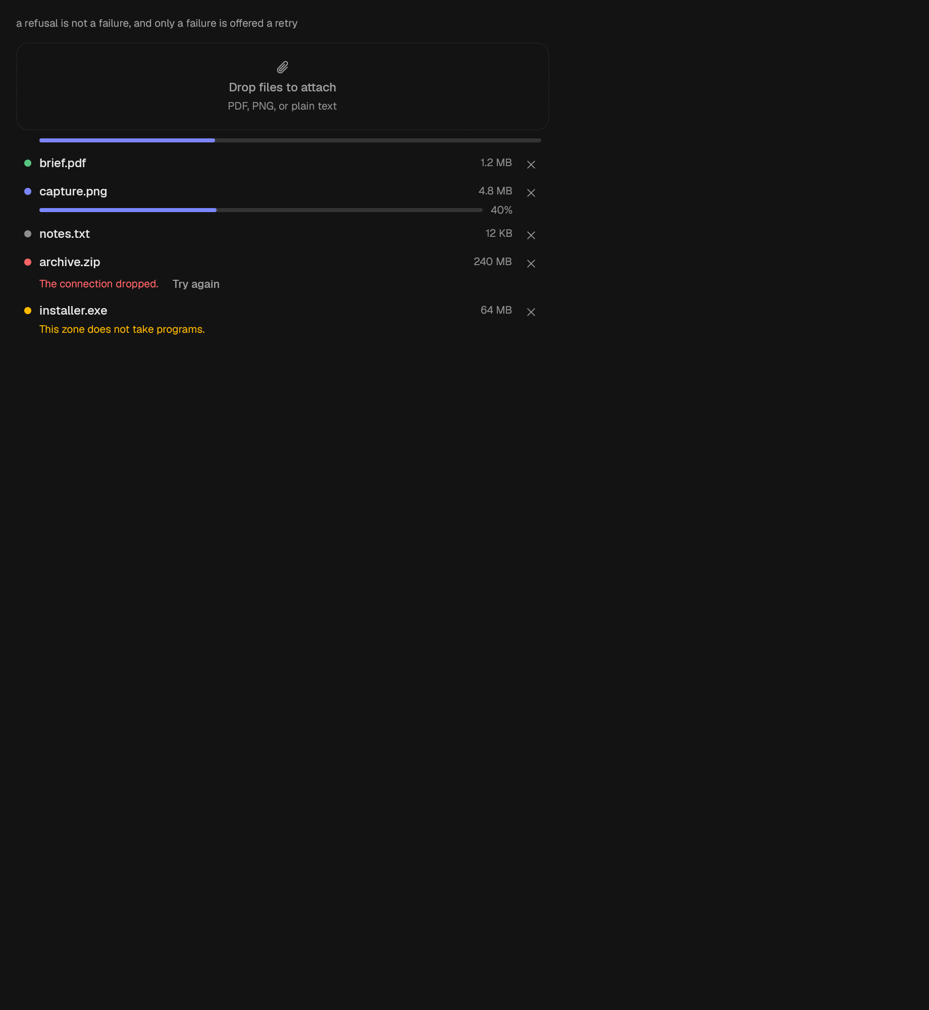
A list of files being uploaded, optionally over the zone that took them.
data
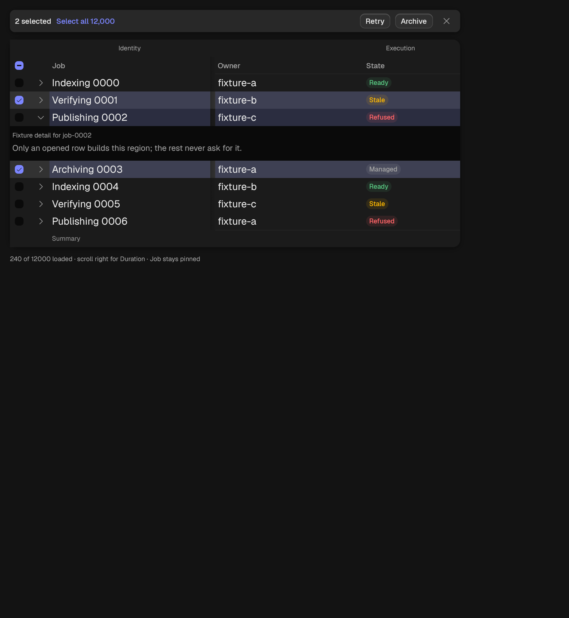
The bar that appears over a selection, says how large it is, and offers what can be done to it.
A grid that virtualizes rows and columns over caller-owned data.
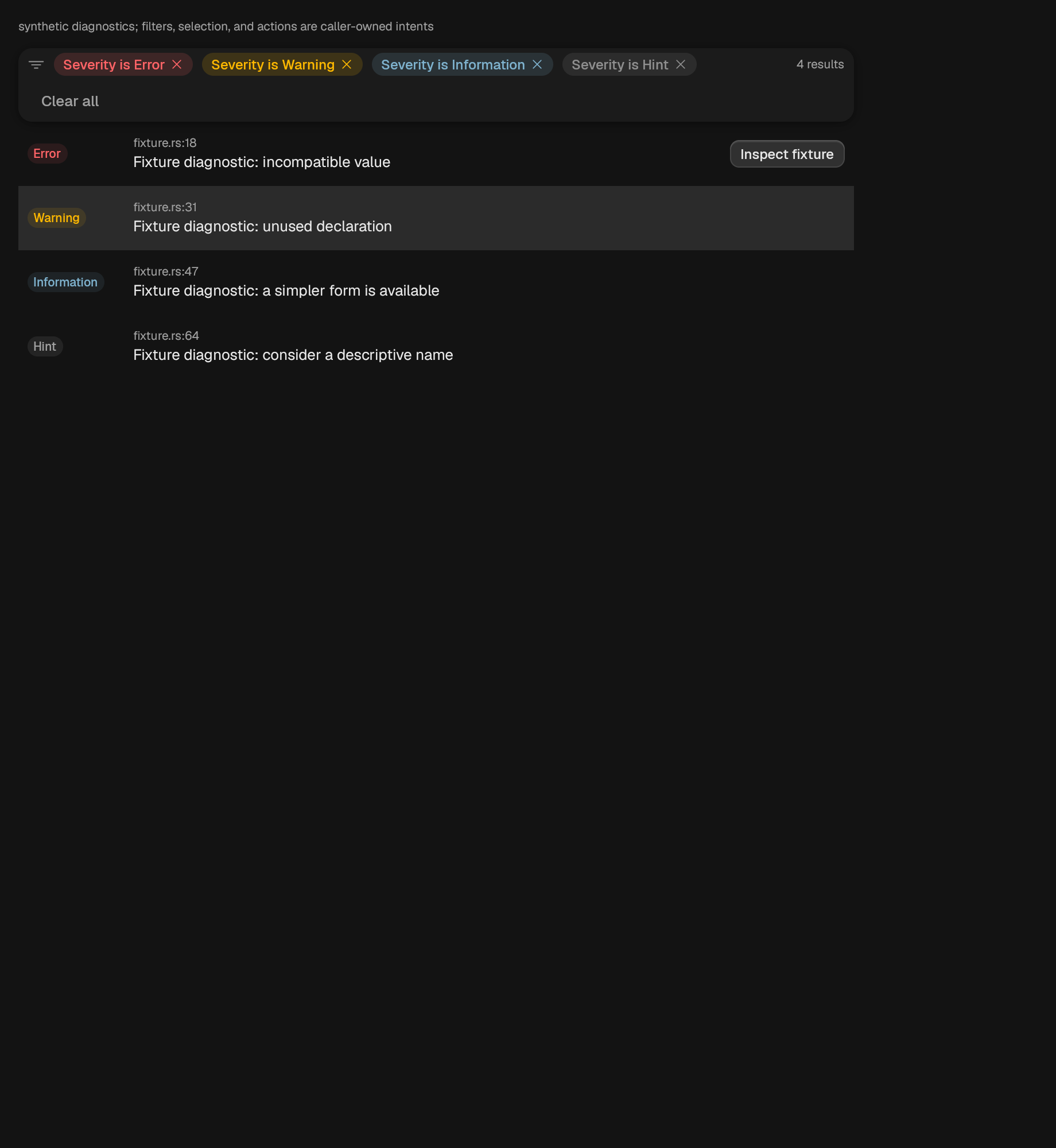
A diagnostic list whose data and state remain owned by its caller.

Rows drawn by their caller, laid out only where the viewport reaches.
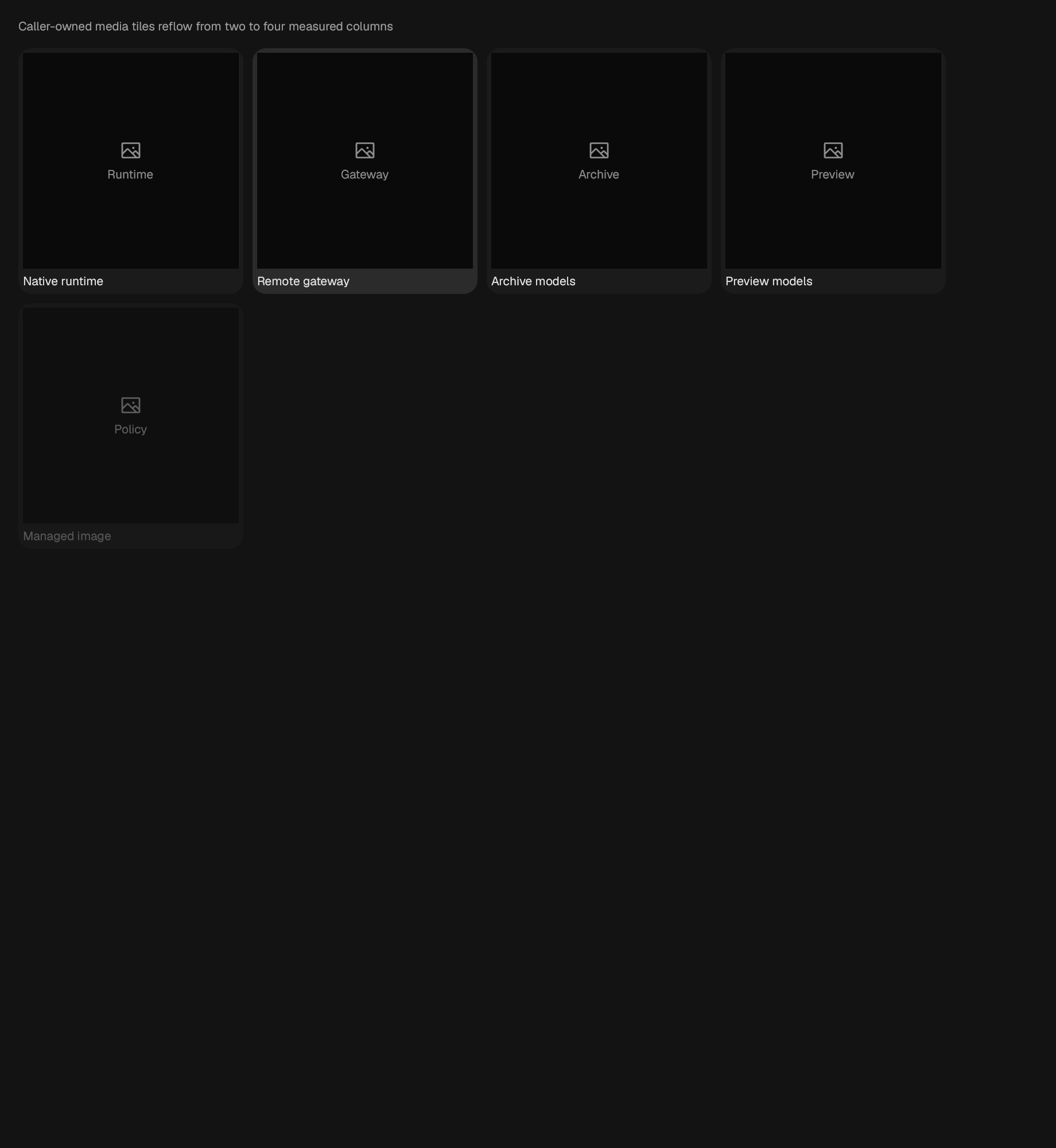
A token-spaced image tile collection.
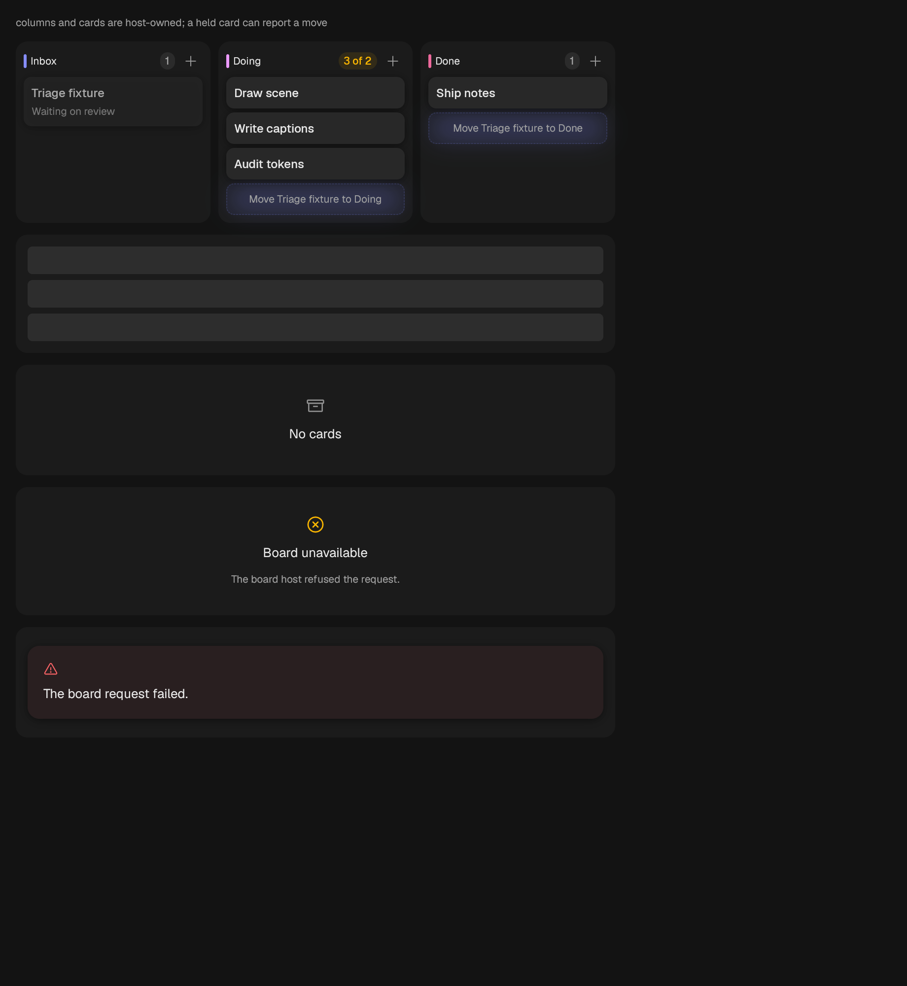
A board of host-owned columns and cards.
A list that renders only the rows its viewport holds.
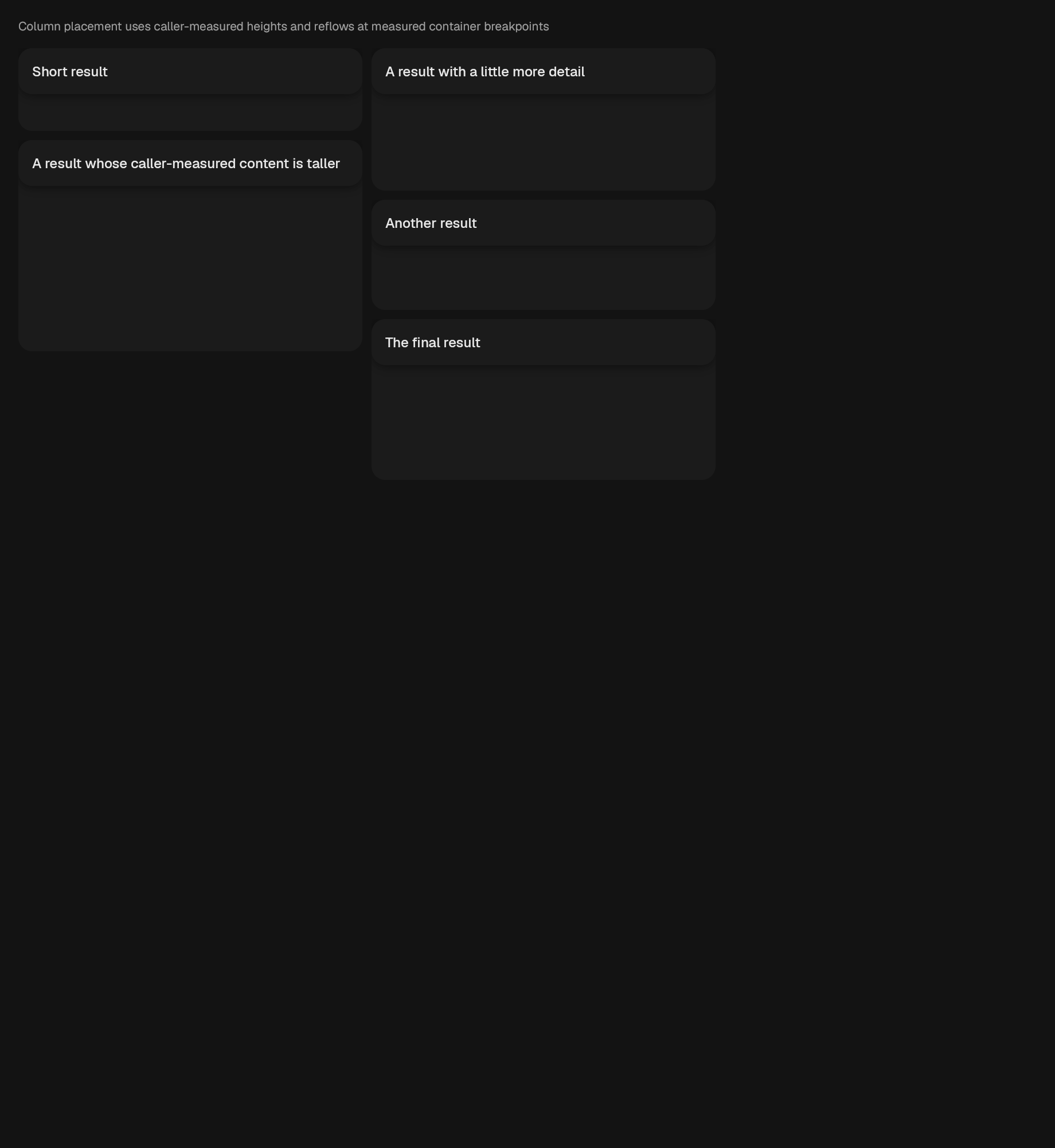
A measured masonry layout over caller-owned content.
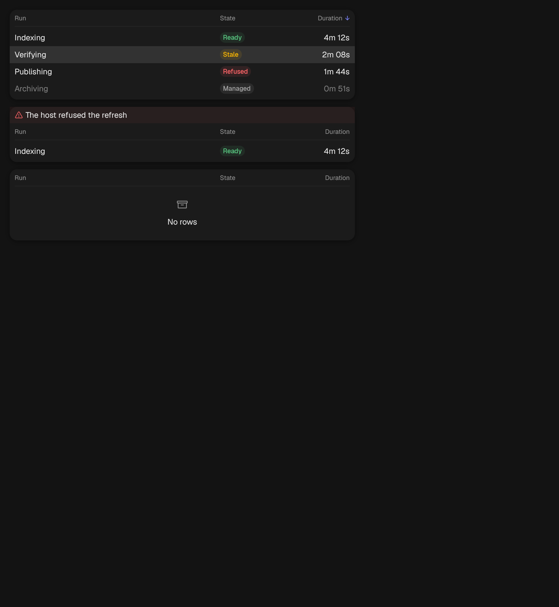
A table with a header that stays put while the body scrolls.
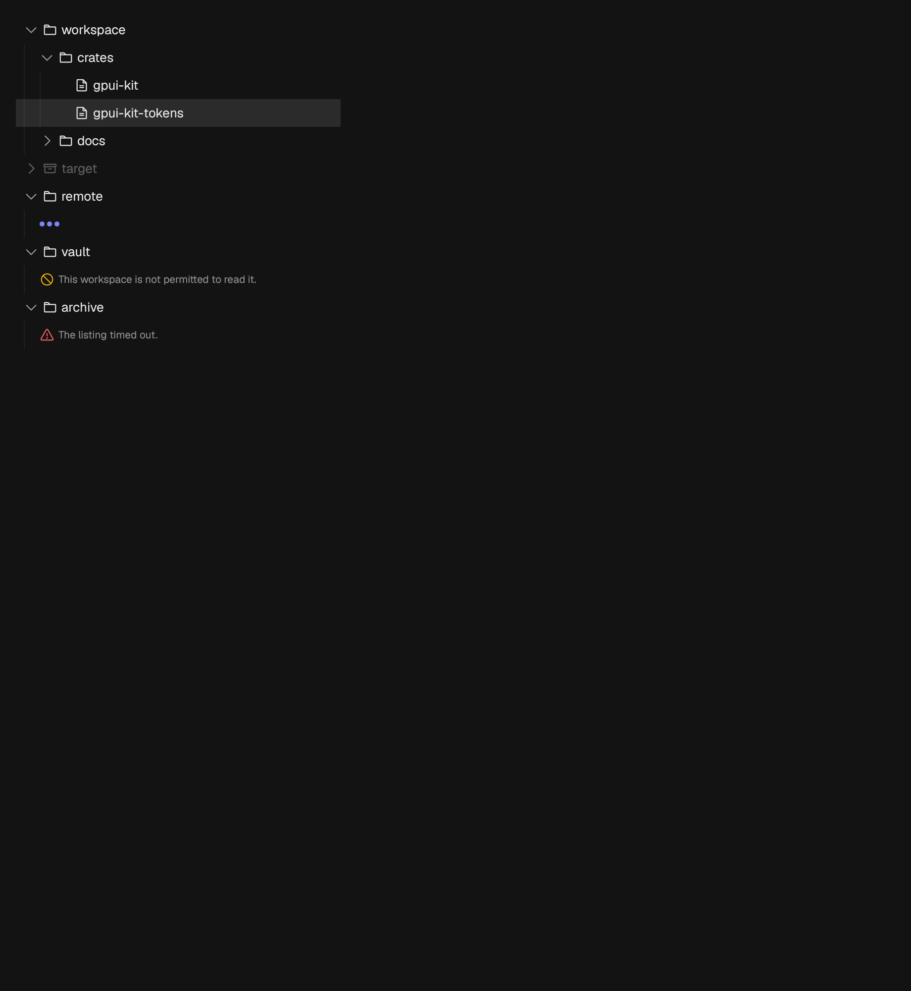
A disclosure hierarchy.
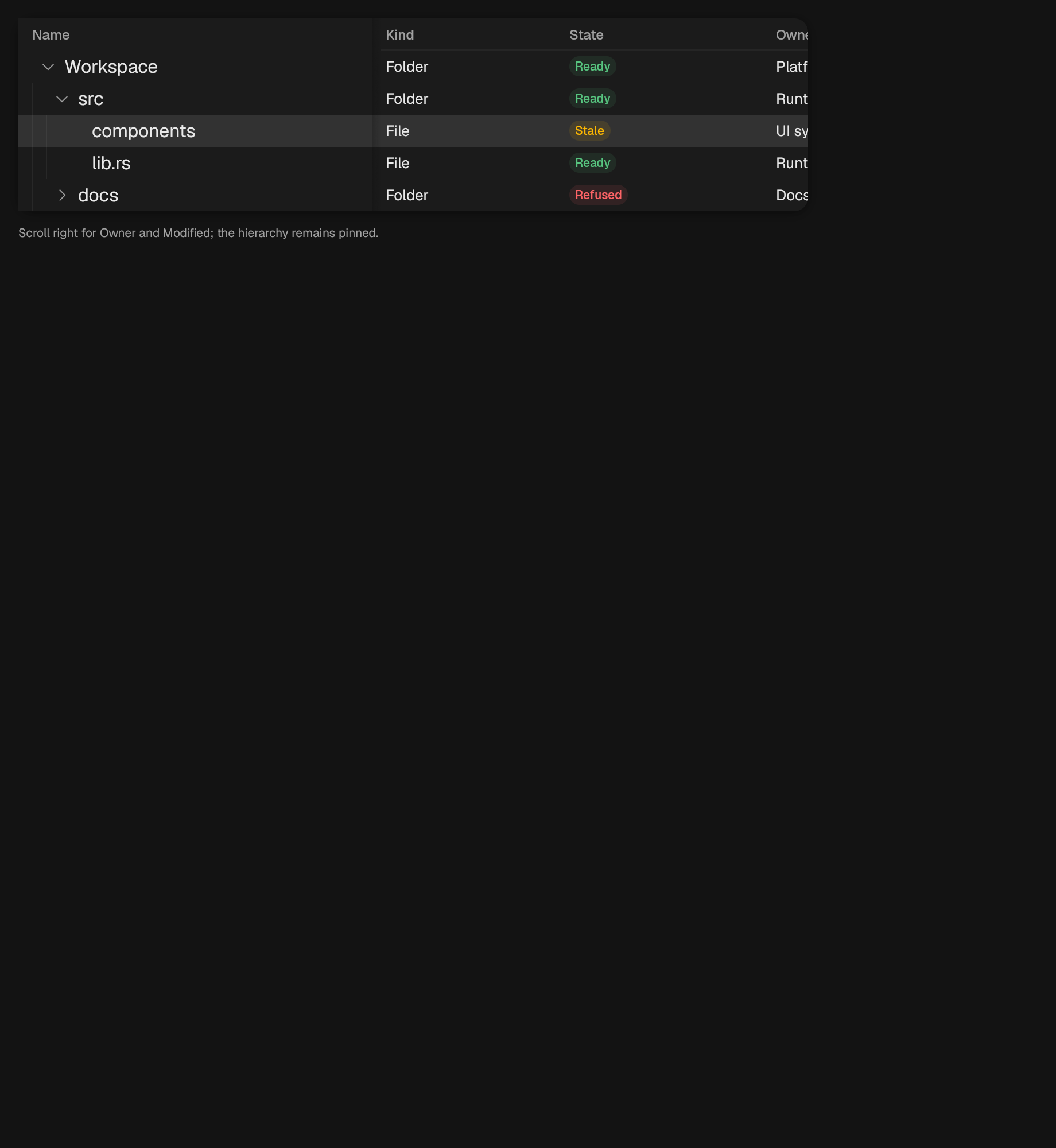
A product-neutral, caller-owned virtualized treegrid adapter.
datetime
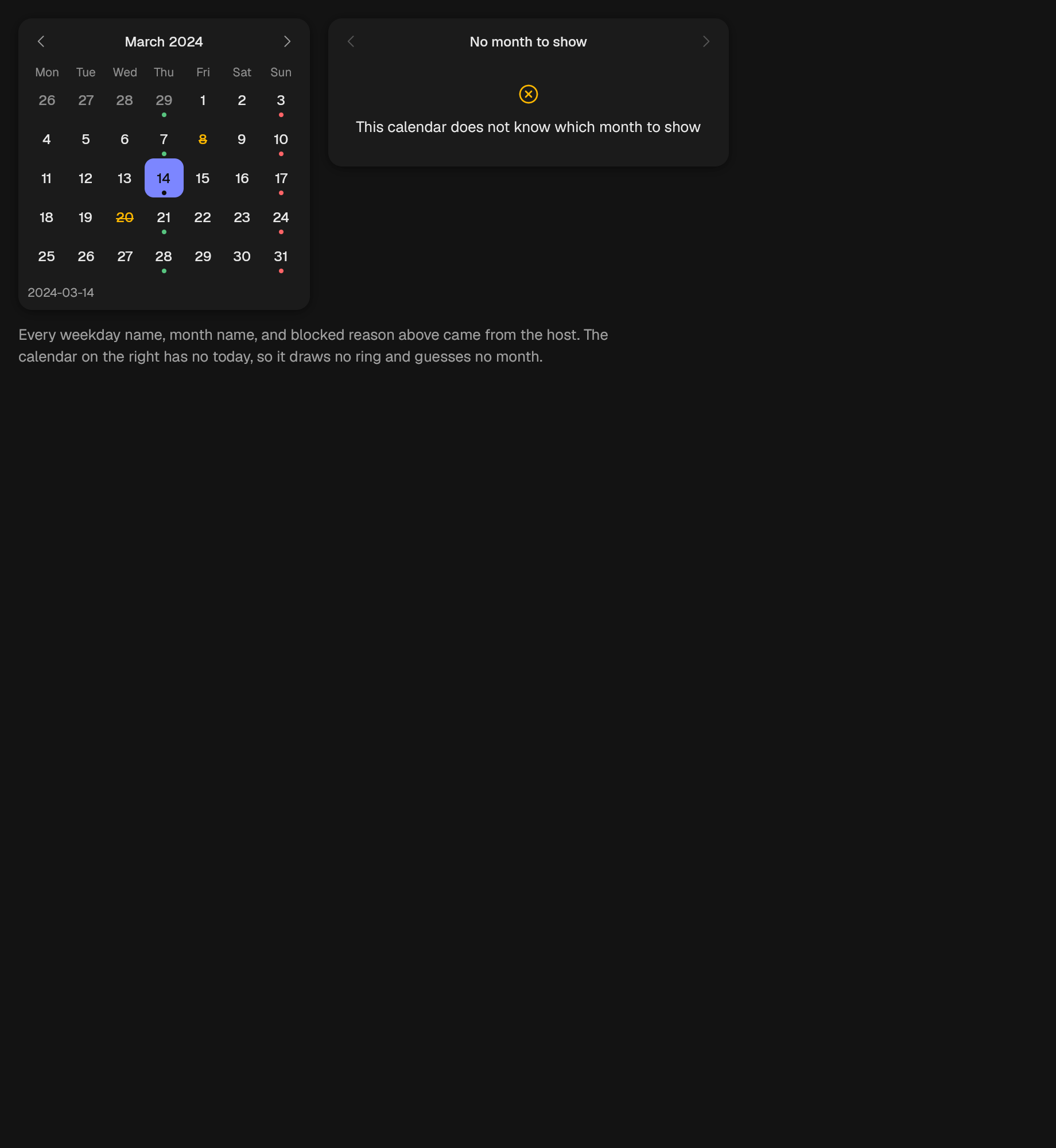
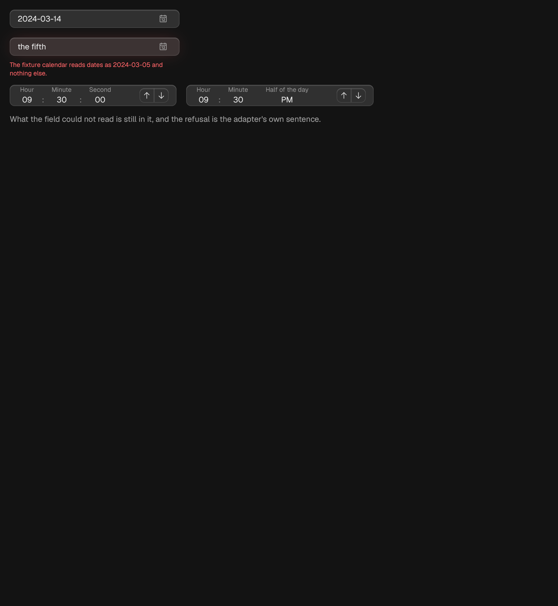
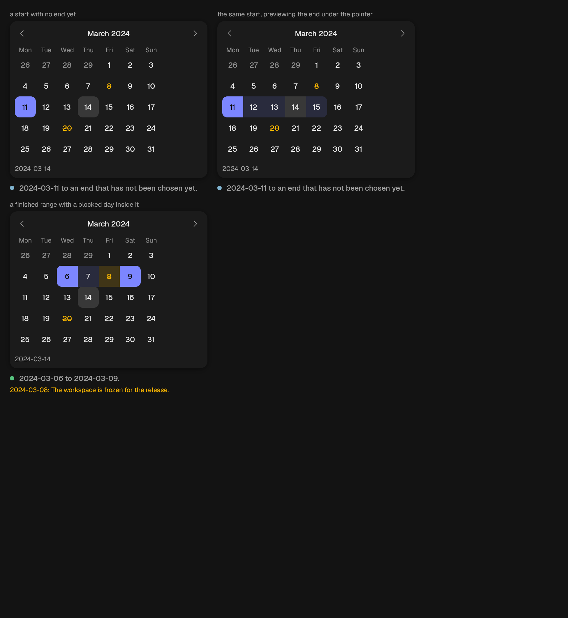
display
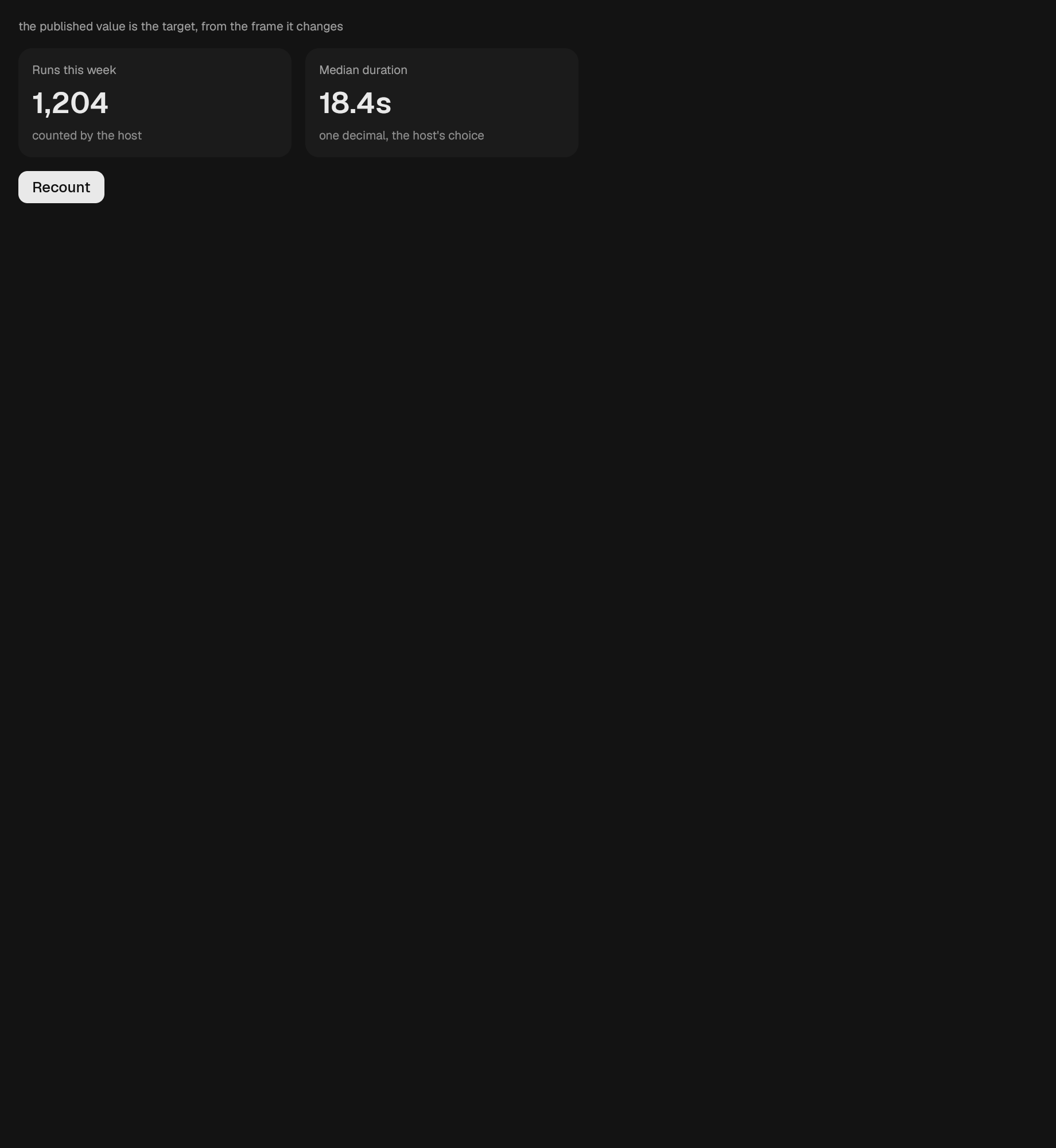
A numeric readout that animates between values.
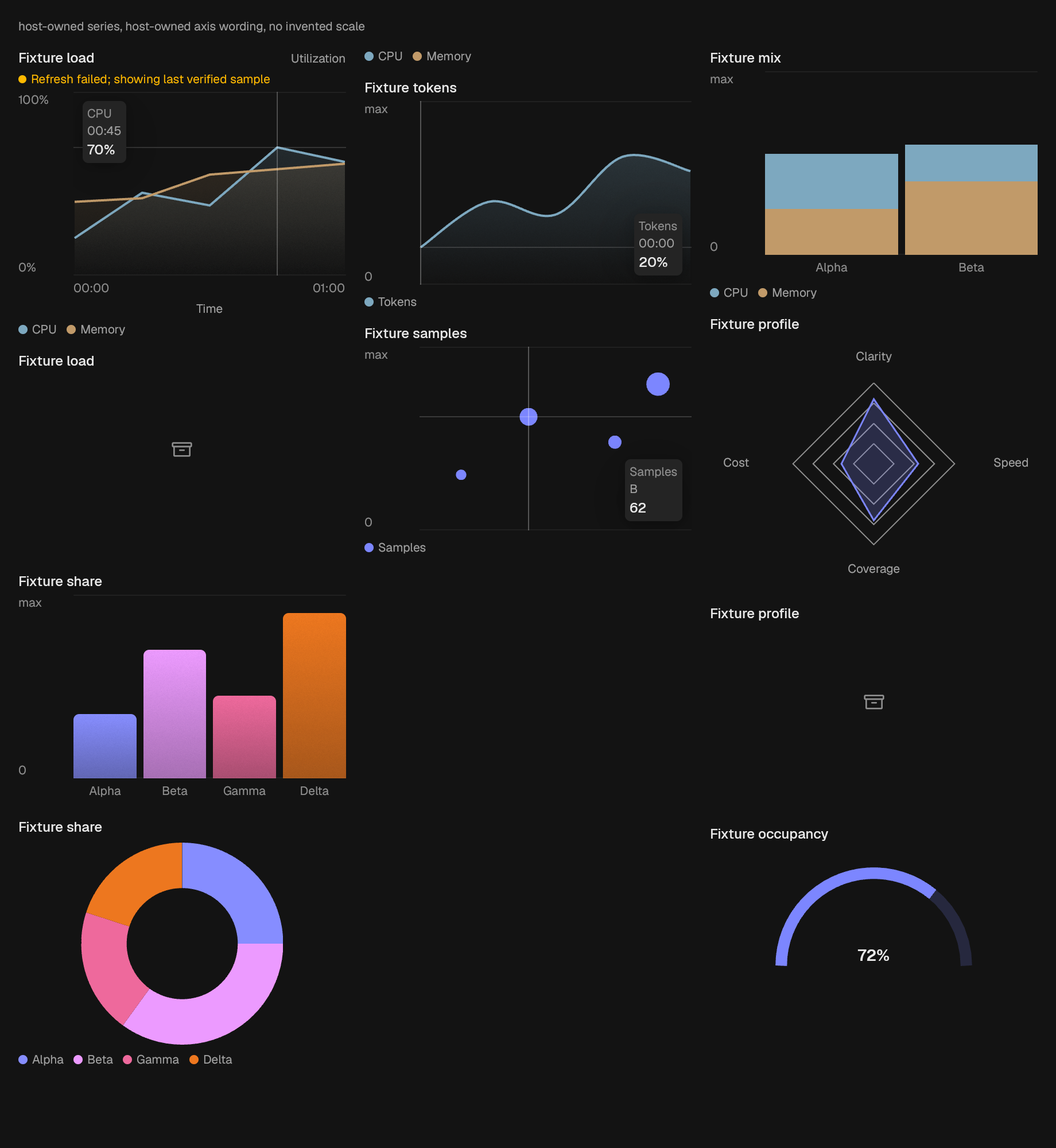
A filled area chart over one or more host-owned series.
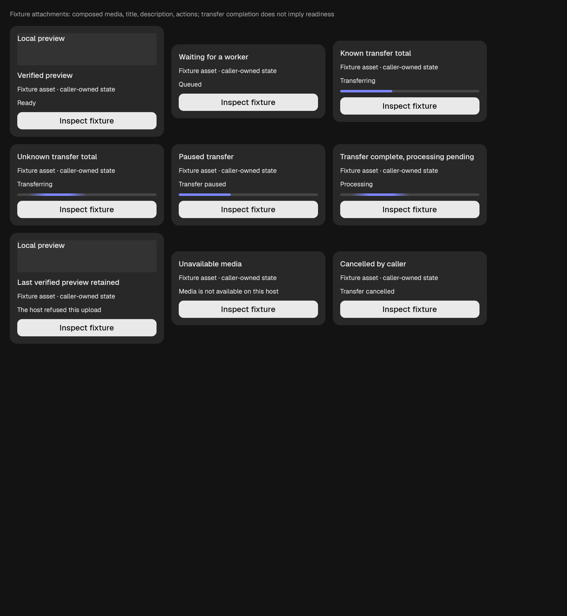
A standalone attachment tile, separate from message-list attachment metadata. All four slots compose native elements: media, title, description, and actions. A supplied preview remains visible on failure because already-known media is not erased by a failed transfer or refresh.
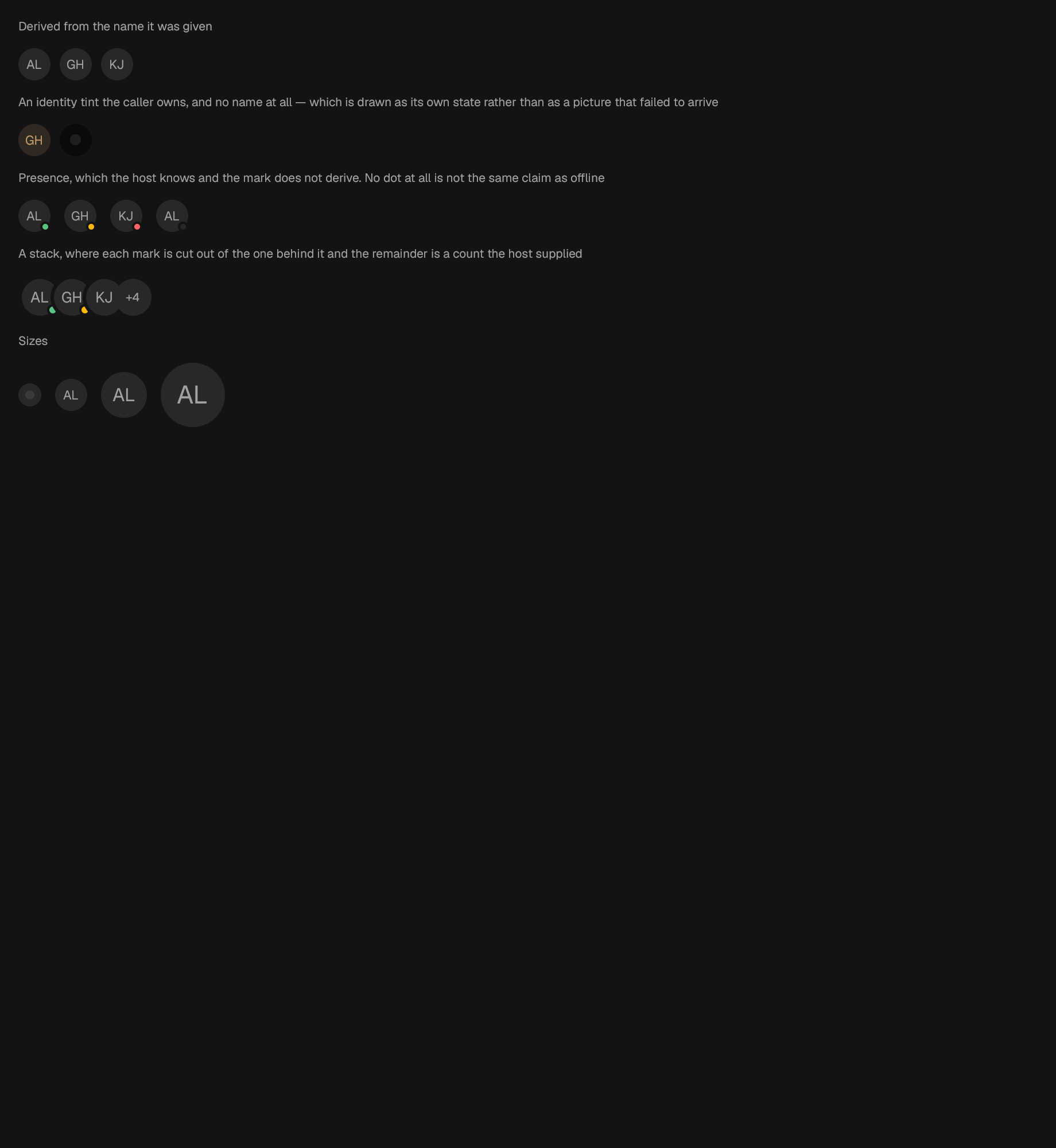
A circular mark for a person or a workspace.
Several identities in one place, overlapping, with the rest counted.
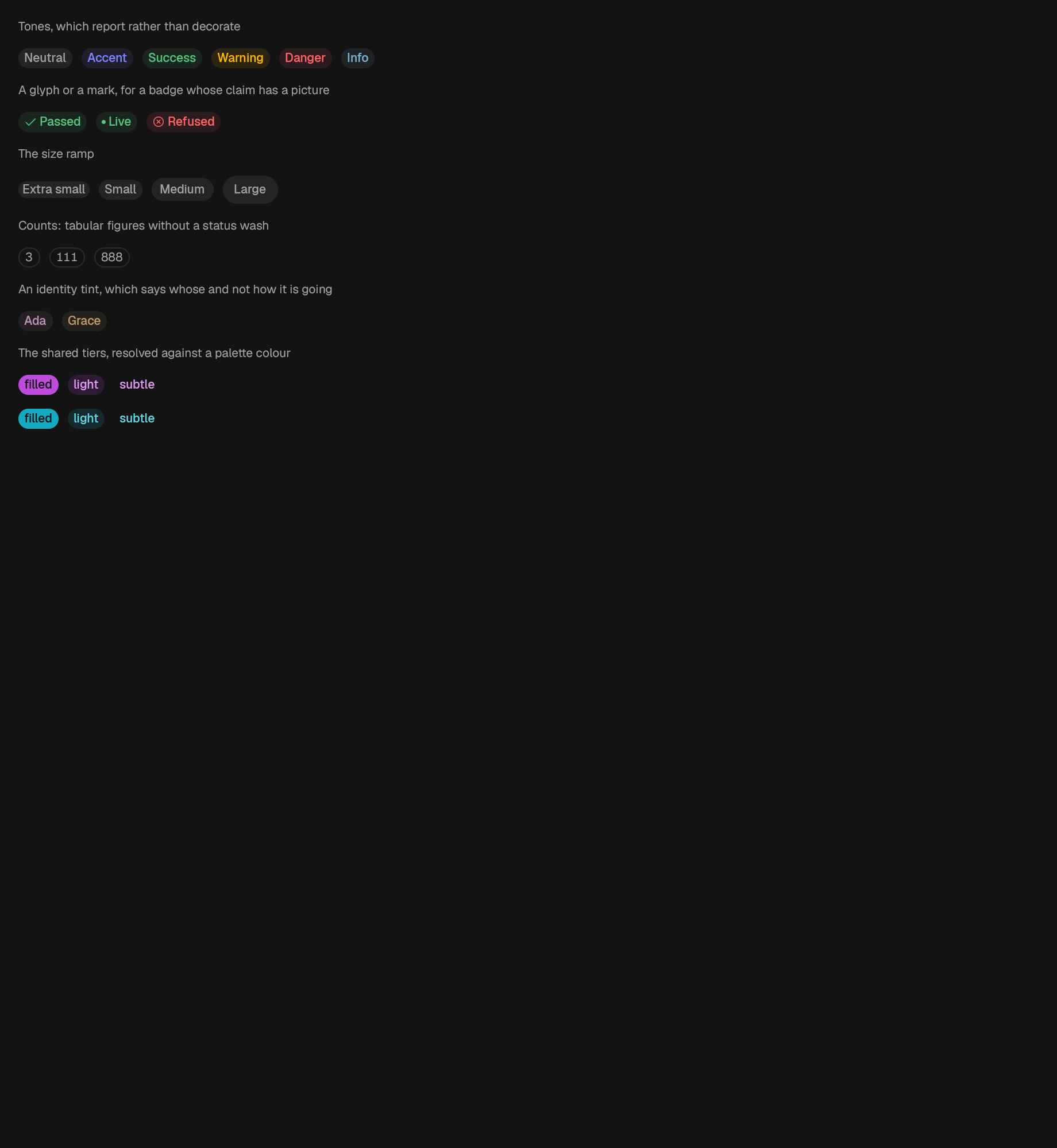
A compact status label.
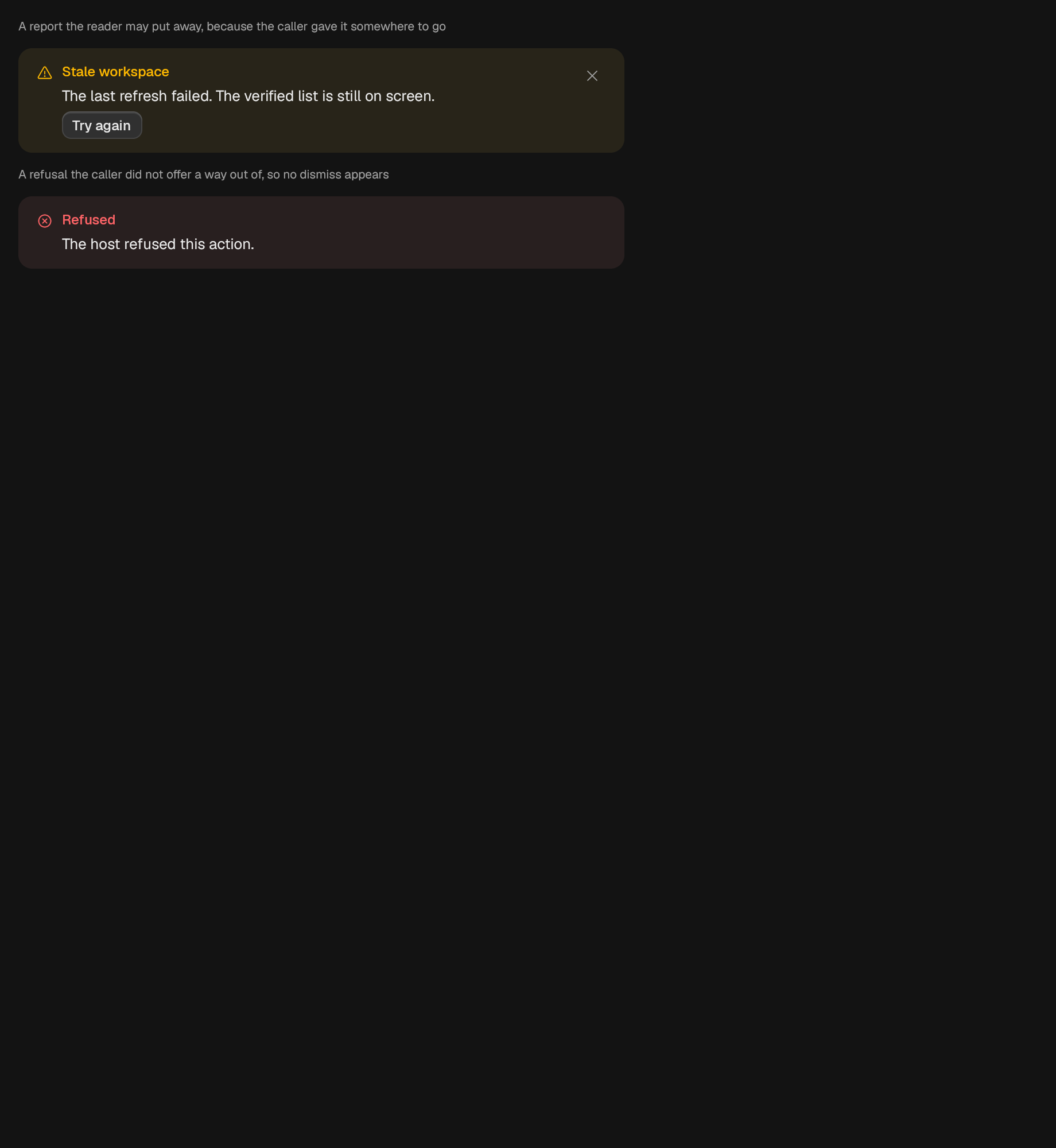
A page-level tinted report: title, action, and a way to close it.
A bar chart over one host-owned series of categorized values.
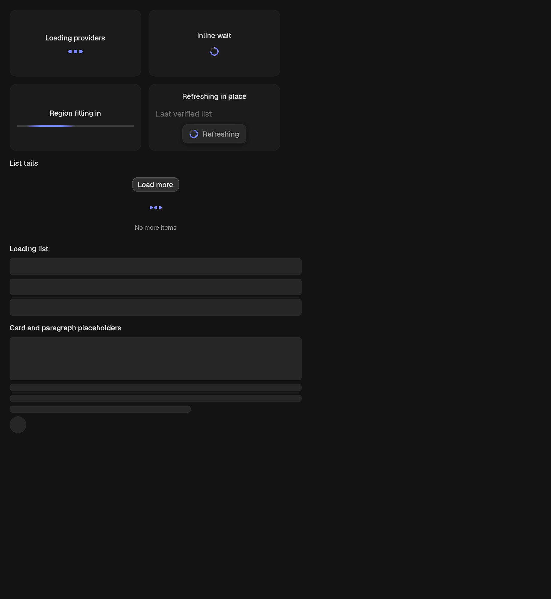
A thin working strip for the edge of a region that is filling in.
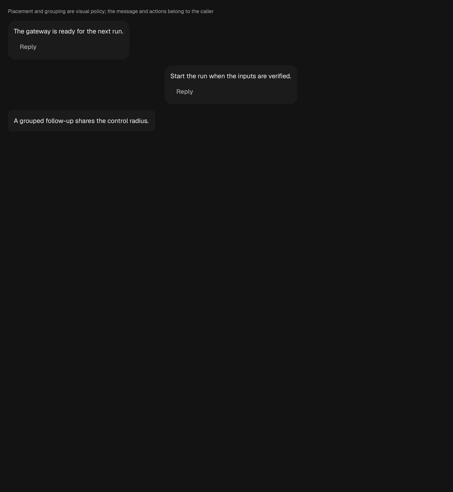
A token-backed message surface with caller-owned content.
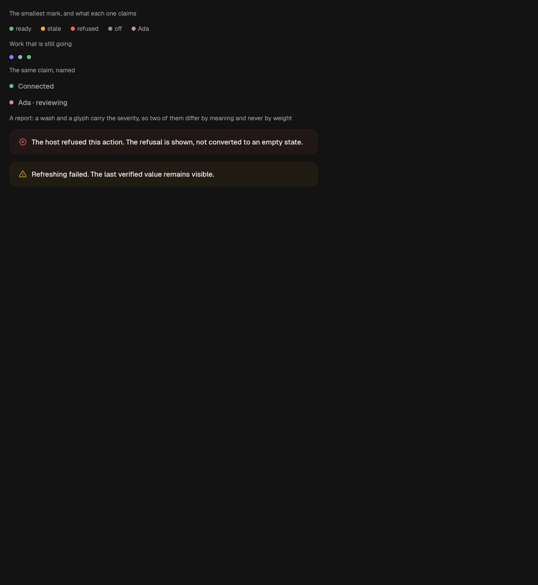
A tinted message block.
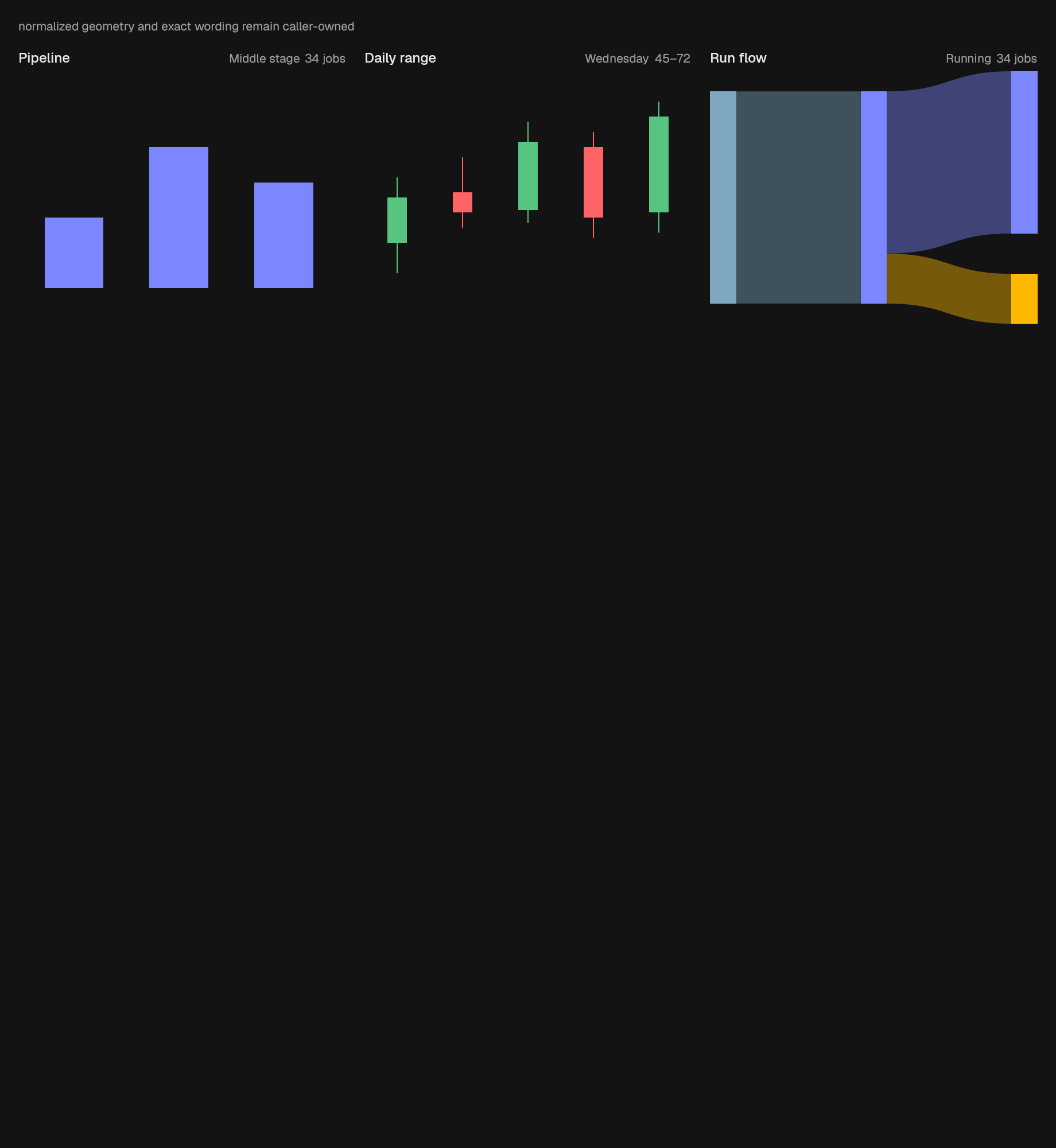
Candlesticks over caller-owned normalized OHLC readings.
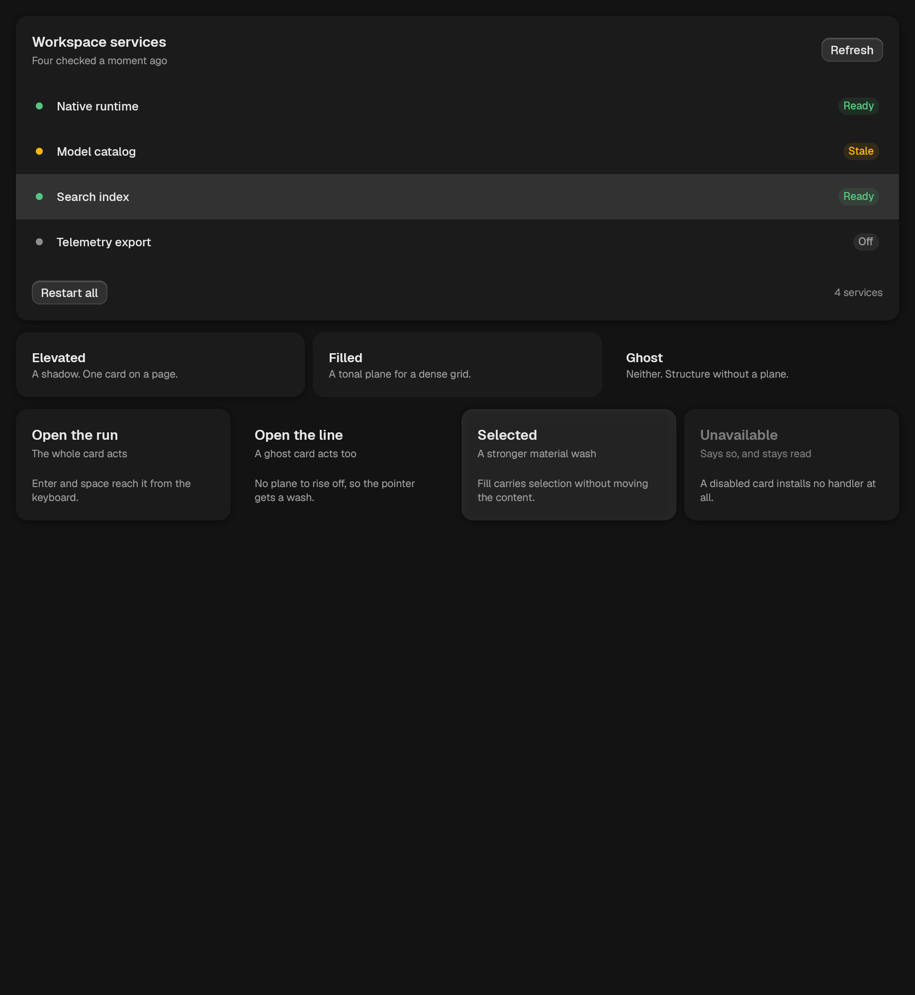
A raised panel that groups related rows or content.
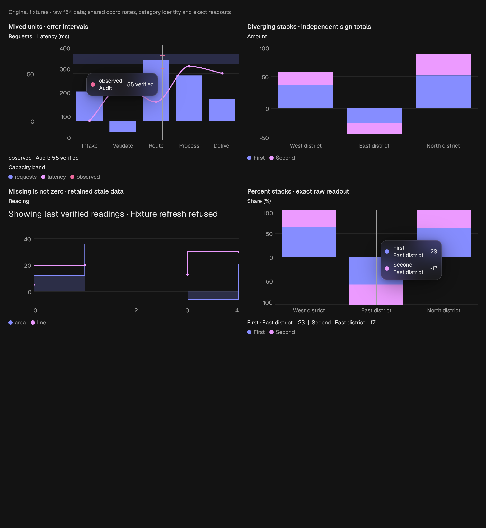
Shared-coordinate line/area/bar/scatter layers over raw f64 observations. Missing samples break paths. All-zero data is ready, not empty. An invalid dataset is an explicit error. Stale data remains visible with its reason.
A standalone legend that reports series hide and show.
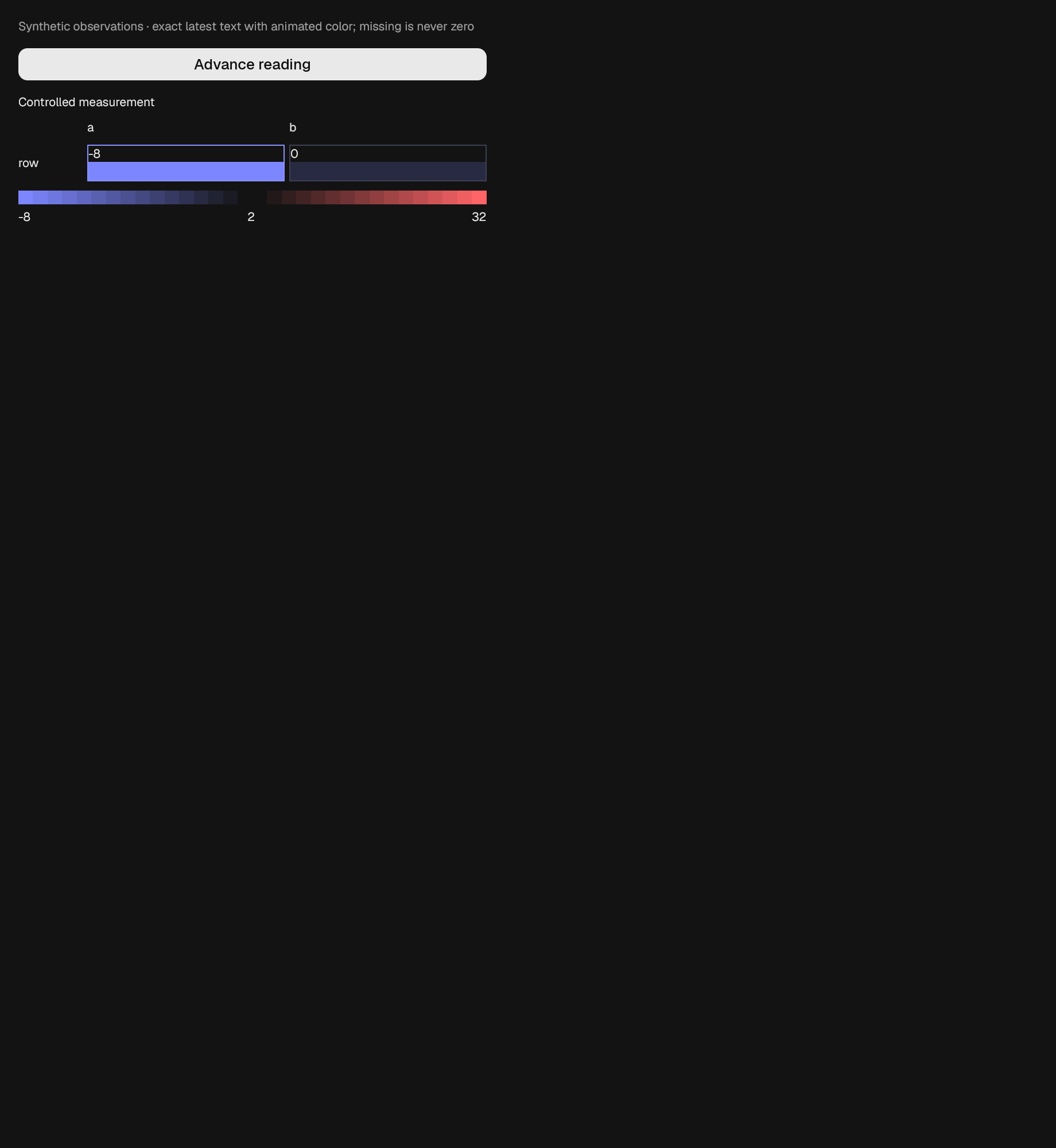
A raw-valued matrix with visible cell values and a numeric color legend. Selection is caller controlled. Invalid coordinates, identities, and readings produce an explicit error; a stale refresh retains verified cells and reason.
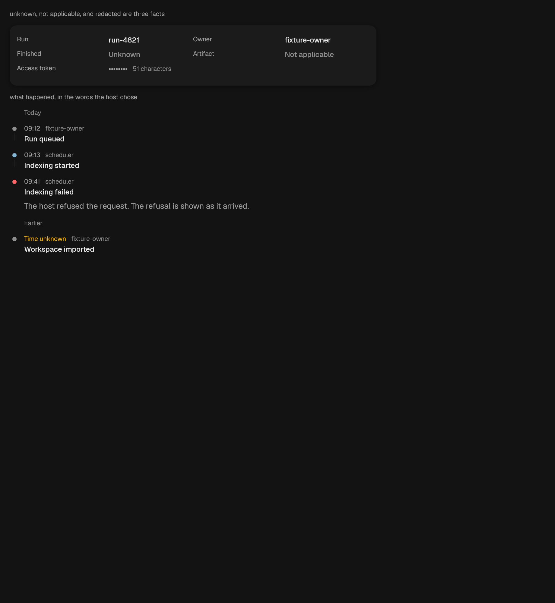
A list of term and description pairs, in one or two columns.
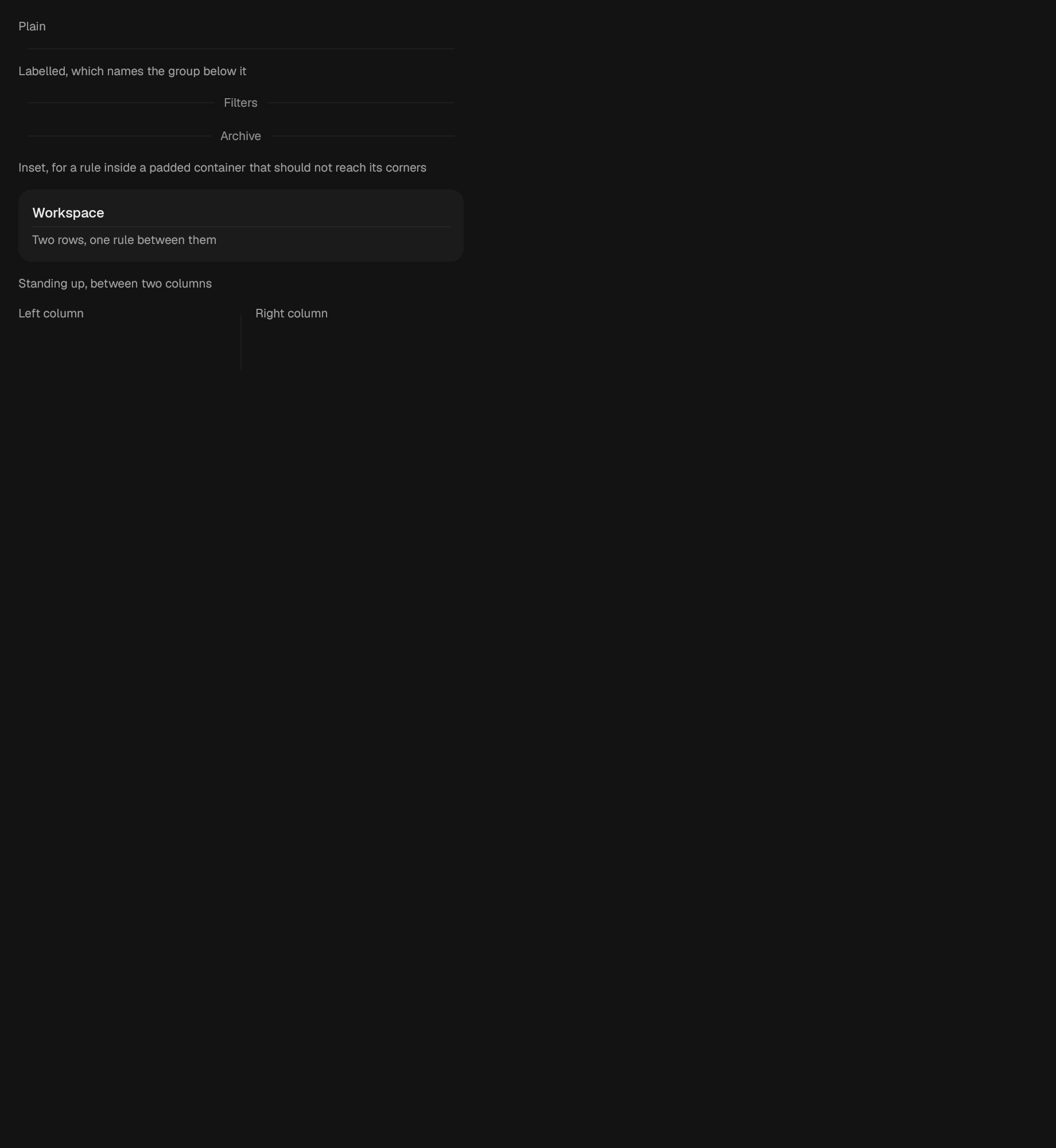
A soft rule between groups.
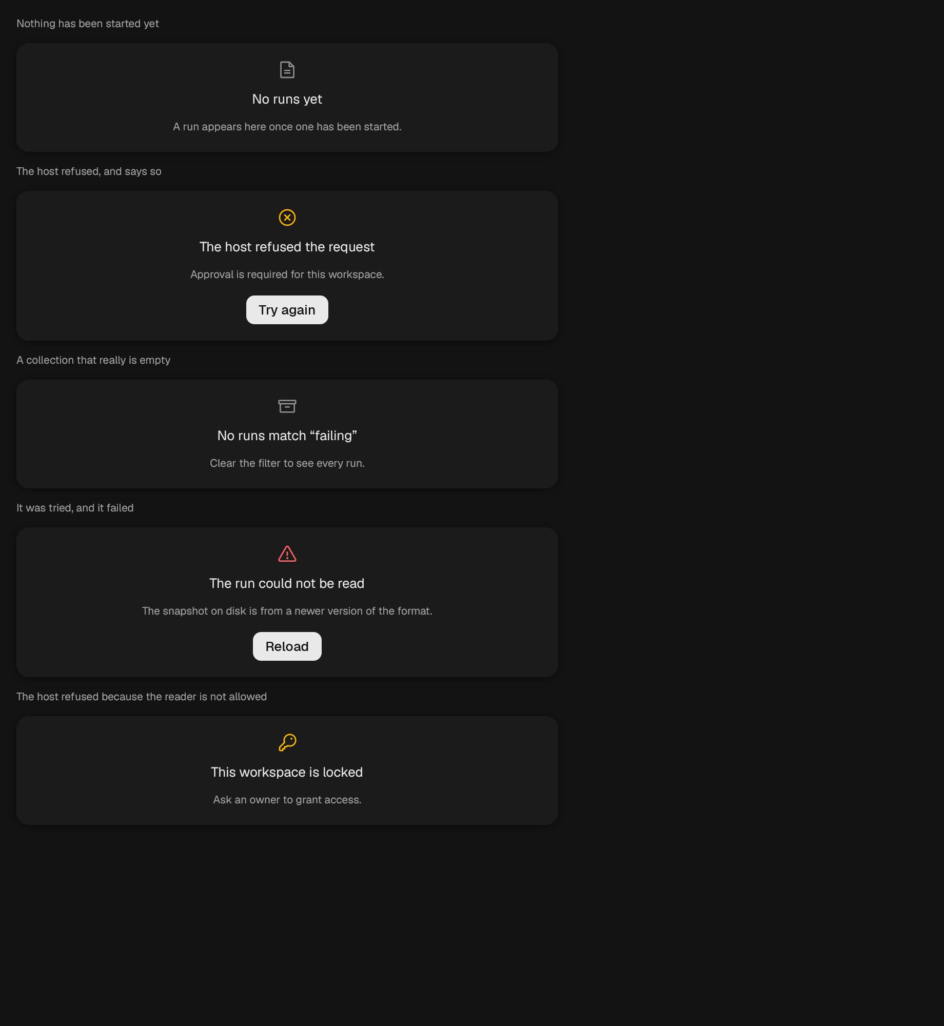
A centred explanation with an optional action.
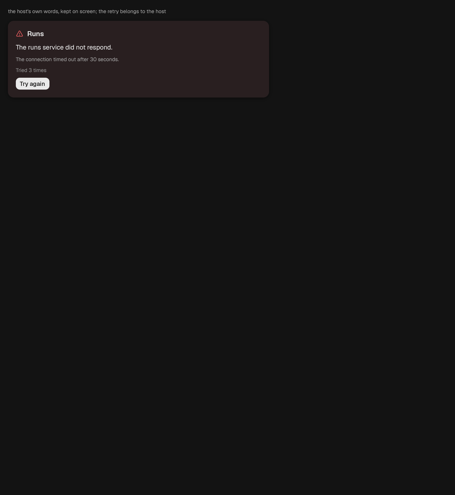
A panel that states what went wrong instead of what it was going to show.
A single already-normalized reading on a semicircle.
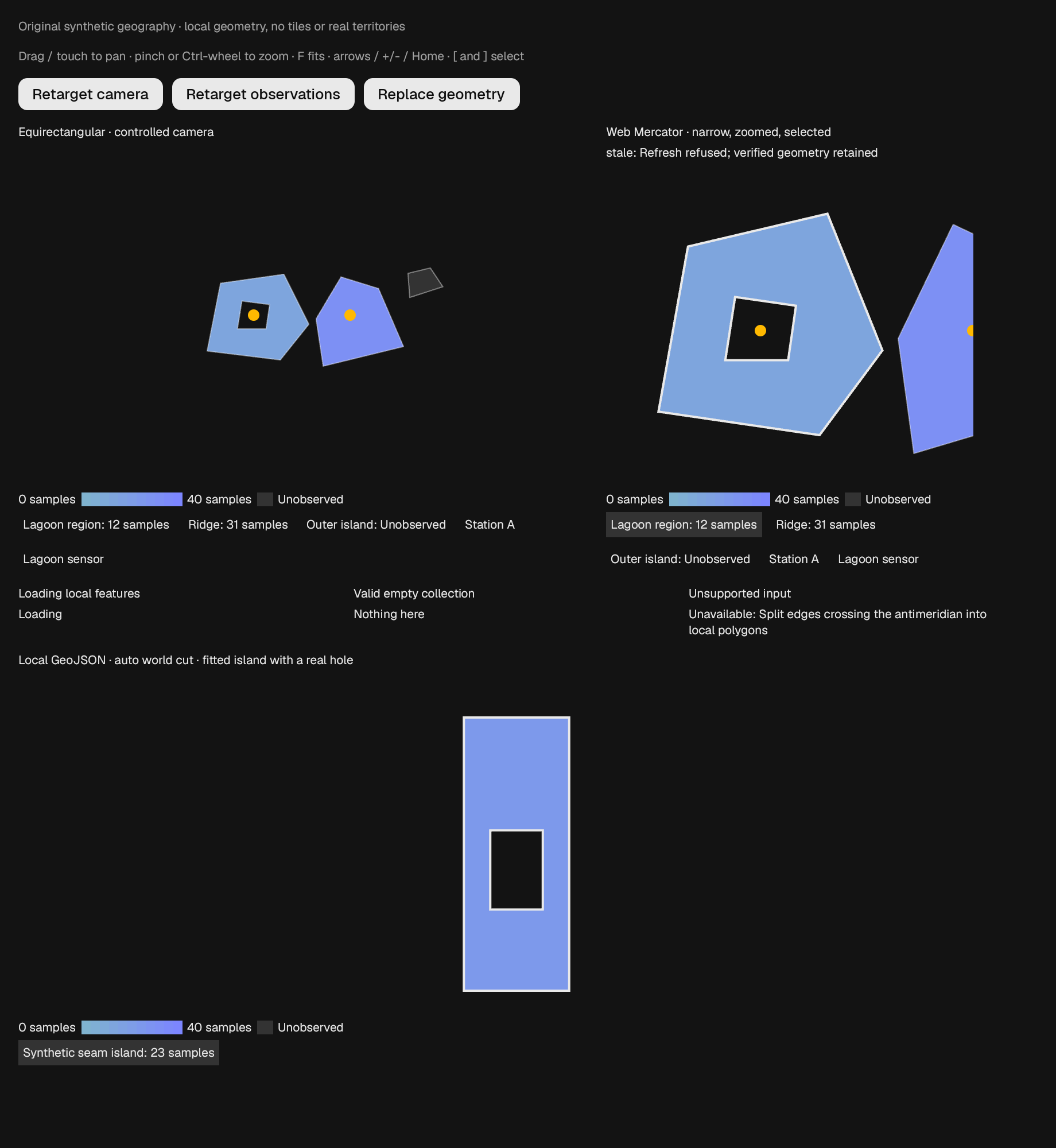
A controlled local map with choropleth legend, selectable feature readout, and point overlays. Click selects projected geometry; captured drag/touch pans and pinch/Ctrl-wheel zooms about the pointer. Arrow keys pan, +/- zoom, Home resets, F fits, / cycle selection. Escape cancels a drag or clears selection. No handler means a read-only map.
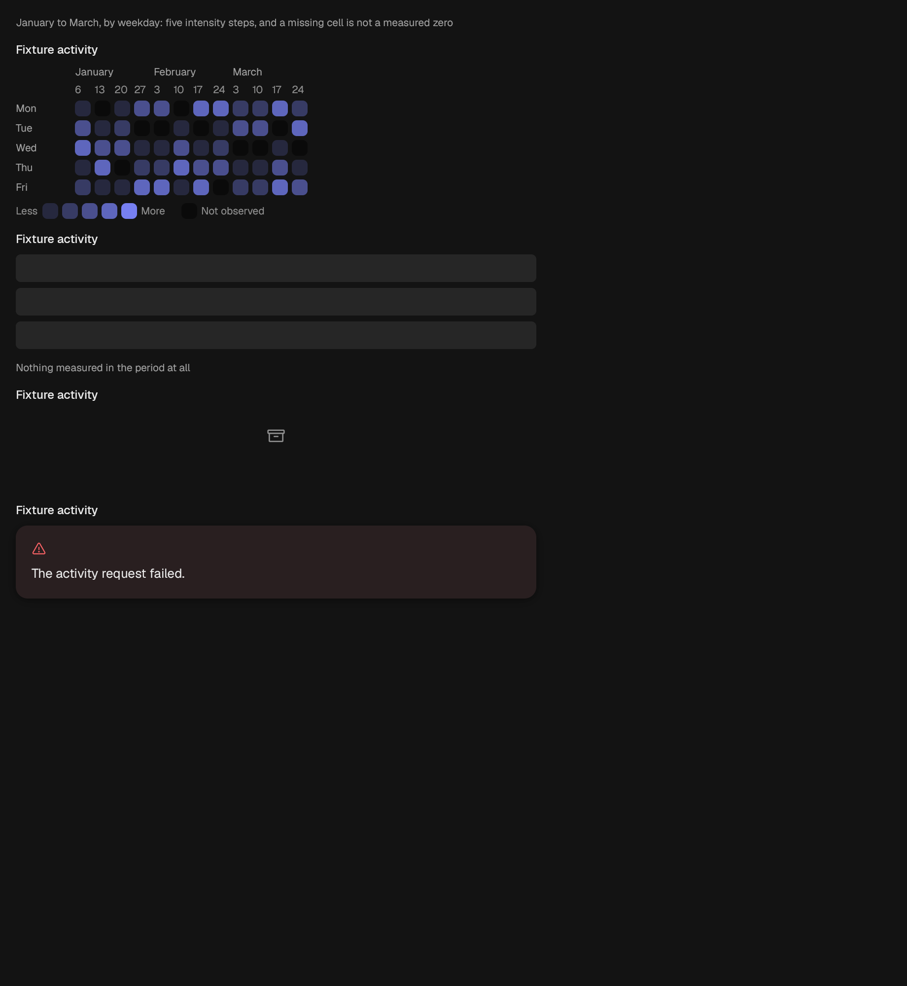
A labelled grid of intensity cells.
A run of text with some of it marked.
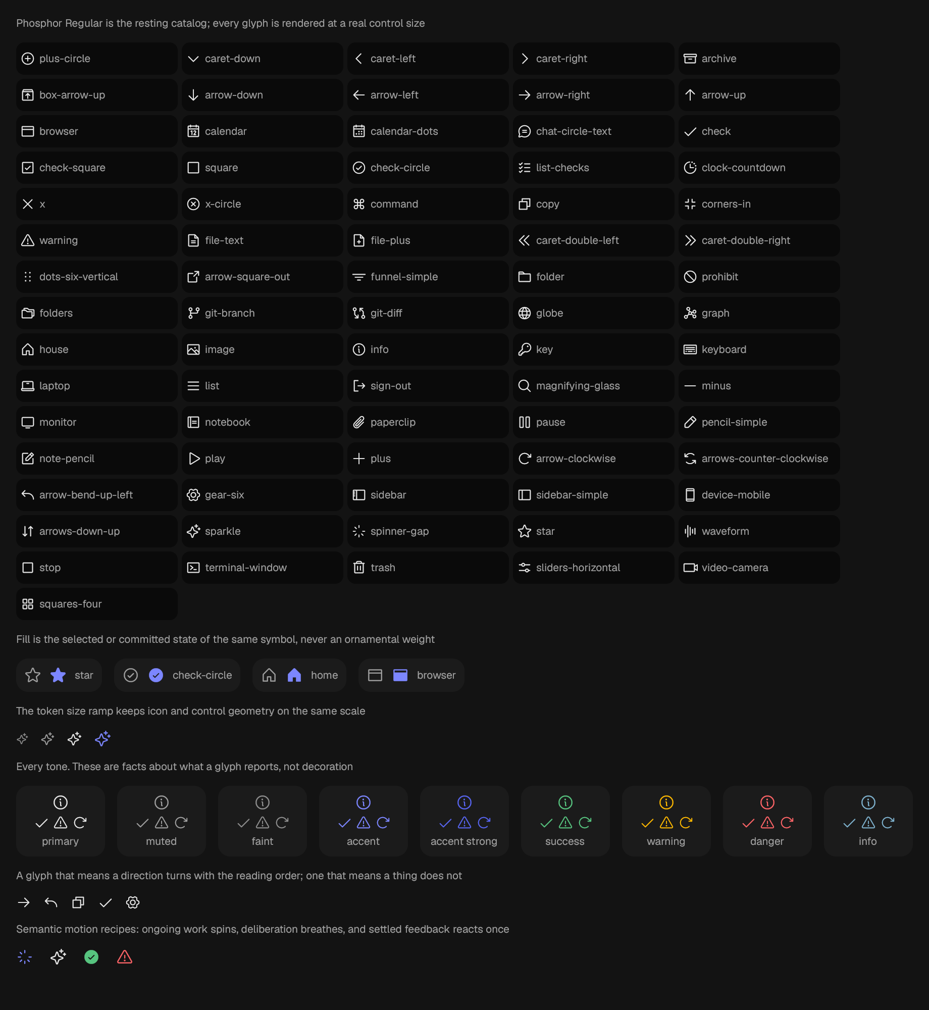
A glyph from the bundled catalog.
A line chart over one or more host-owned series.
One row inside a Card.
The tail row of an incrementally loaded list.
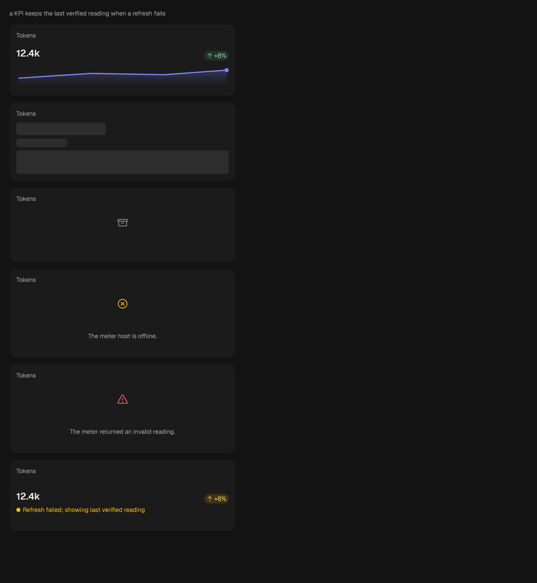
A compact KPI card.
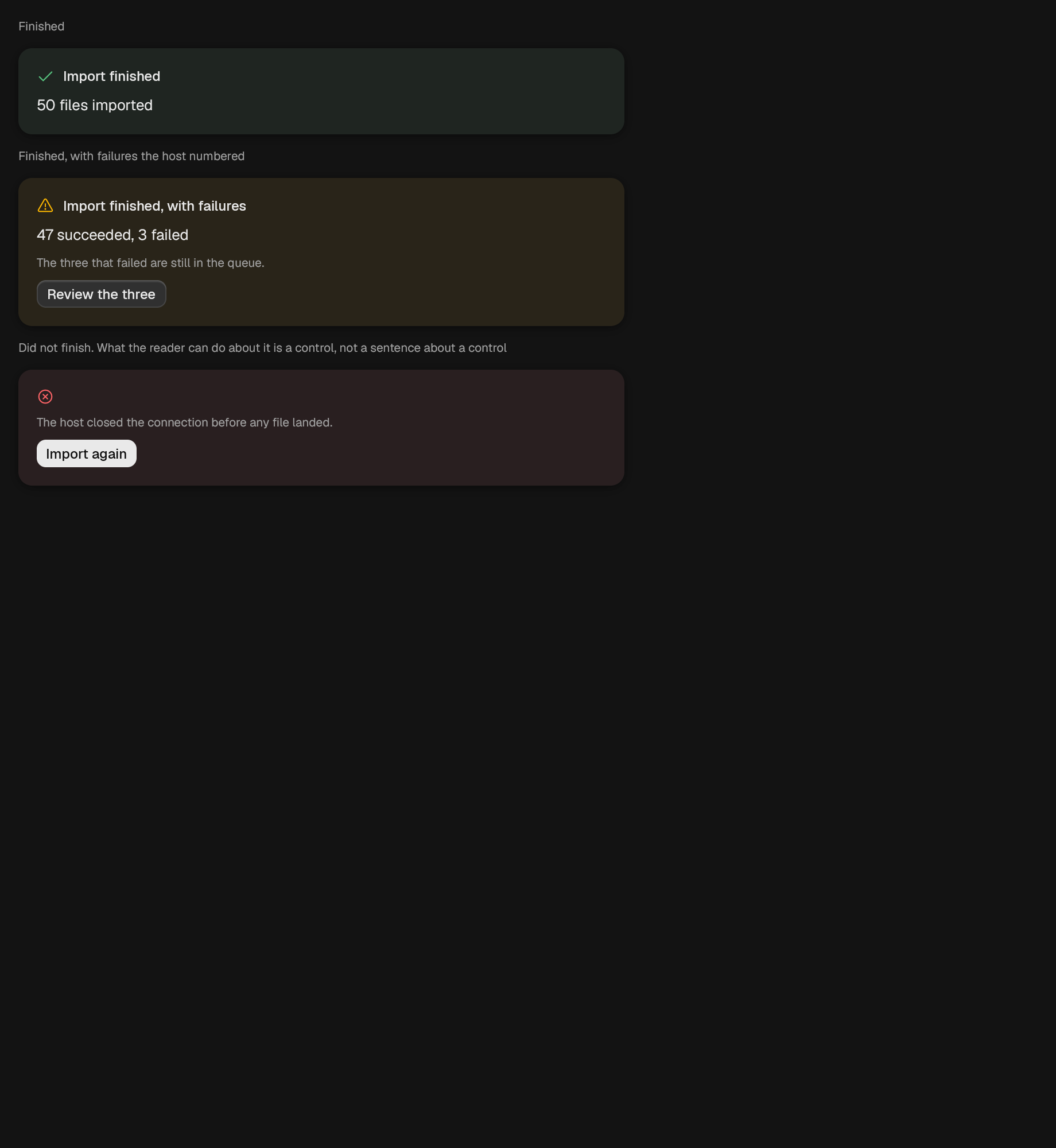
A panel that states what finished, including a partial success.
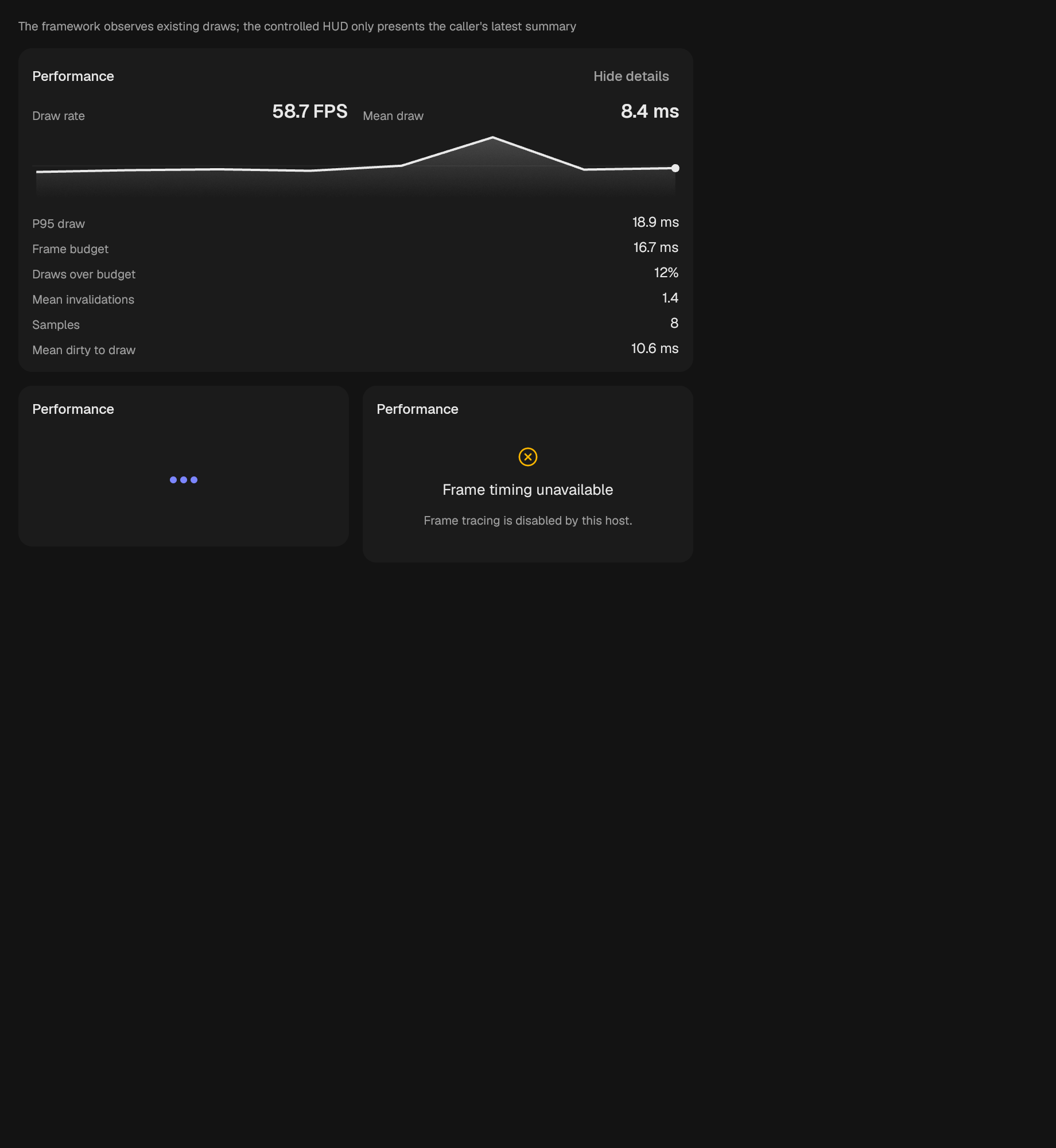
A compact or expanded frame diagnostics surface.
A pie or donut over one host-owned series of shares.
A measured plot with caller-painted content and semantic marks.
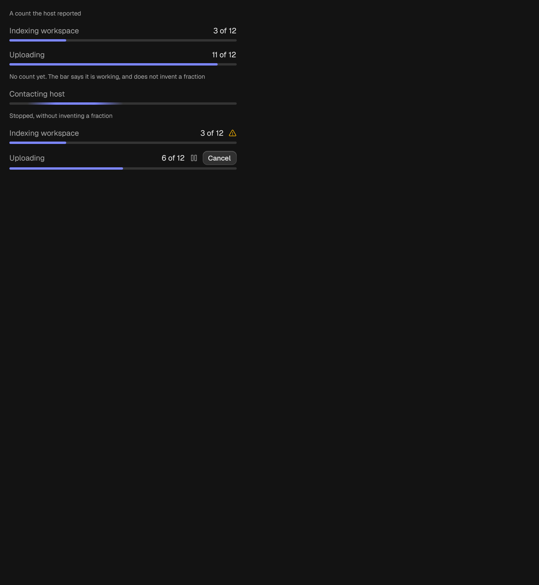
A horizontal bar for work whose extent is known.
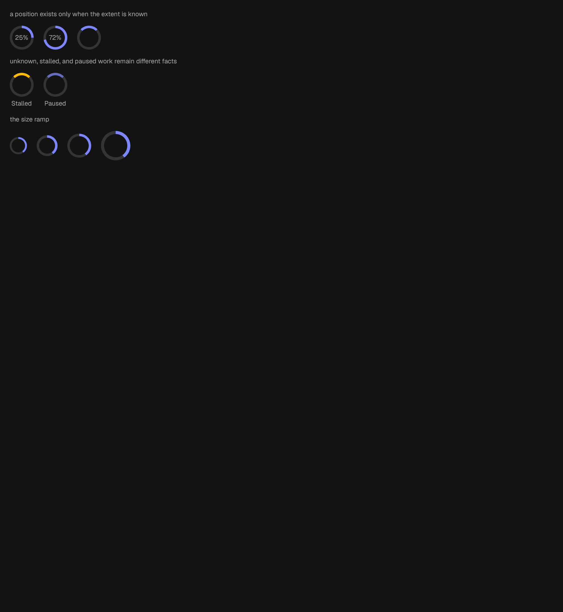
A ring for work in a place too tight for a bar.
A row of breathing dots, used while a request is in flight.
A polar reading over host-owned axes.
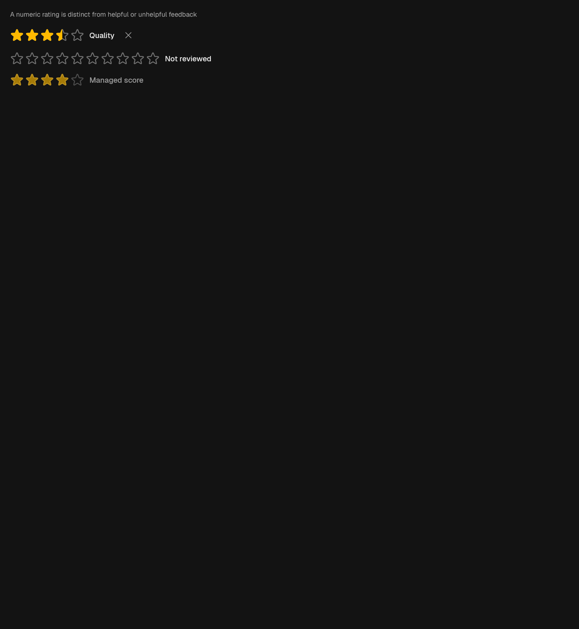
A controlled scalar rating rendered as token-sized stars.
A veil over content that is still the last verified value.
Sankey ribbons over caller-owned normalized layout.
Scatter or bubble marks over one or more host-owned series.
Placeholder rows shown while a list's real shape is unknown.
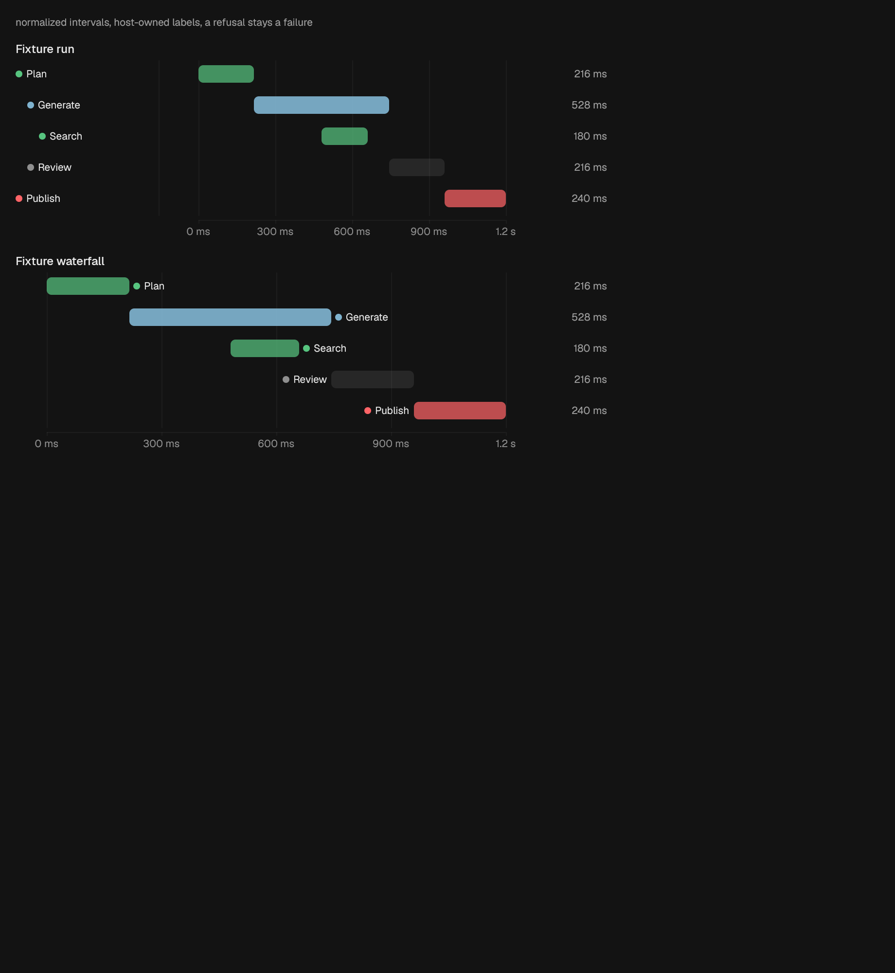
The waterfall alone: bars and a time axis, with each span named at its own bar instead of in a gutter.
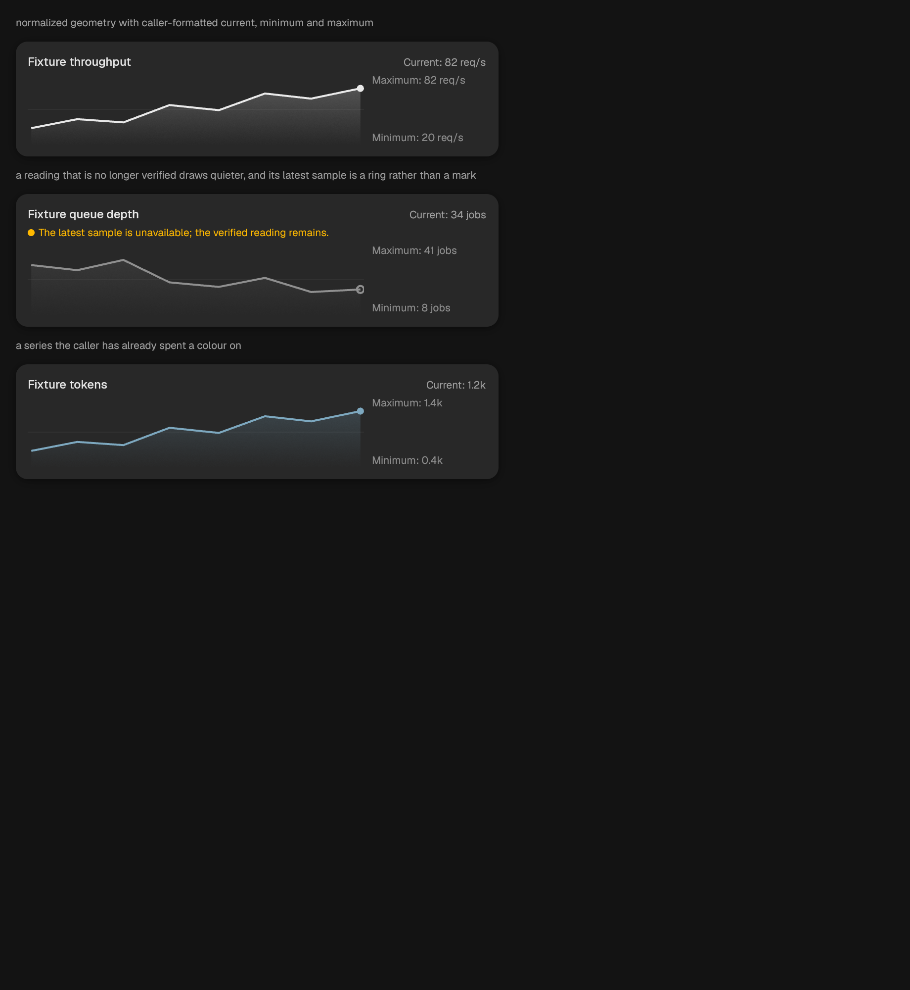
A compact, accessible trend reading.
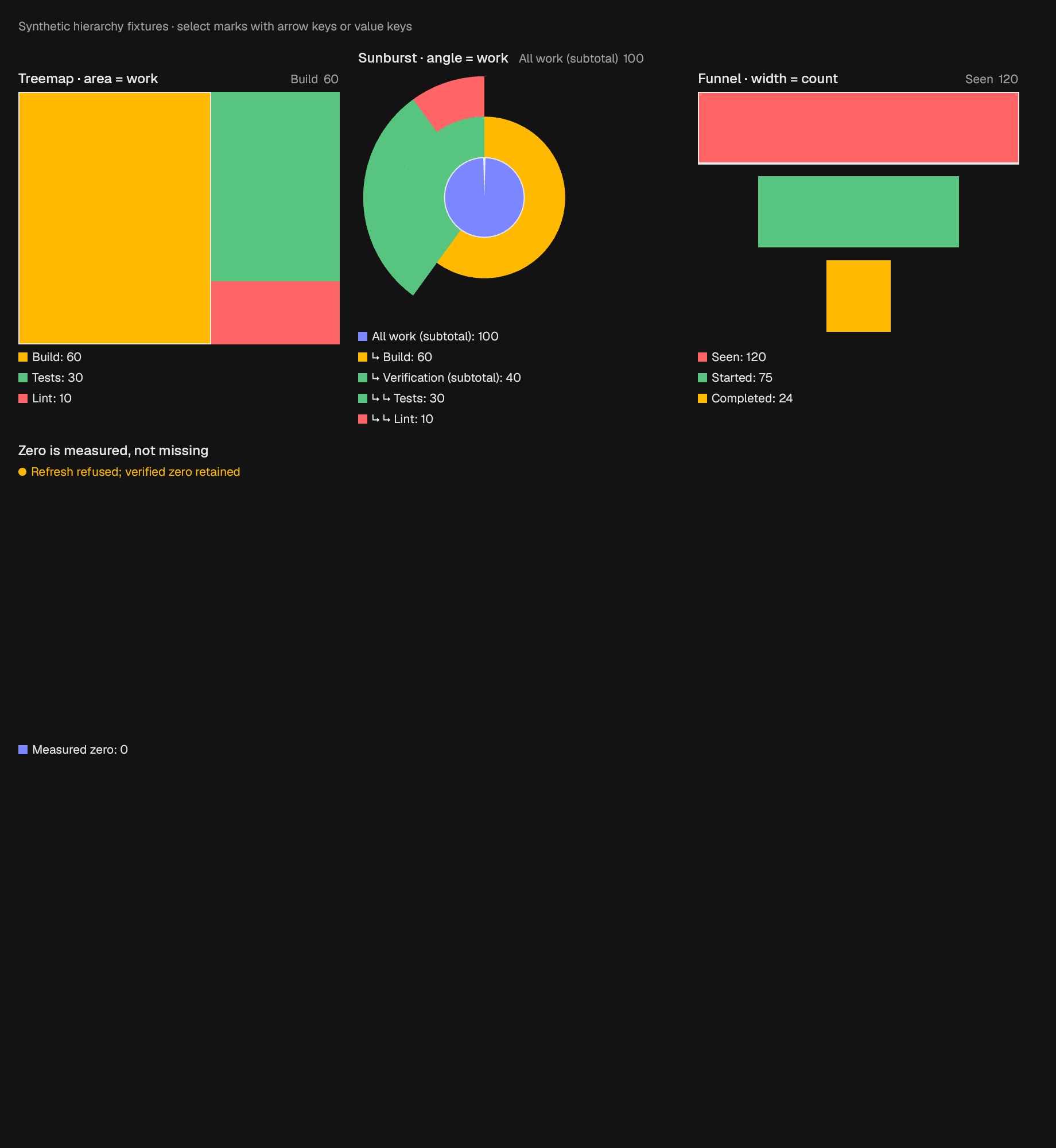
Specialized raw-value presentations with a persistent labeled value key, keyboard selection, semantic marks, and retained-data refresh failures.
An inline turn, for a wait that sits next to a label.
Bars stacked from the same category identity across series.
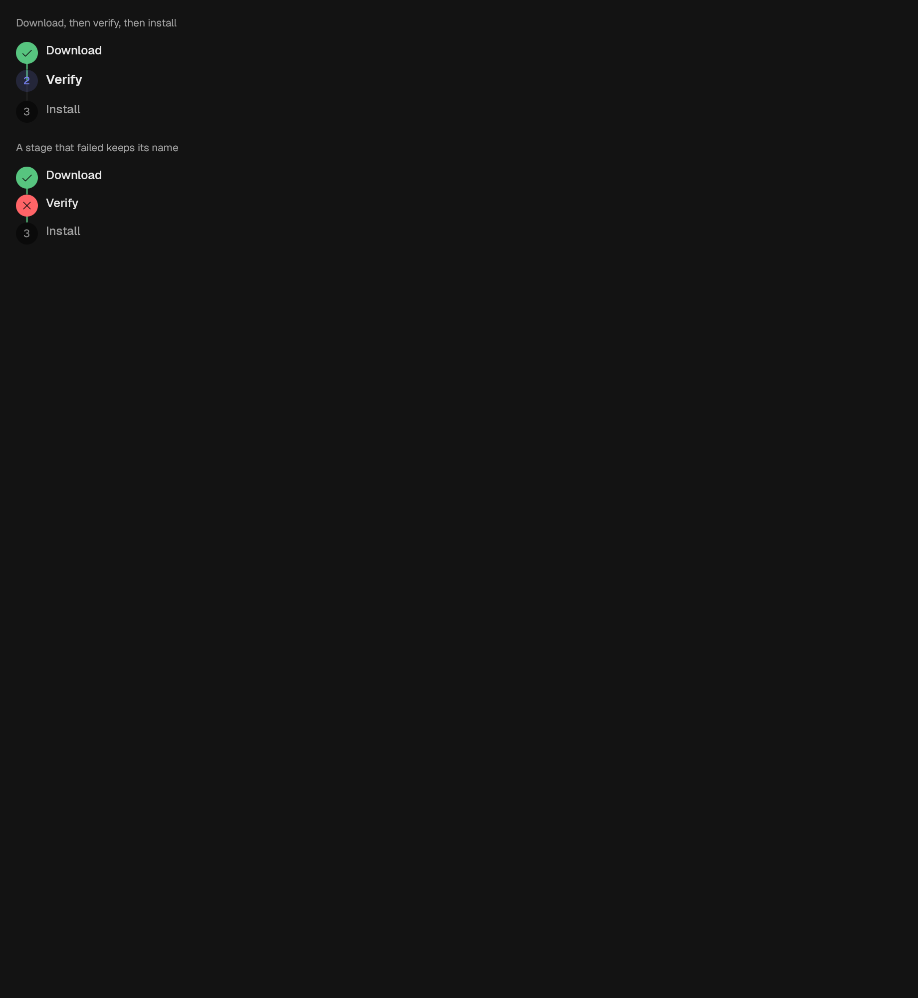
A run of named stages, all of them supplied by the caller.
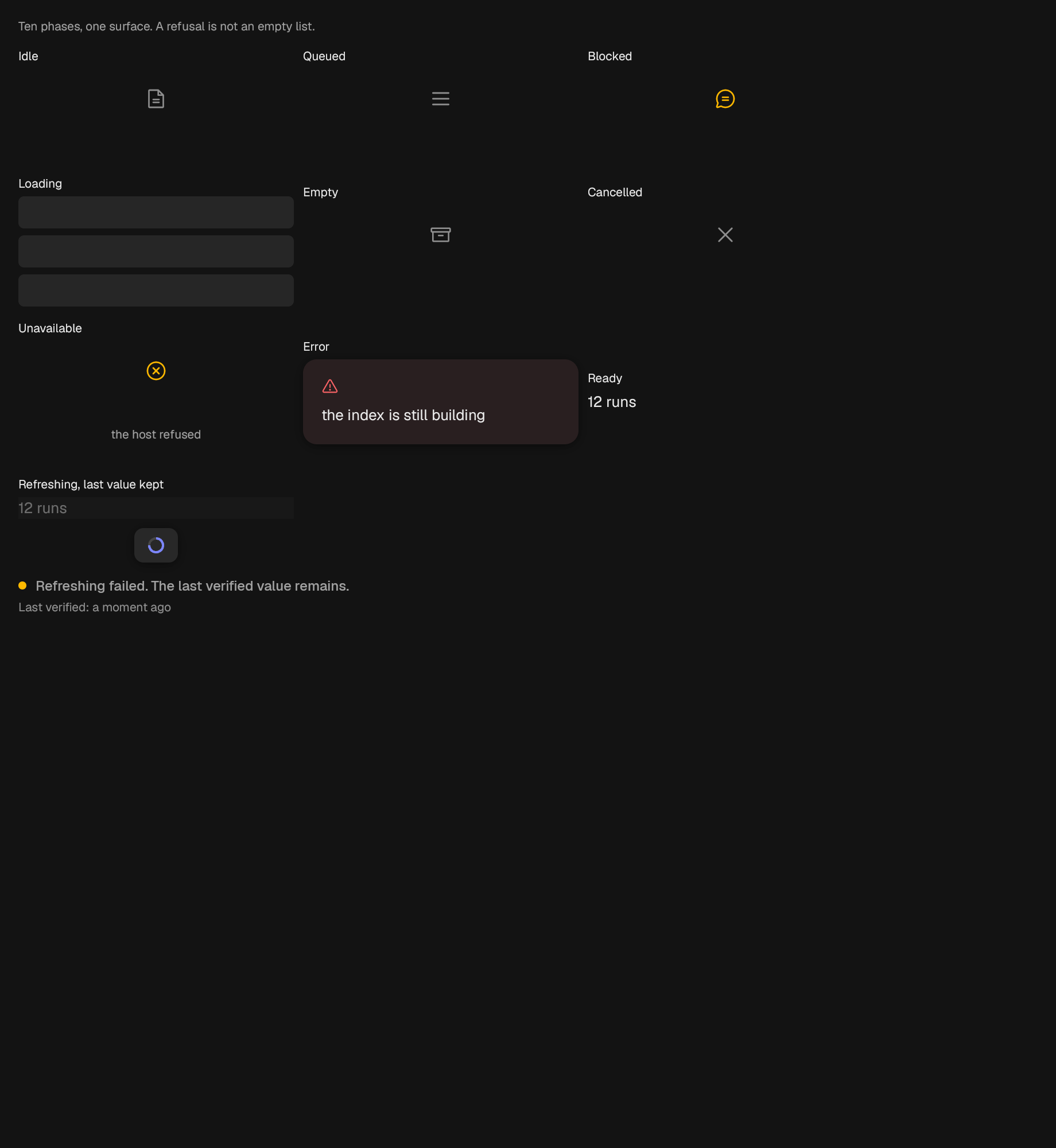
The mark that a verified value is still on screen after a failed refresh.
A region that picks the truthful waiting, empty, failed, or ready surface.
A tone-colored dot, the smallest state indicator in the system.
A dot plus a short label, for inline state.
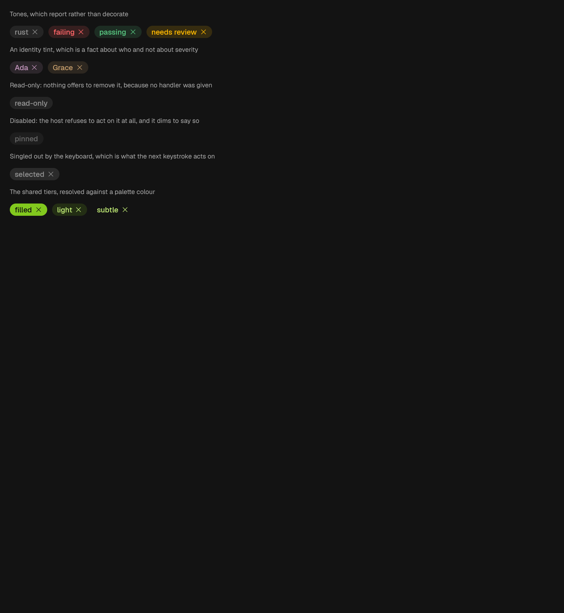
A label with an optional remove action.
A chronological feed, optionally divided into days.
Hierarchical labels beside a waterfall of caller-owned spans.
effects
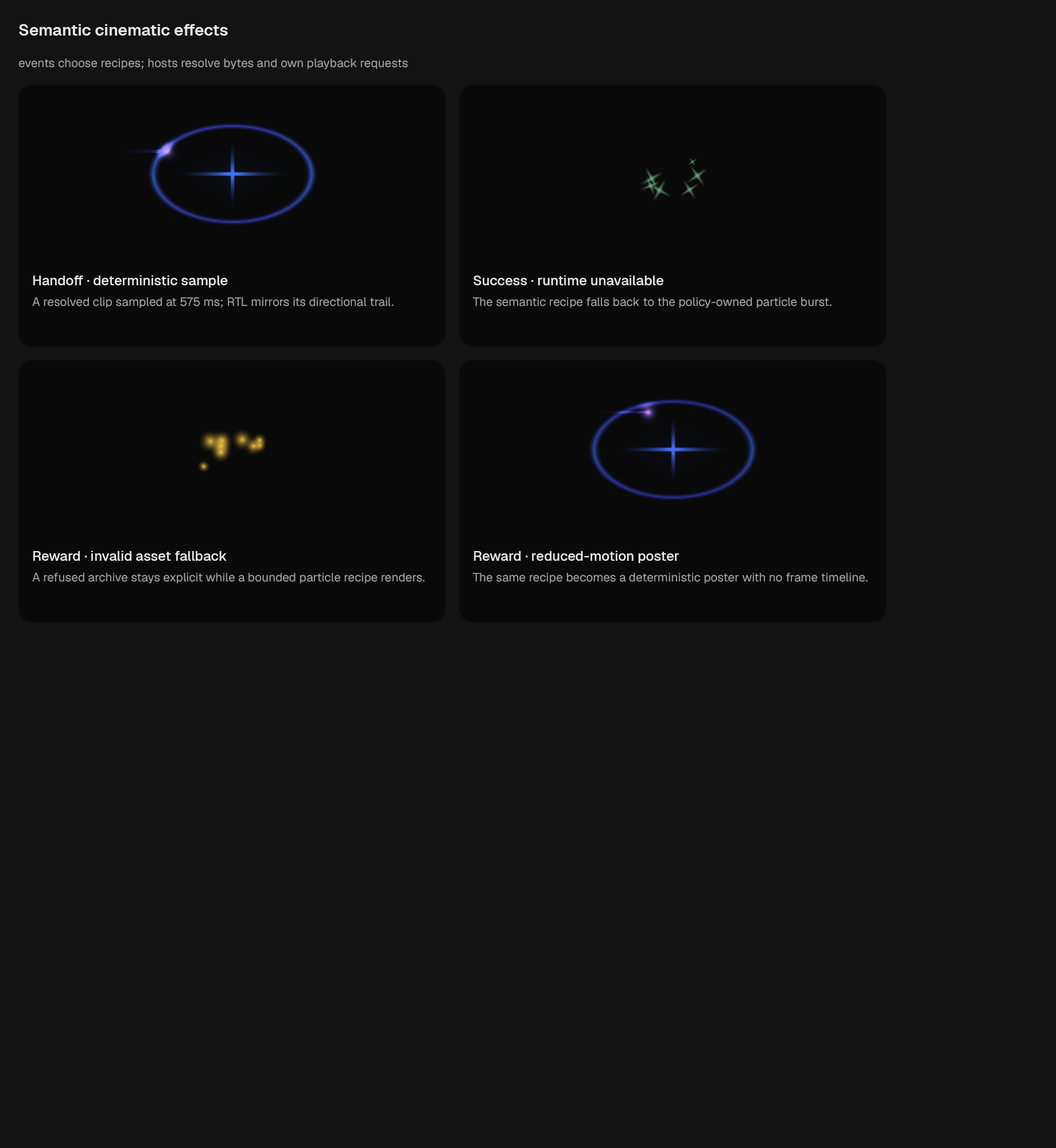
game
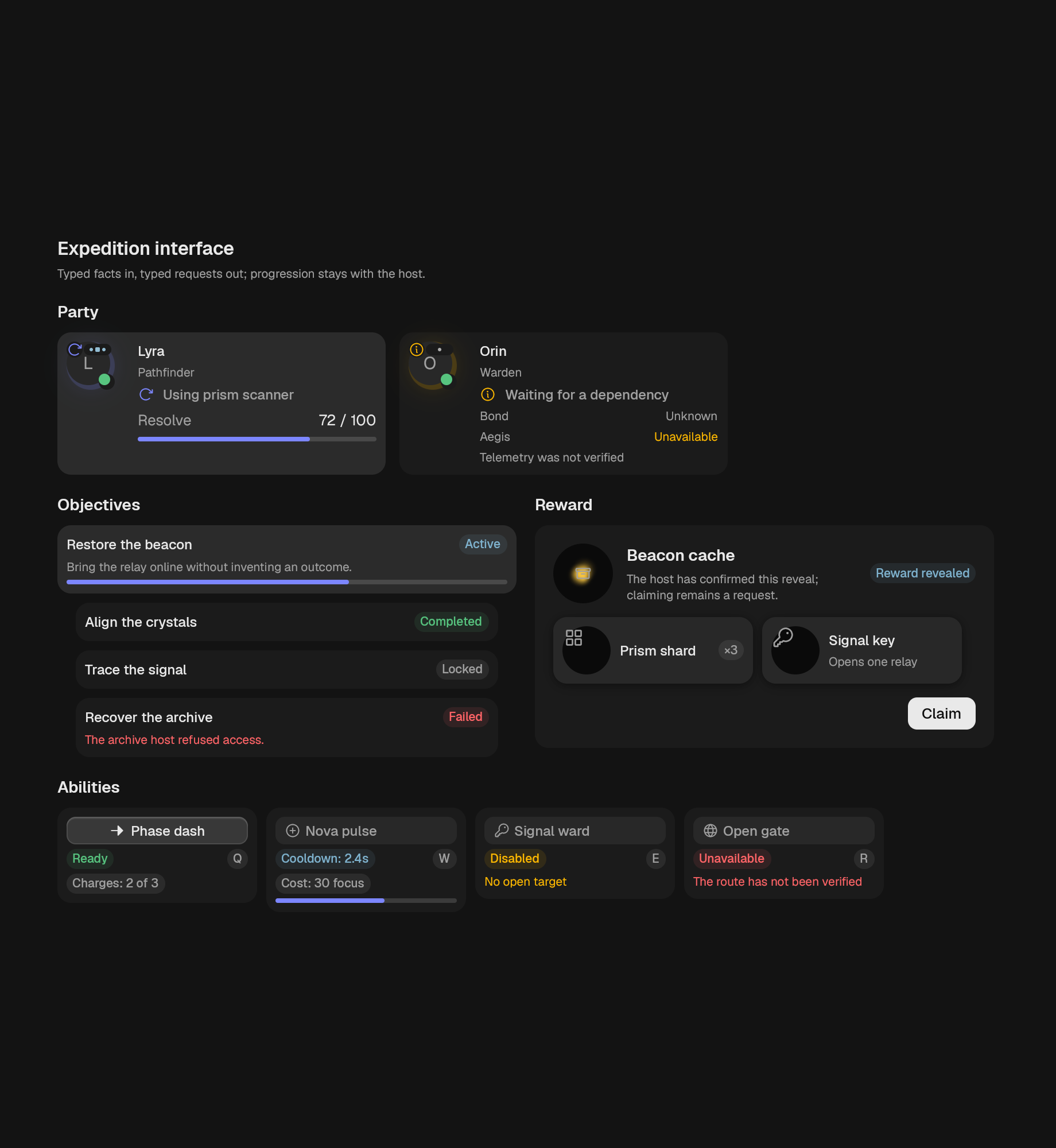
Standard ability controls with cooldown, charge, cost, shortcut, and refusal presentation.
A hierarchical objective tracker with strict identity validation.
A responsive party roster over standard agent and persona presentation.
A complete reward reveal composition with optional policy-resolved effects.
interaction
layout
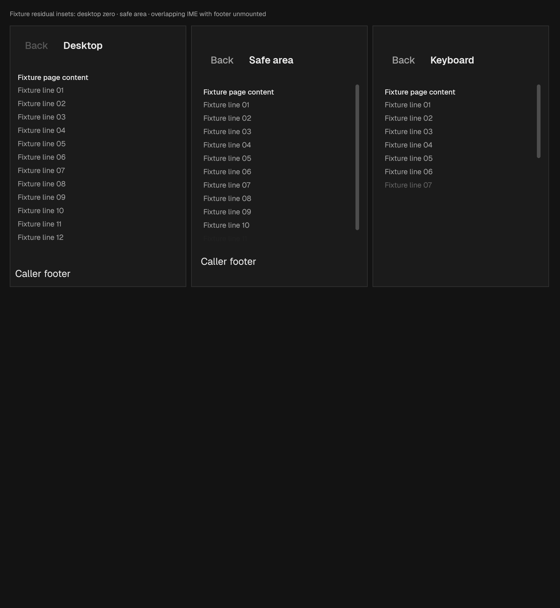
A page title with caller-owned leading and trailing actions. Slots should contain accessible controls. Safe areas belong to the enclosing PageLayout.
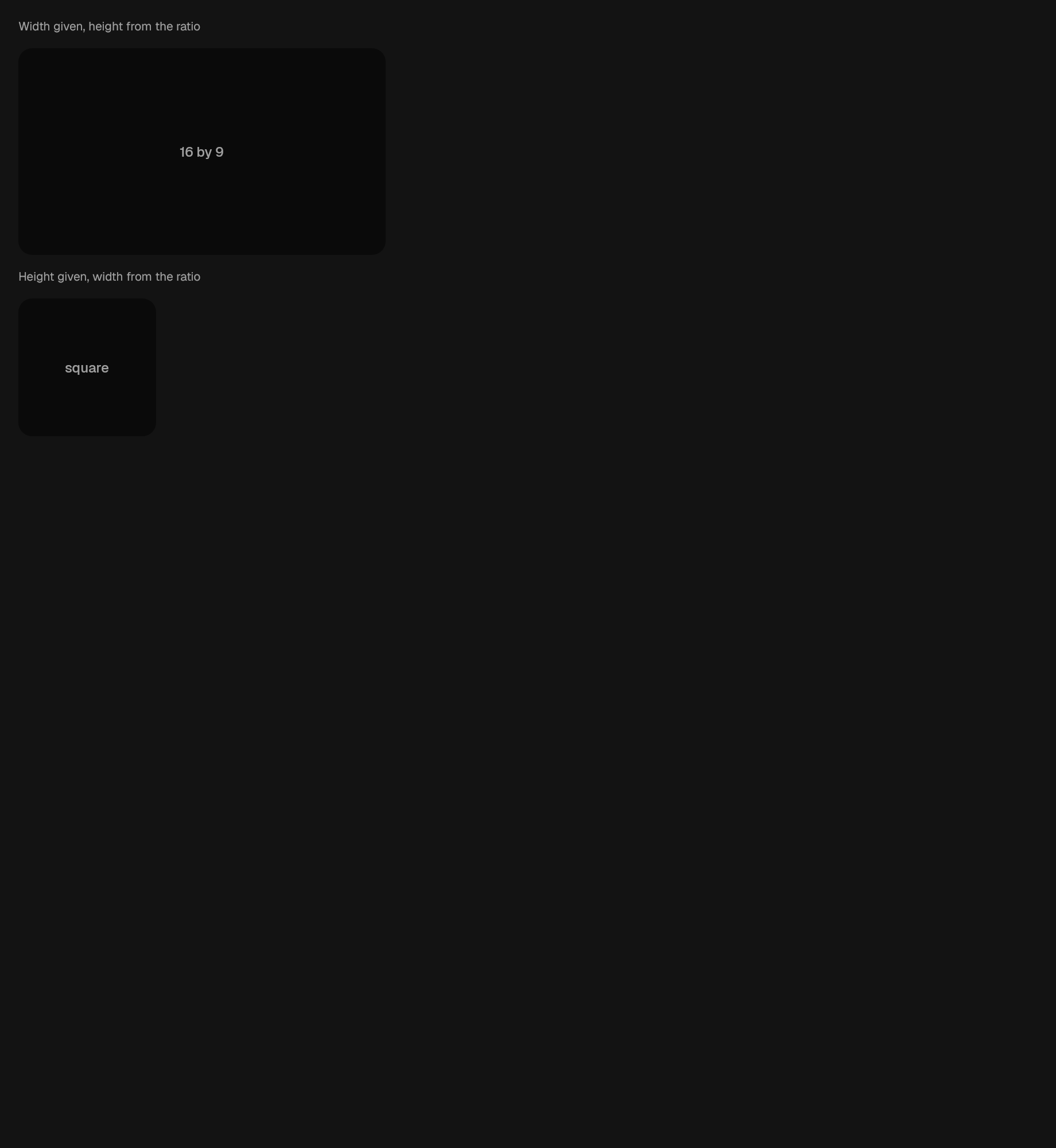
A container whose two dimensions stay in a fixed ratio.
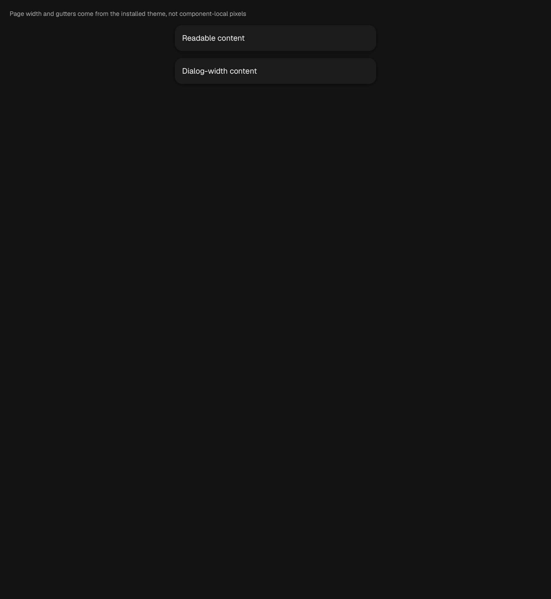
A centered, token-backed page container.

A client-rendered desktop titlebar with native window-control hit testing.
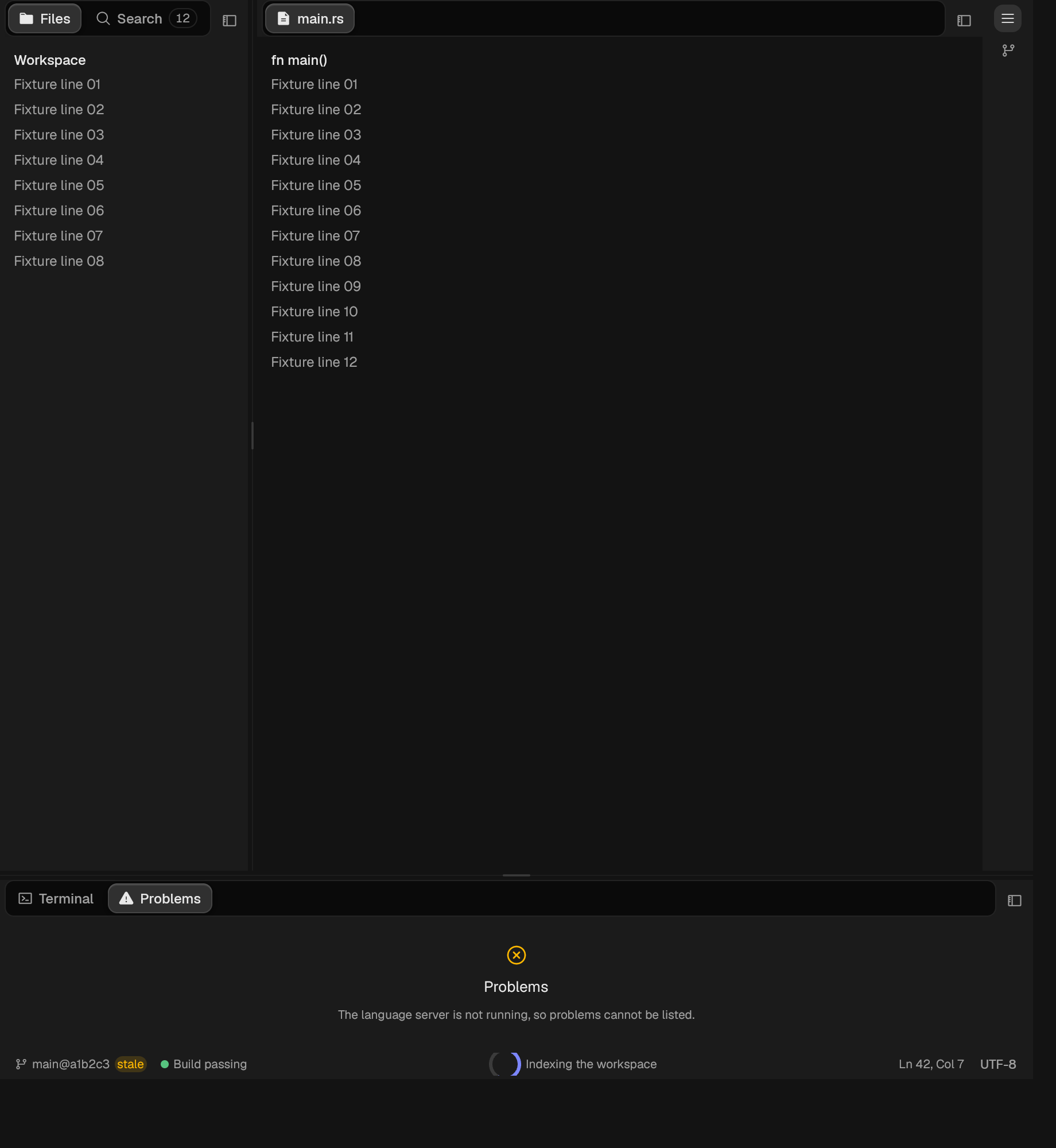
Panels arranged in regions around a centre.
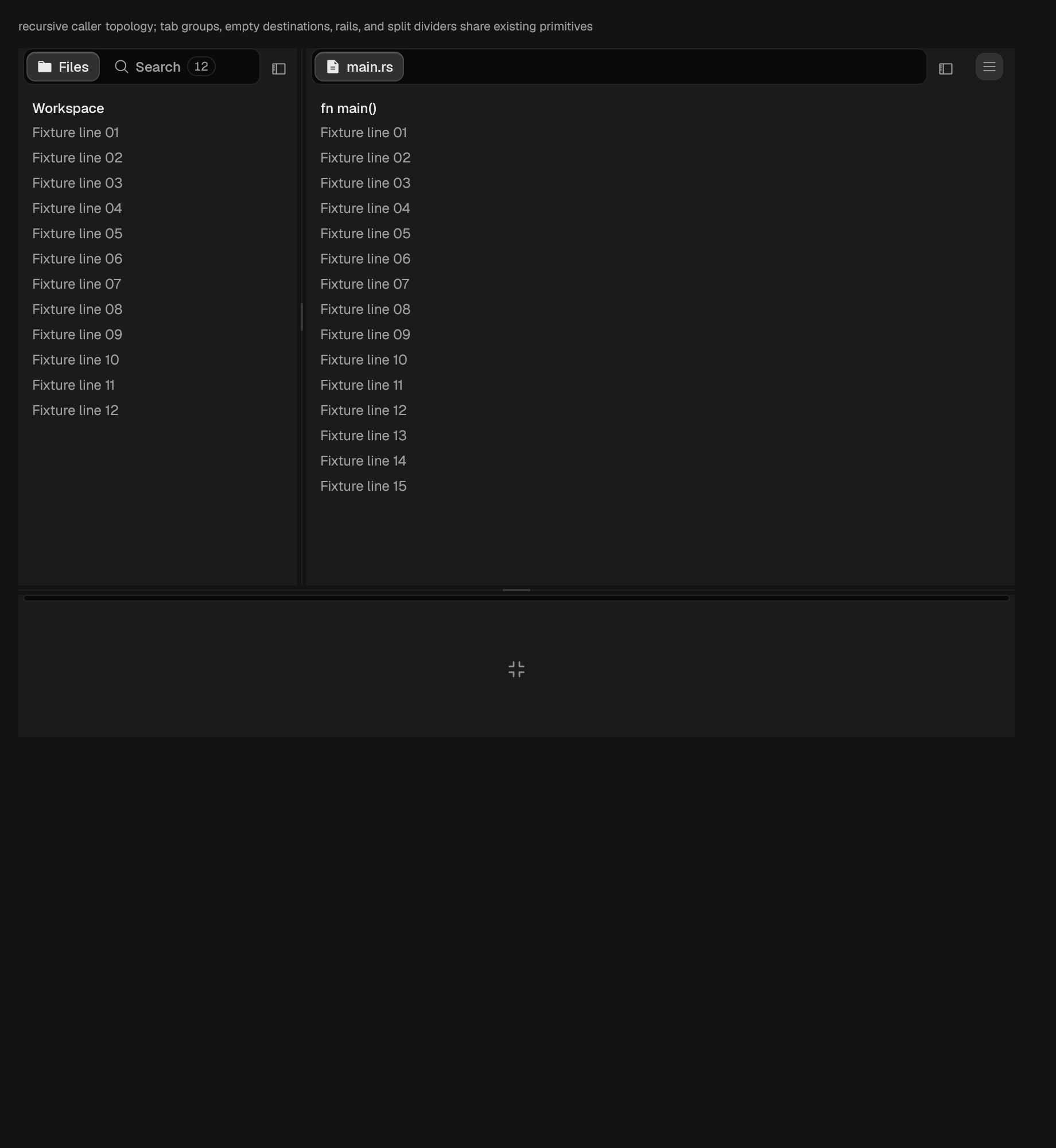
Draws a recursive DockTopology without owning it.
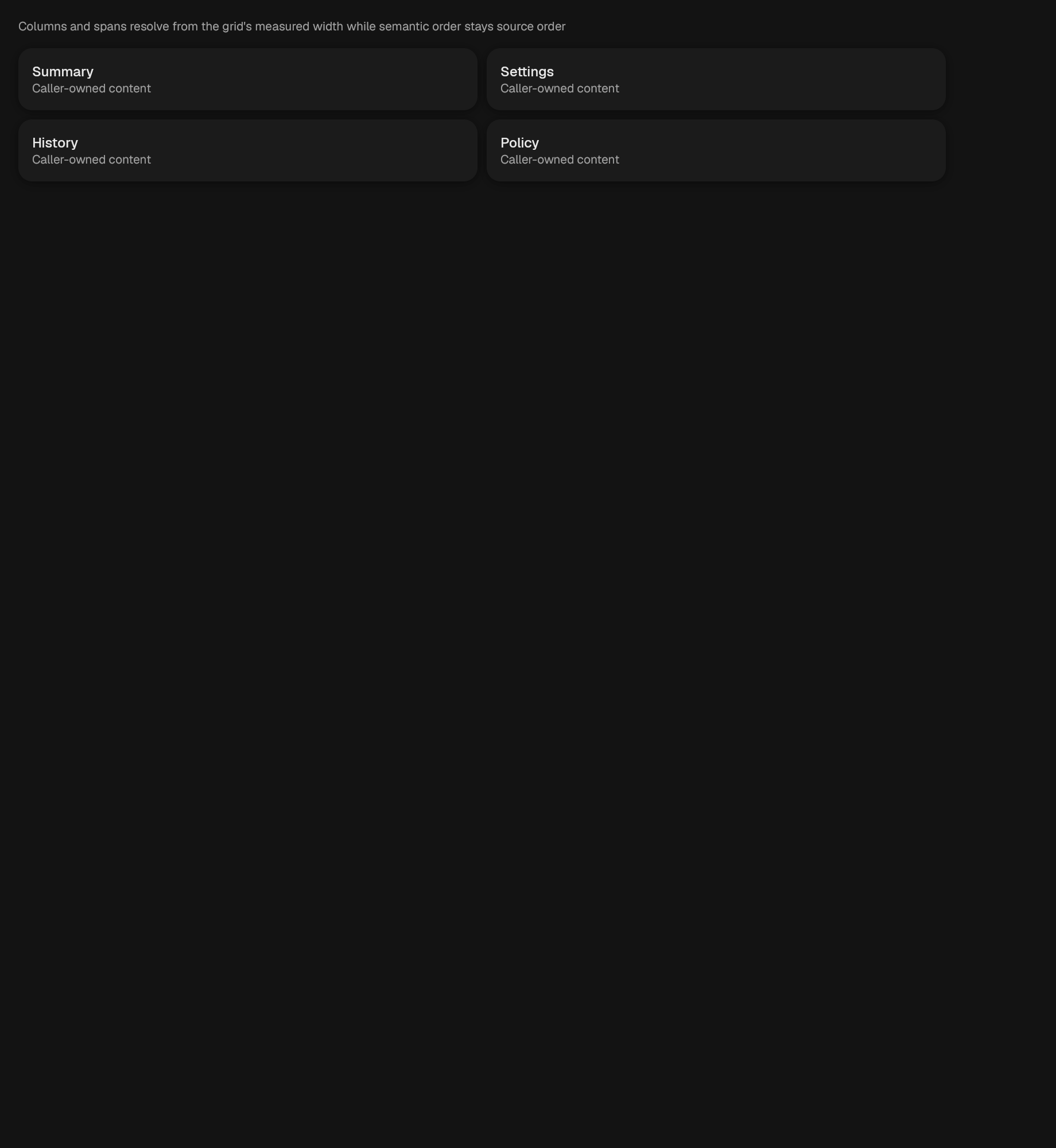
A measured, token-guttered grid that retains caller item order.
A full-height page with fixed header/footer and a bounded body. Insets are residual obscuration in this viewport's logical pixels, not physical screen coordinates. A keyboard that already resized the viewport has zero residual overlap; floating keyboards must not be approximated by edge padding.
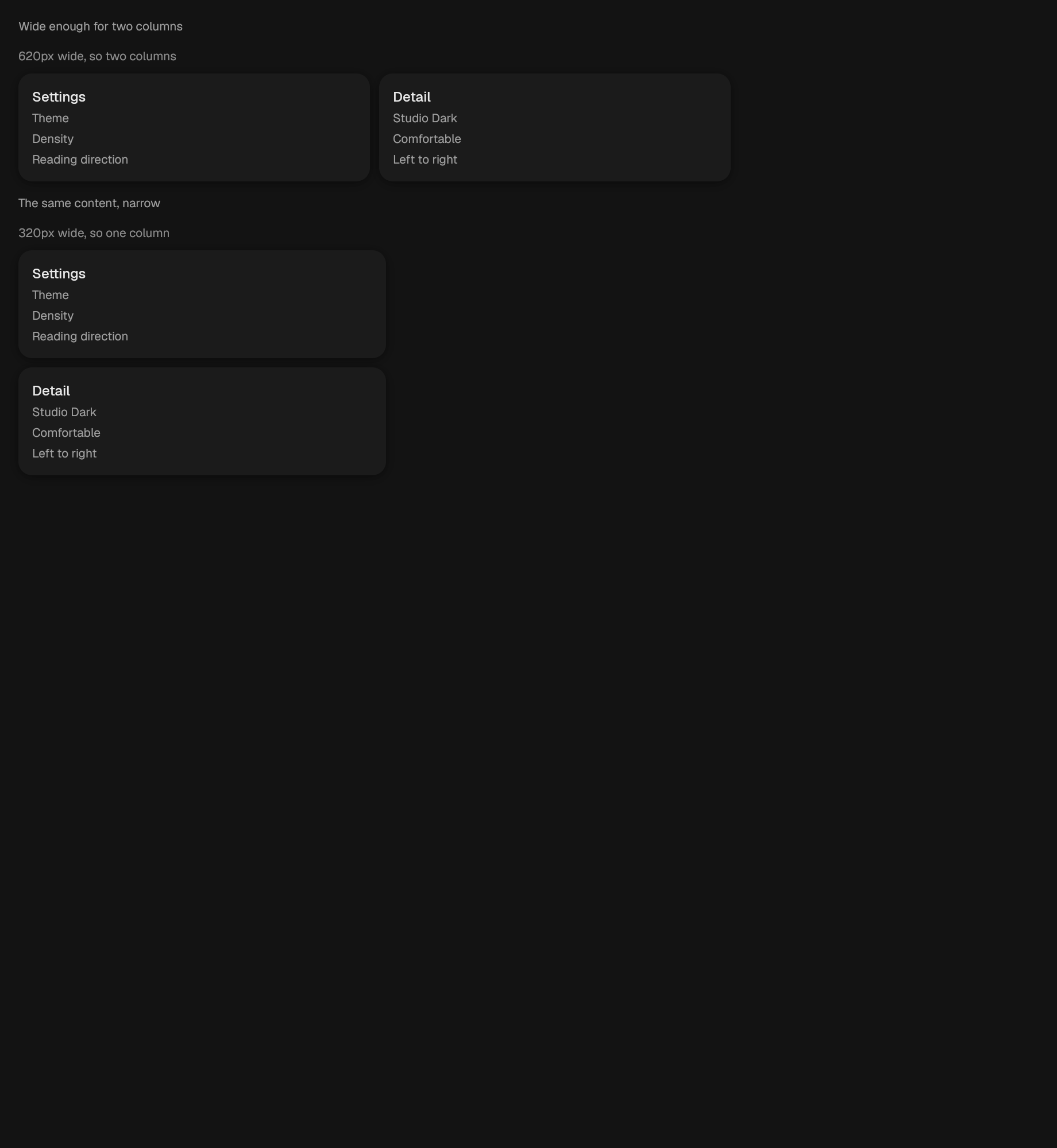
A container that builds its content from its own measured width.
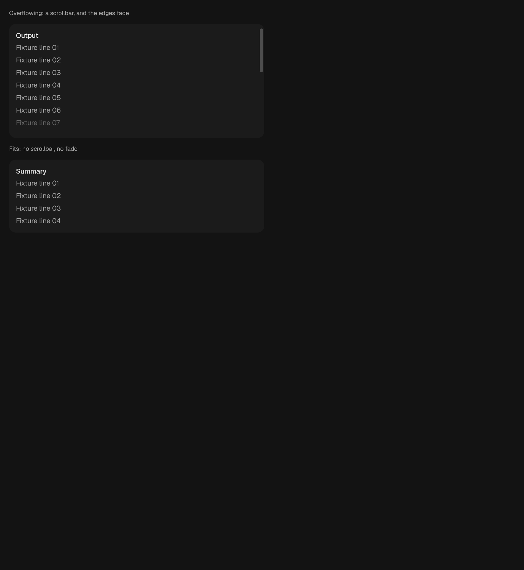
A scrollable region.
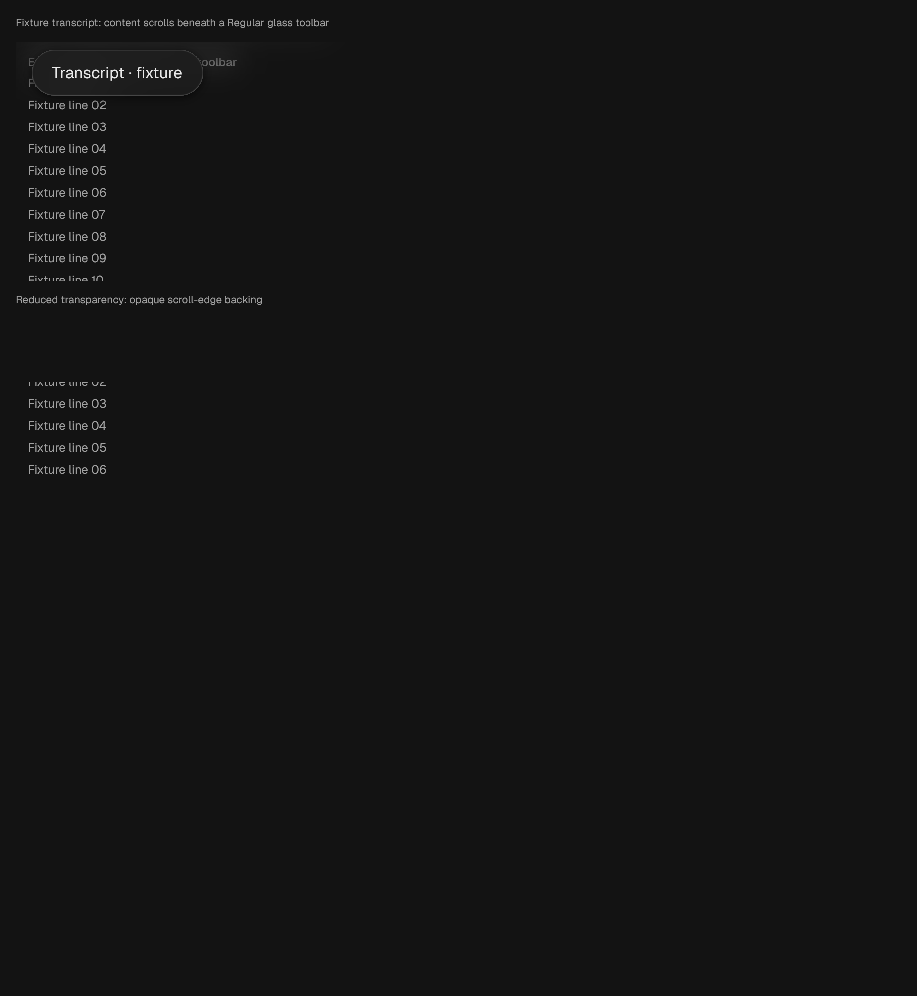
A visual ramp at the edges where floating glass overlaps scrolling content.
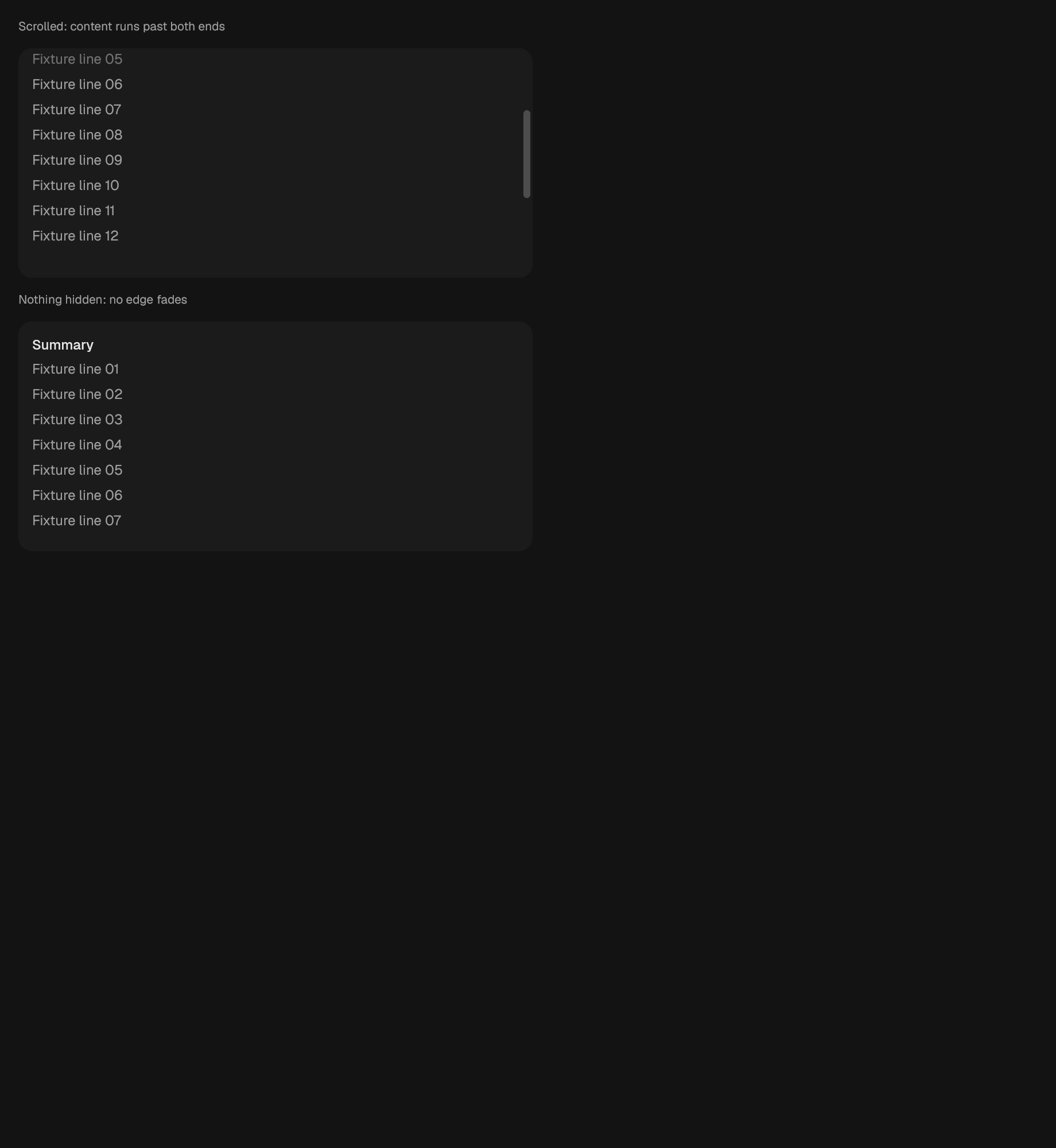
A region whose content fades towards the edges it is scrolled past.
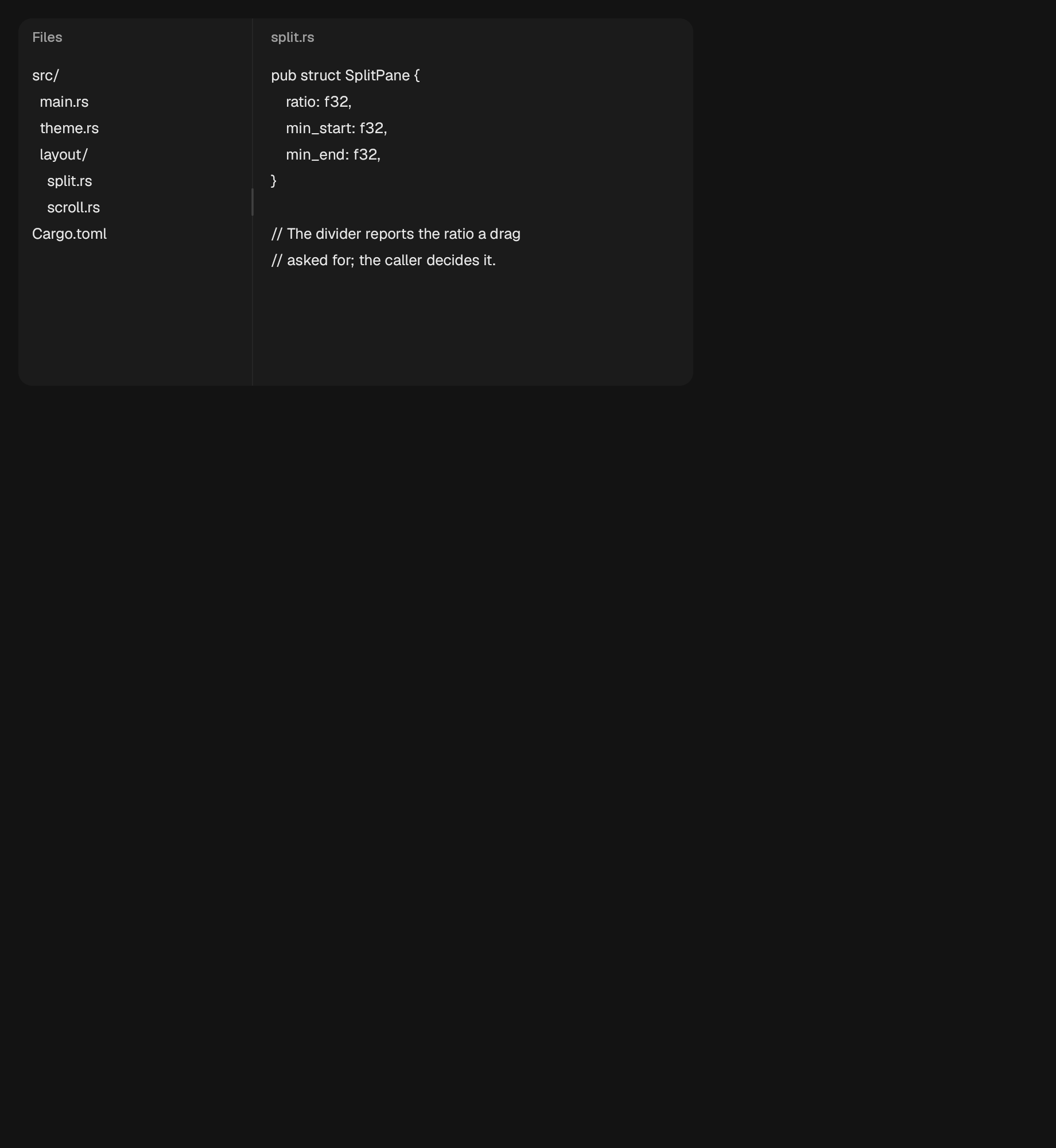
Two panes separated by a divider.
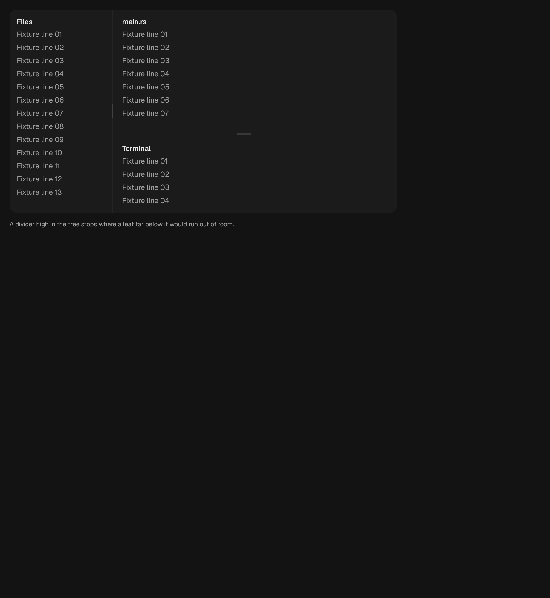
Draws a SplitLayout and reports what the typist asked to change.
The strip along the bottom of a window.

A bar of grouped actions.
media
navigation
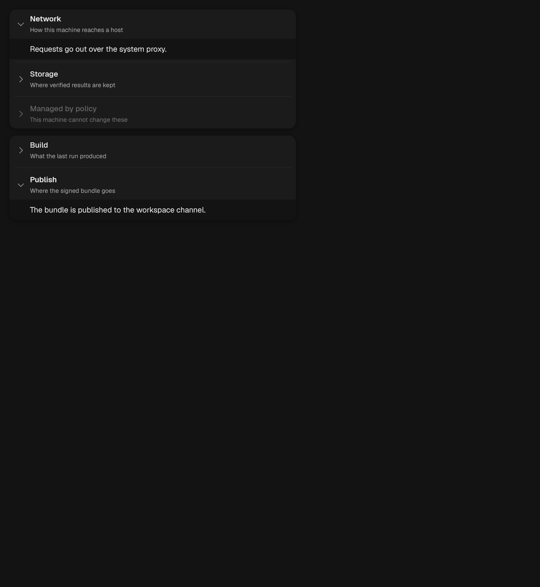
A stack of disclosure sections.

A horizontal reading-order list of links to sections in the current page.
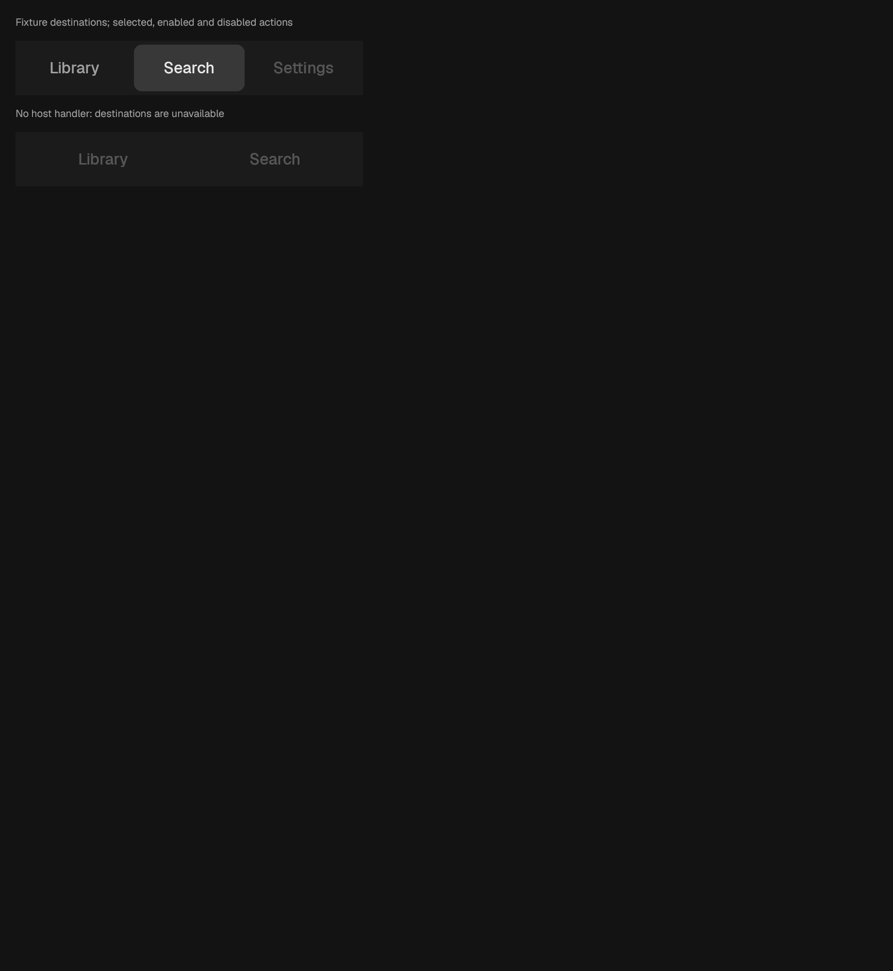
Equal-width destination actions for compact pages. No safe-area padding is added here: PageLayout consumes system insets once for all its slots. Without a handler destinations are disabled rather than falsely operable.

A trail of crumbs, collapsed in the middle when it grows too long.
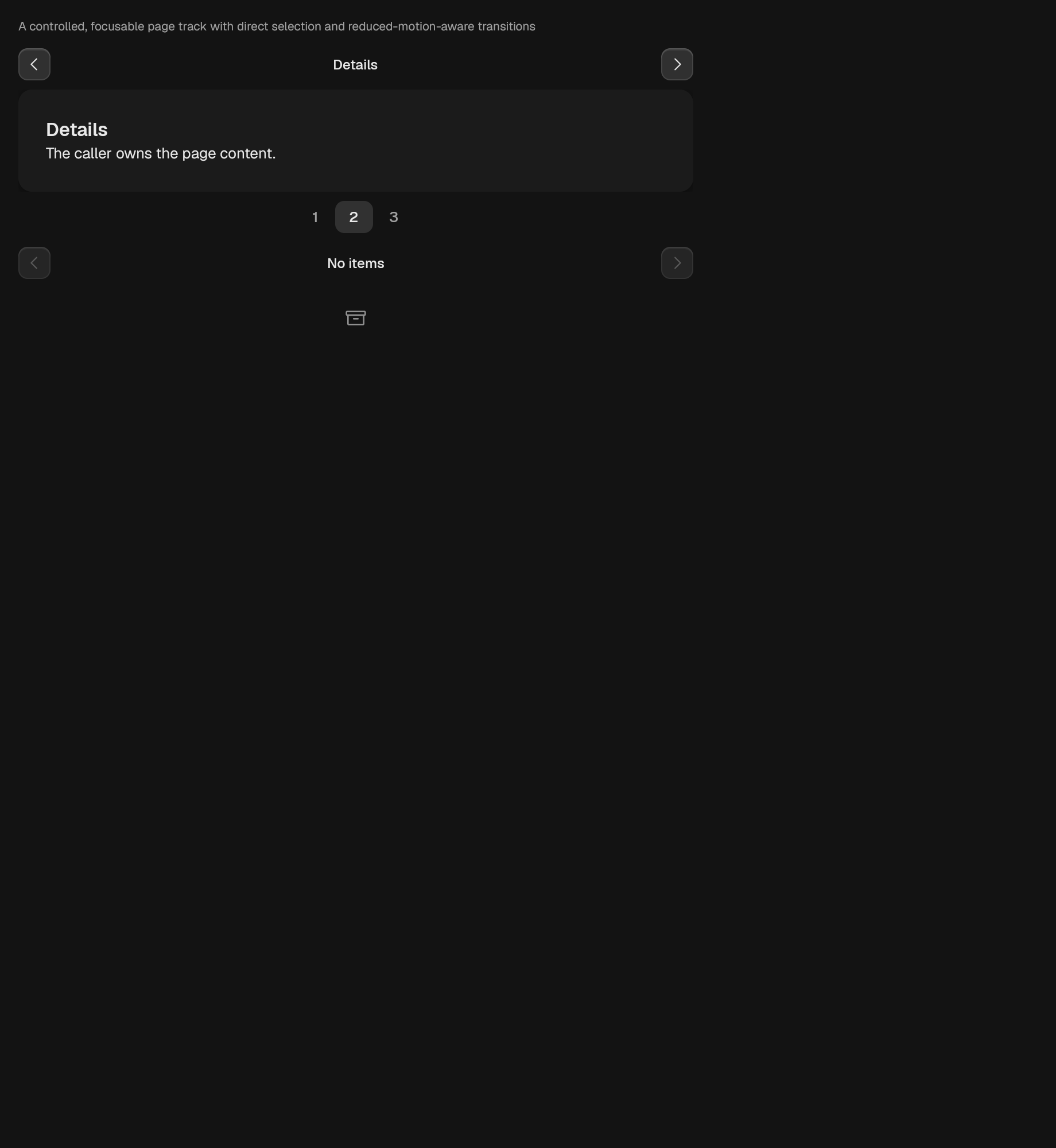
A token-backed paged viewport.
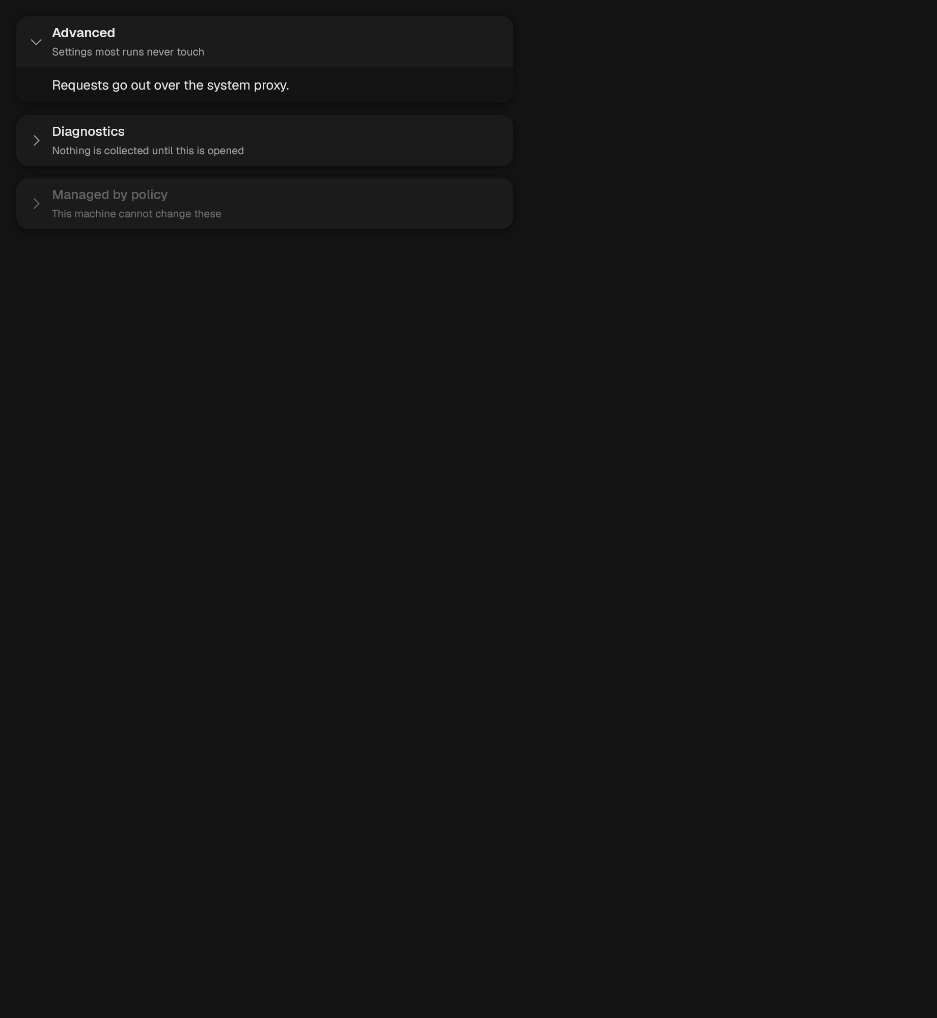
A single region behind a header that opens and shuts it.
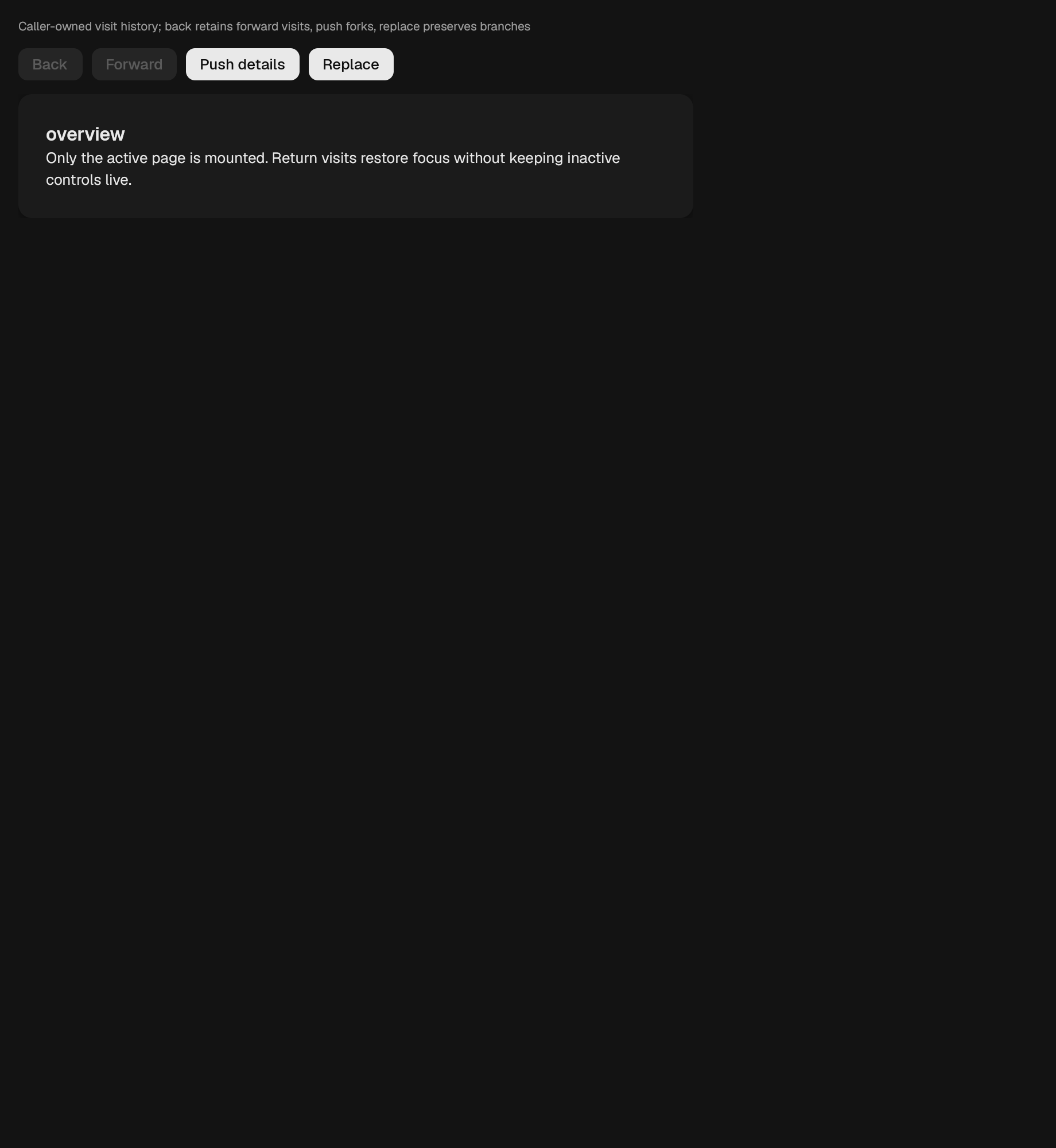
Active navigation content. Inactive pages are not mounted, so their input handlers and accessibility nodes cannot remain active during a transition. Uses a token-backed fade on each accepted history change; reduced motion settles immediately. It restores the last focused descendant on revisits when focus was inside the outgoing page, and never steals external focus.

First, previous, next, and last, plus a numbered range when there is one.
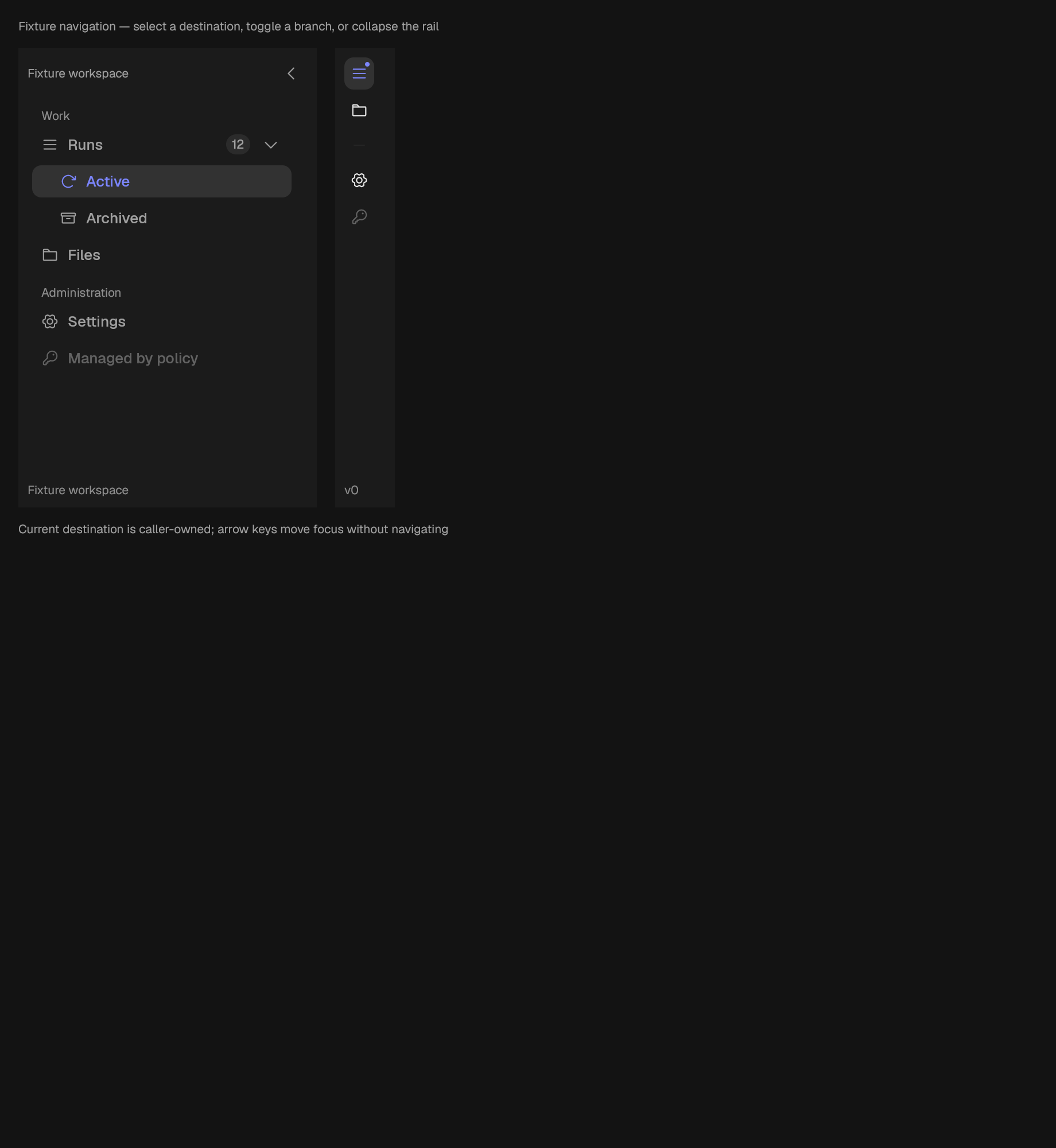
A collapsible navigation rail.
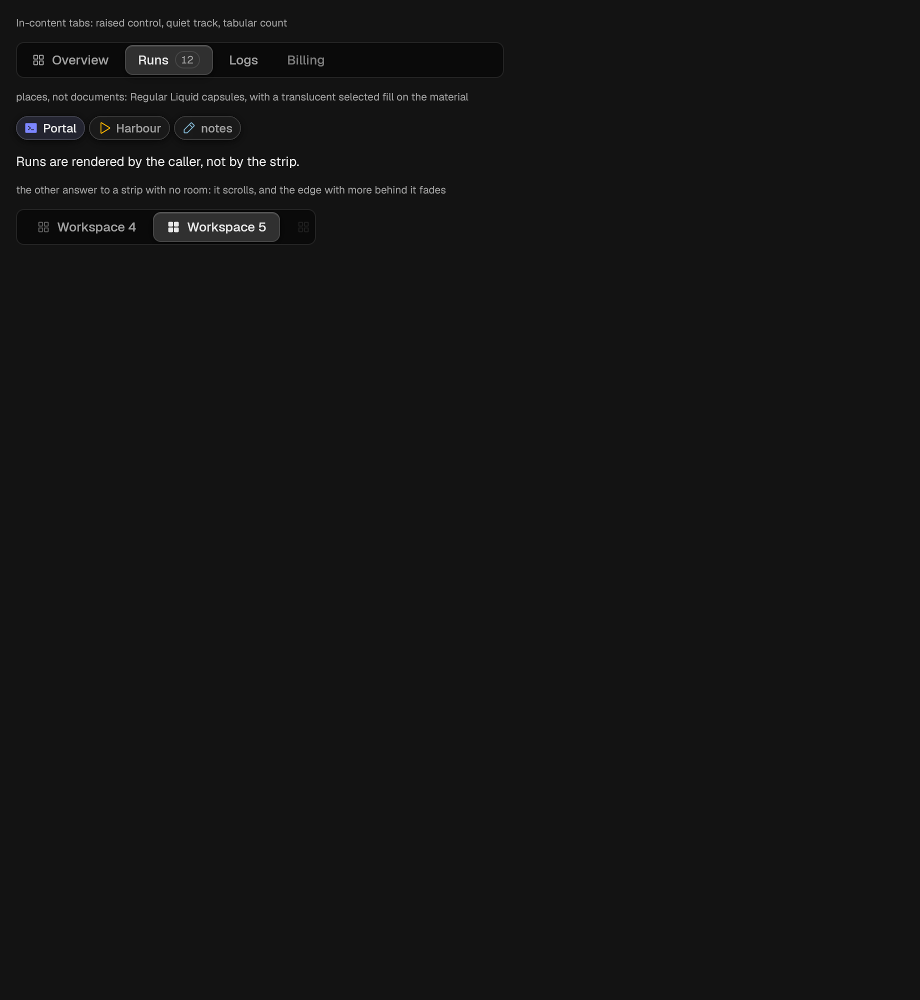
A row of tabs. The strip publishes one Role::Tab node per tab.
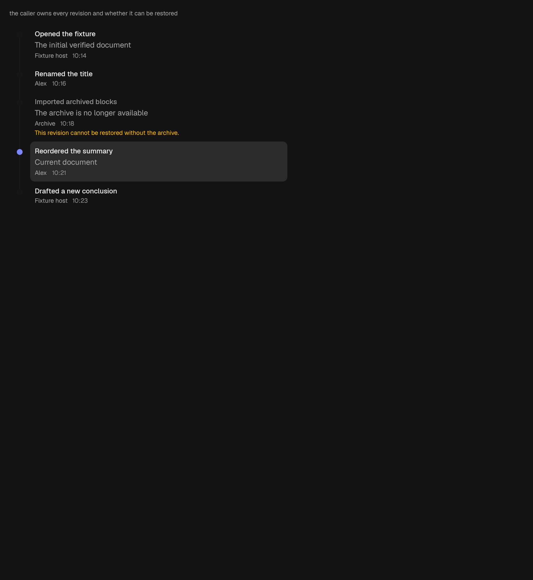
A history list that reports jump intents and changes no document state.
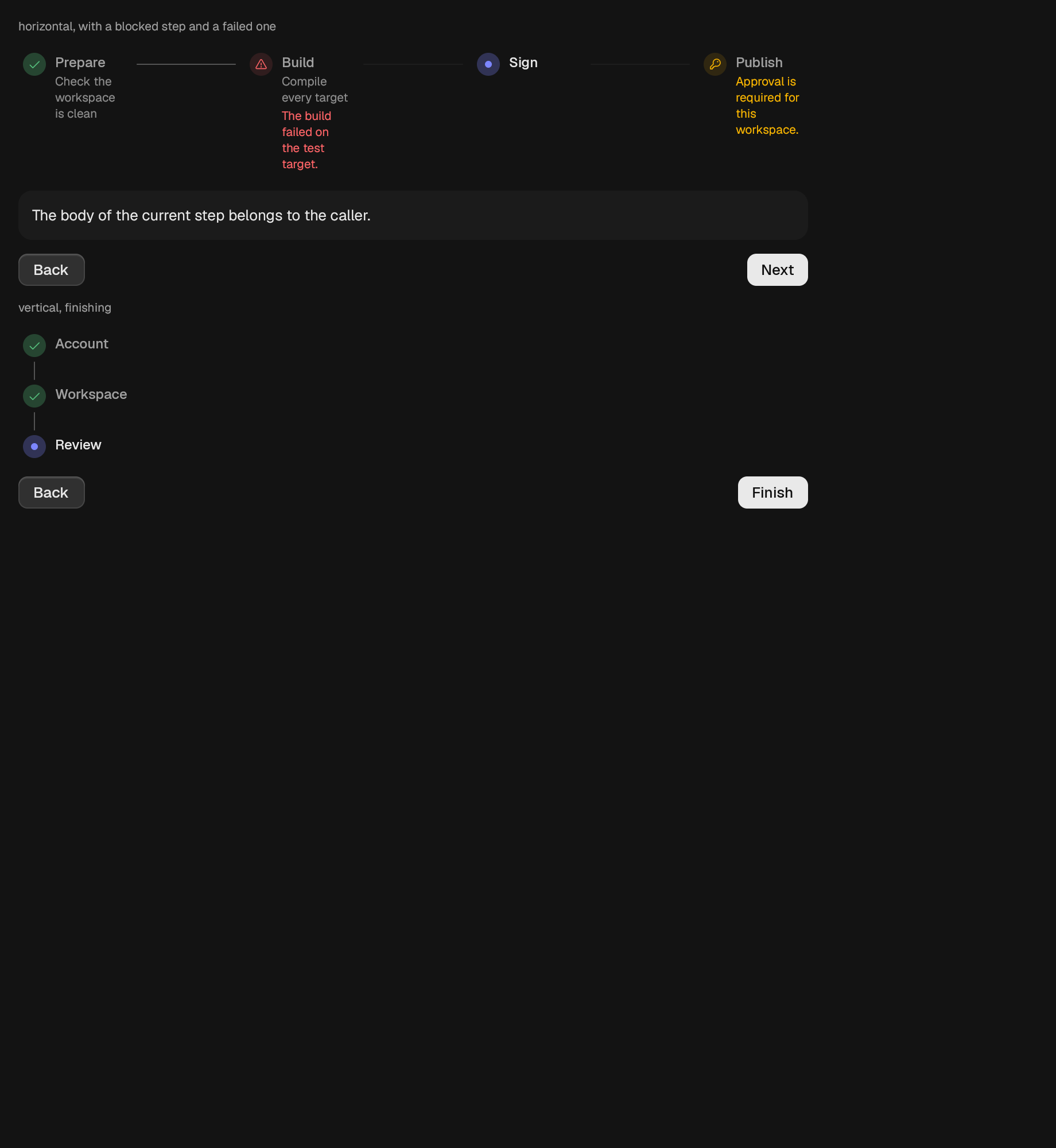
A multi-step flow: the steps, the current step's body, and the way on.
overlay
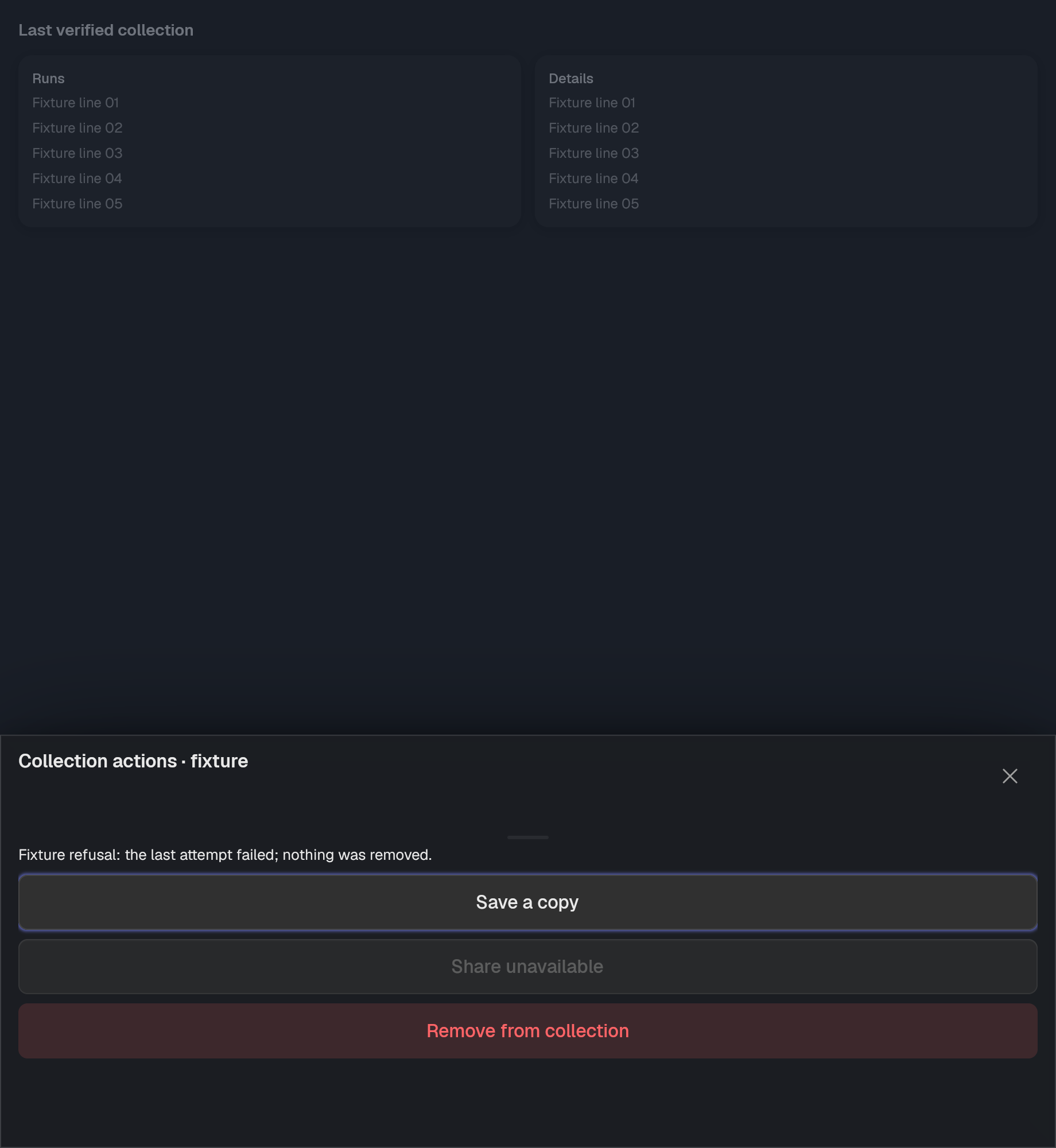
A sheet of caller-owned actions. Choosing a row does not close the sheet or assume success; the caller supplies pending/loading/error and closes it.
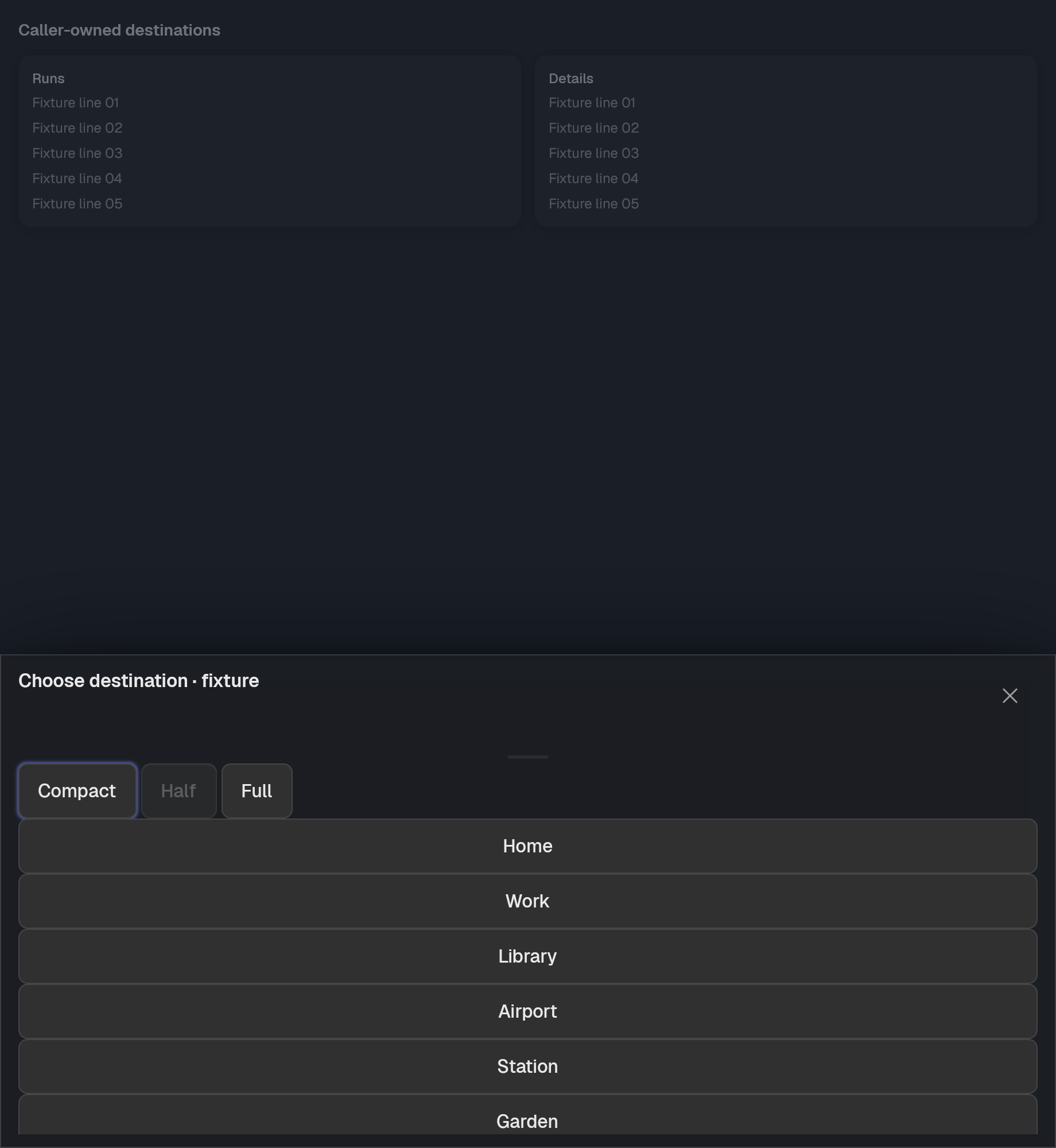
A retained bottom Drawer with explicit detents and cancellable drag preview.
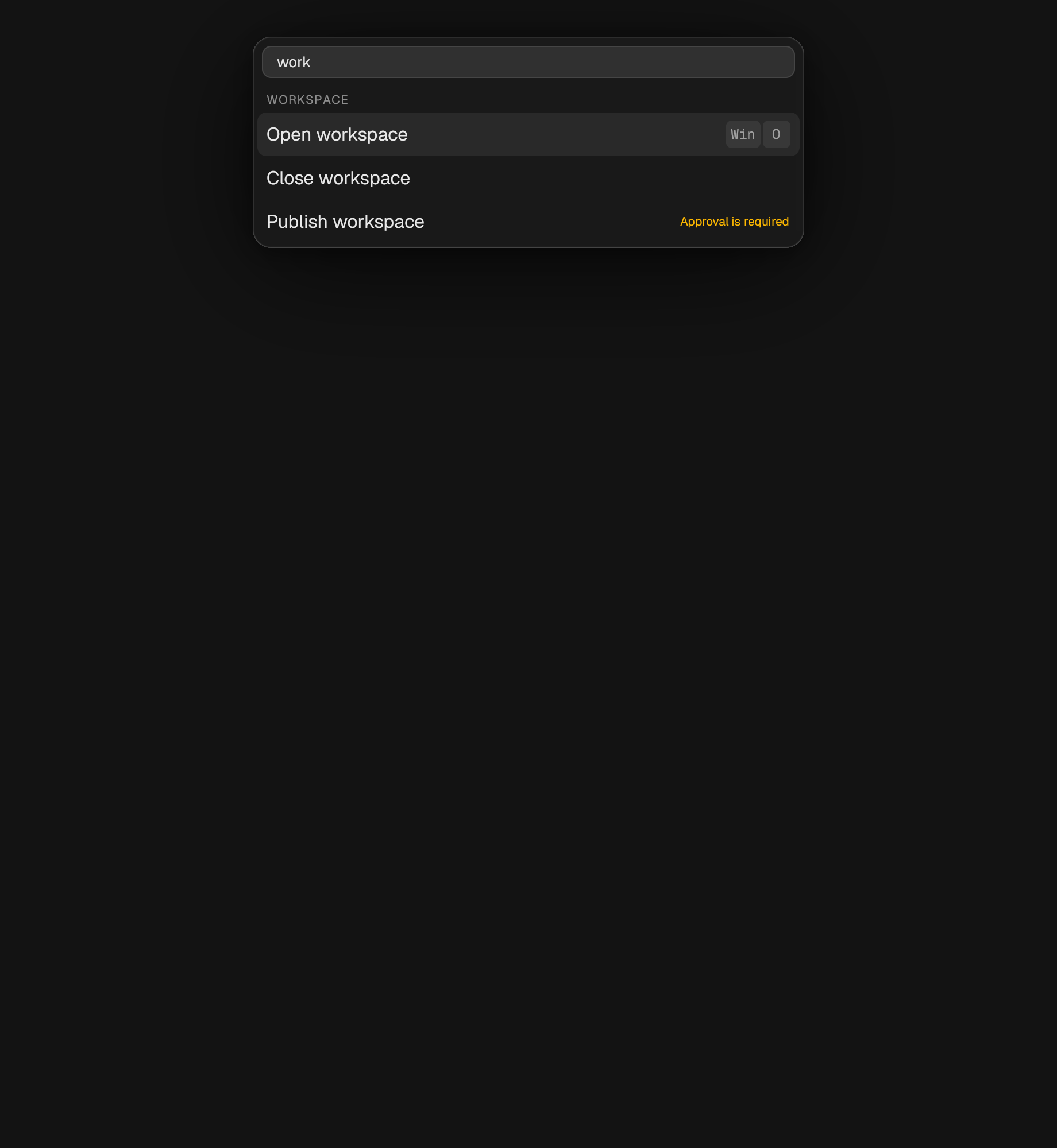
A query field over a list of commands.
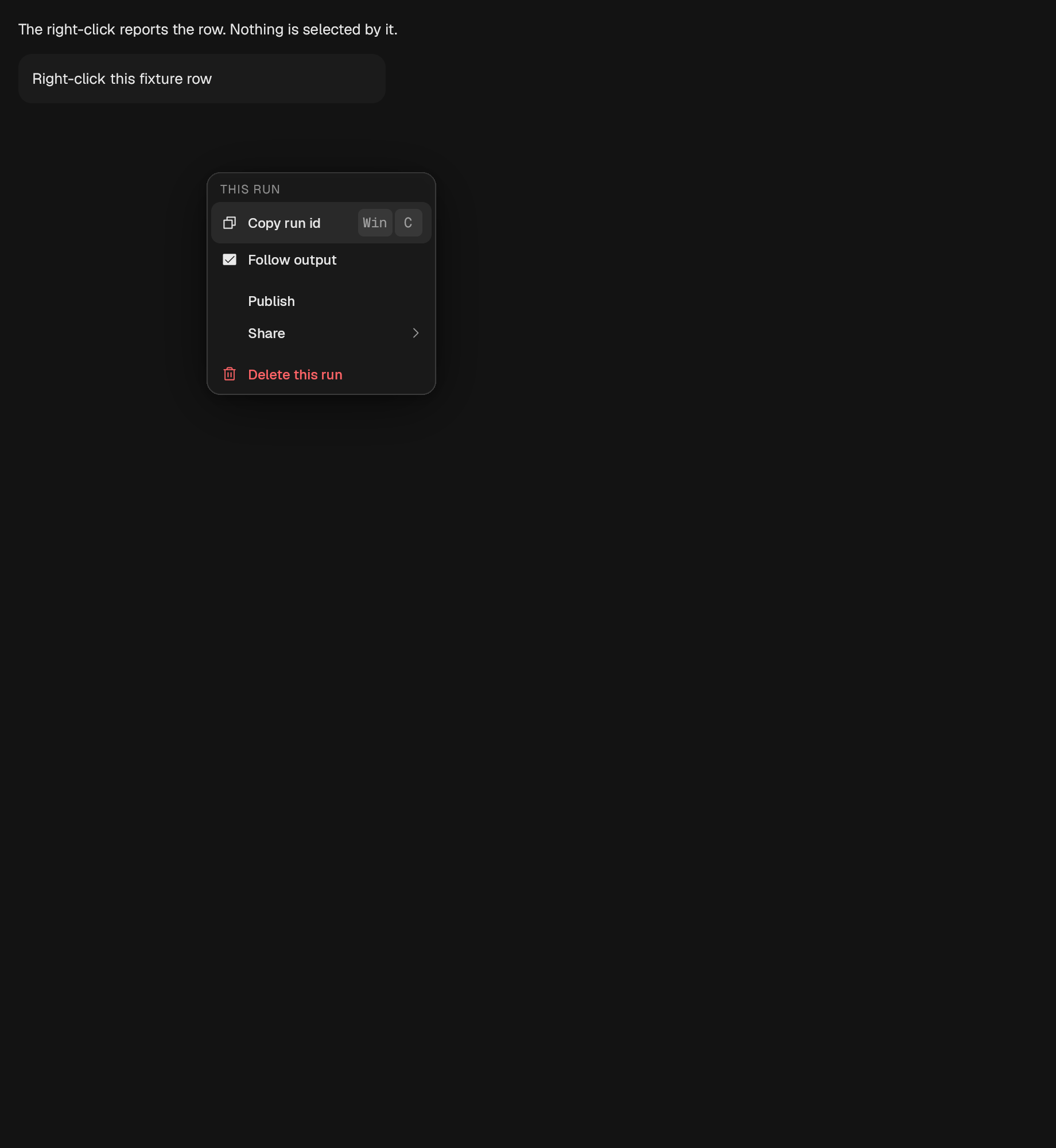
The same menu, opened at the pointer over a region rather than from a trigger.
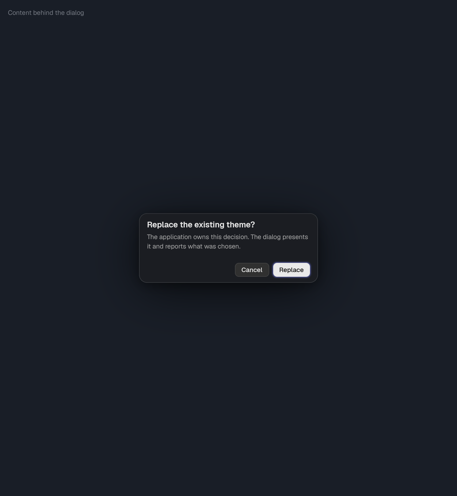
A composed modal: scrim, focus trap, title, body, and up to two actions.
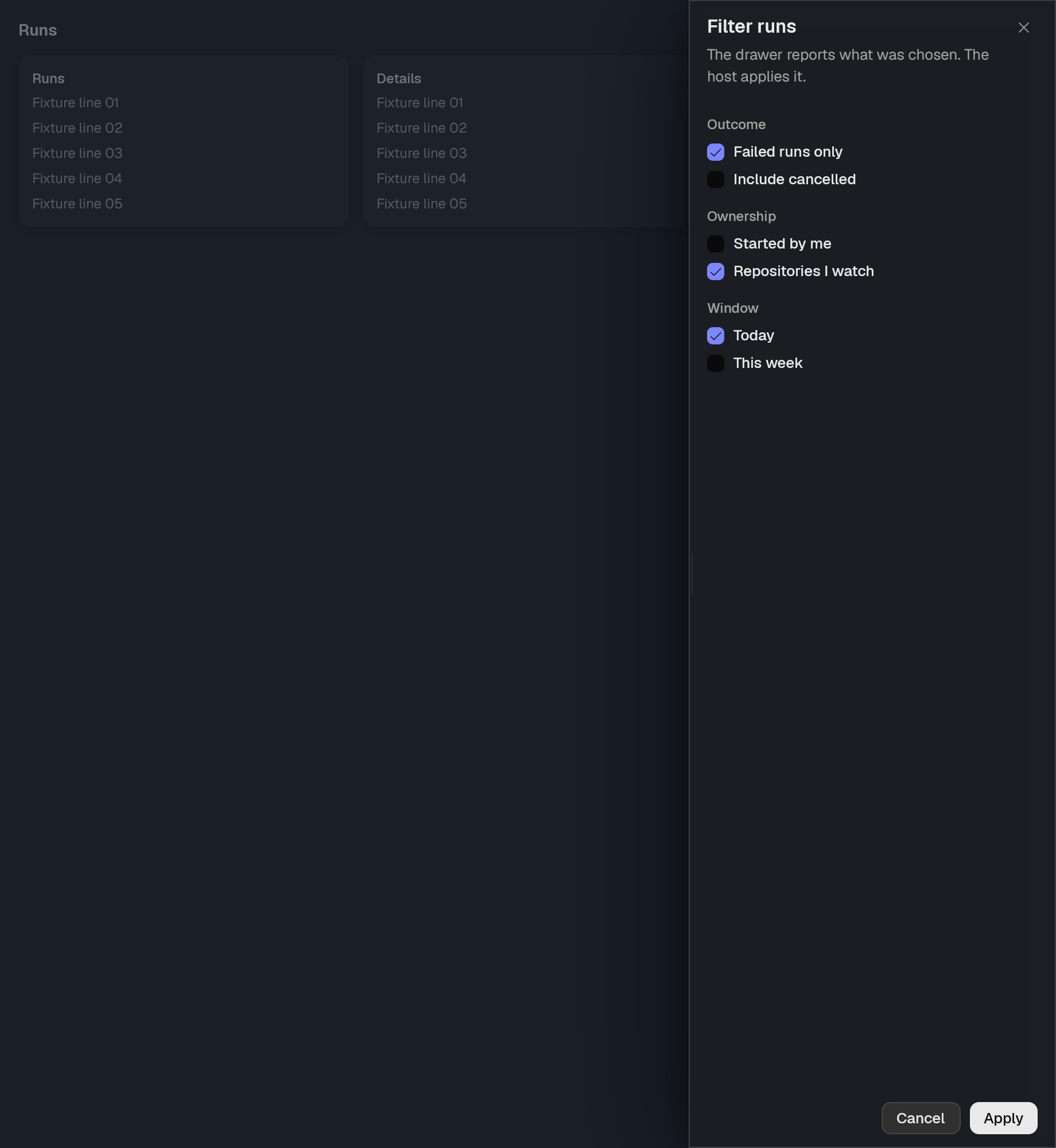
A panel anchored to one side of the window.
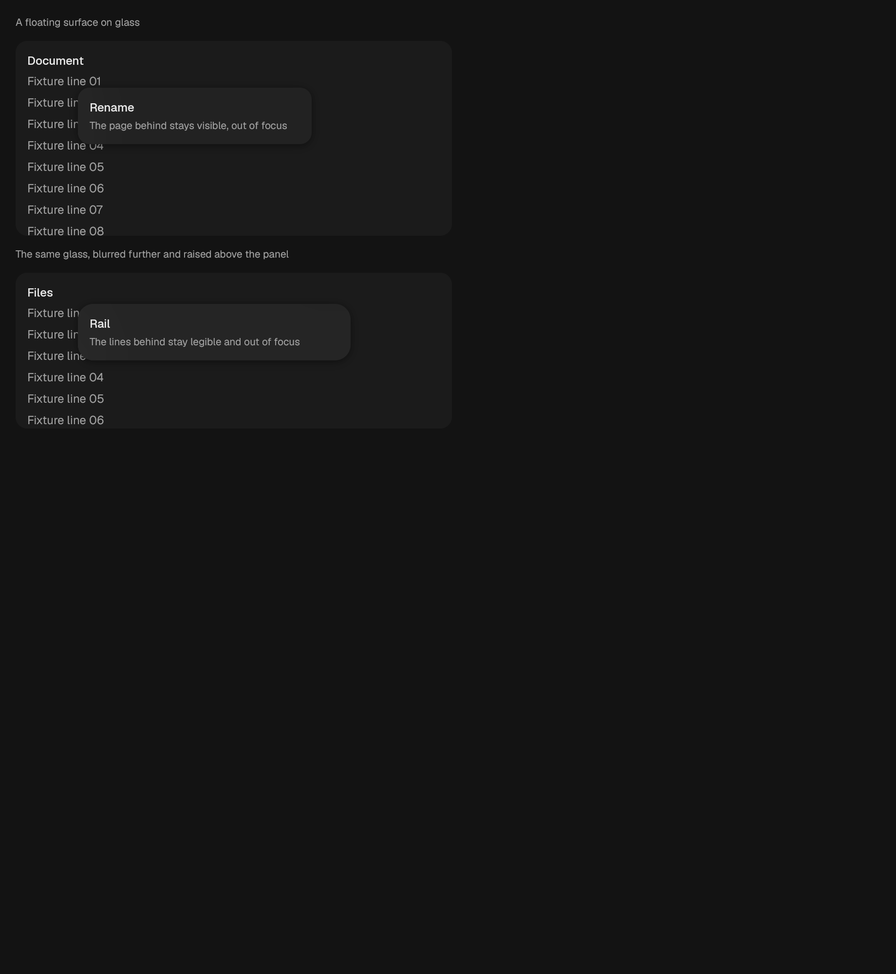
A frosted-glass surface: blurred backdrop, tinted fill, caller's content.
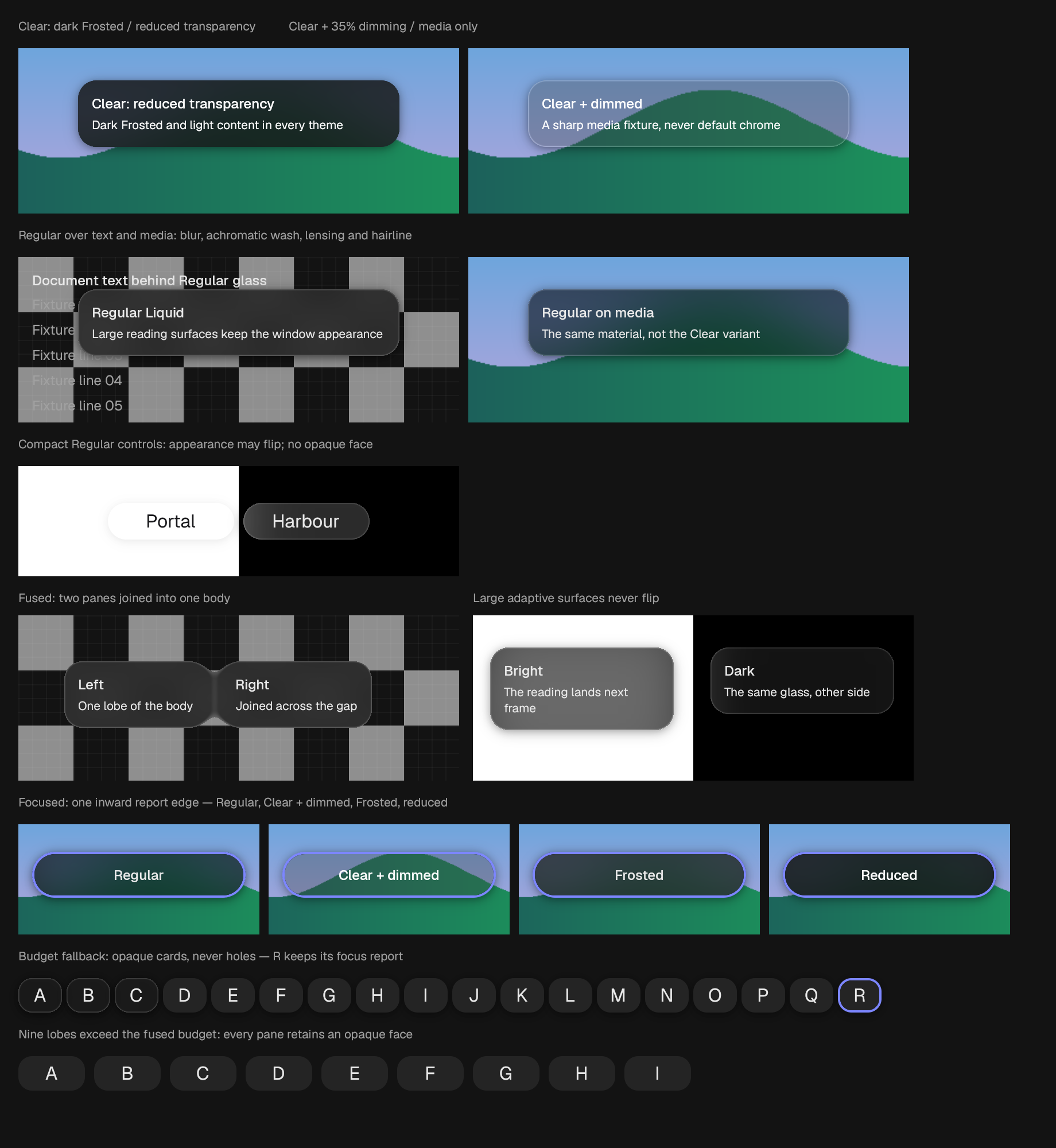
A glass surface: optionally scattered and bent backdrop, optional fill, and caller-owned content.
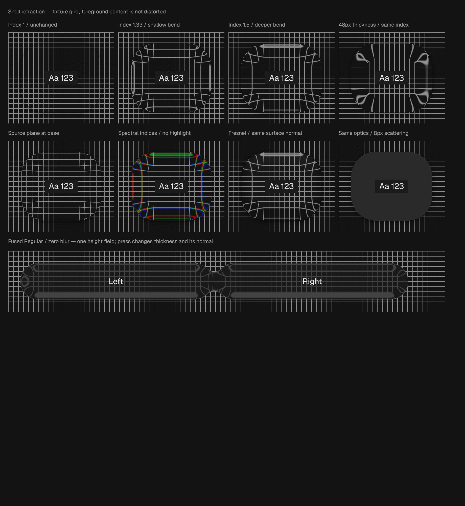
Several glass panes fused into one body.
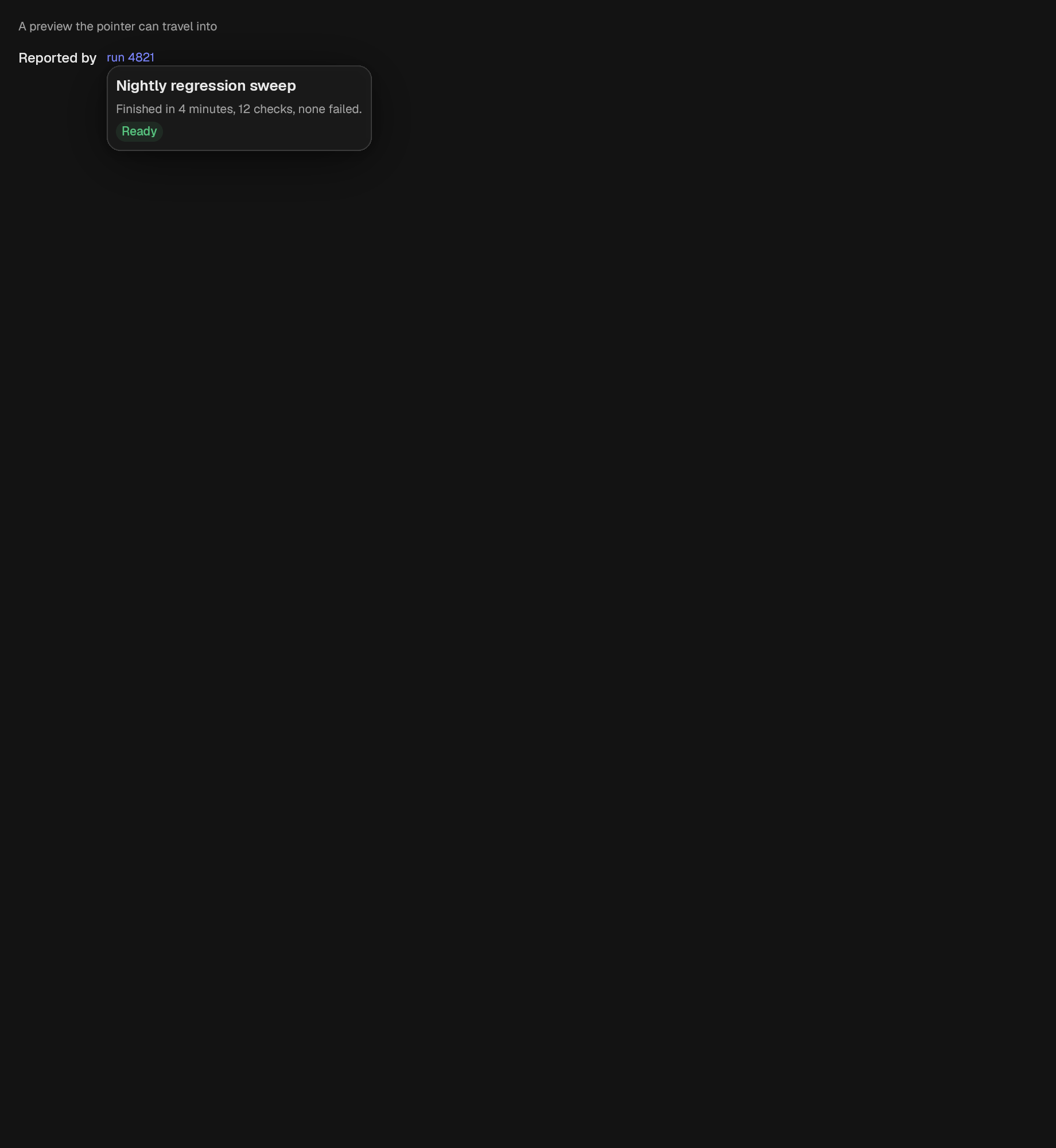
A preview surface that opens on hover and can be pointed at.
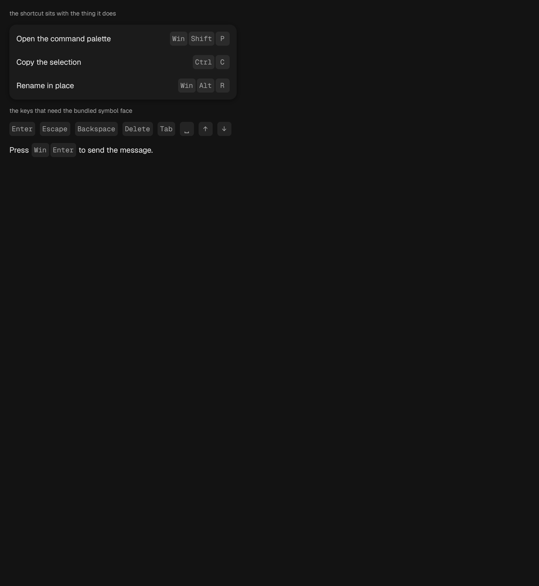
A keyboard shortcut, written the way the current platform writes it.
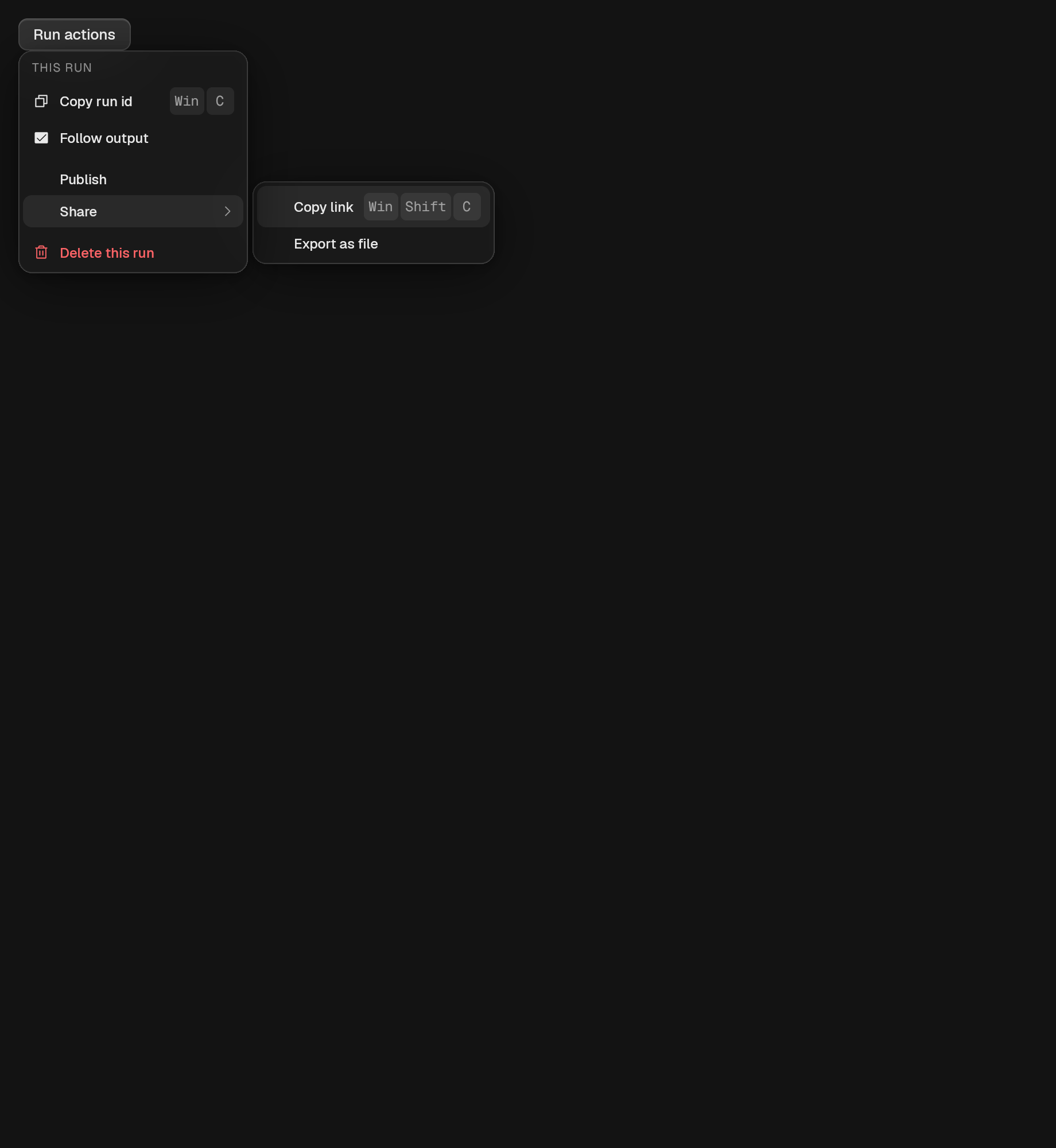
A list of commands, opened from a trigger.
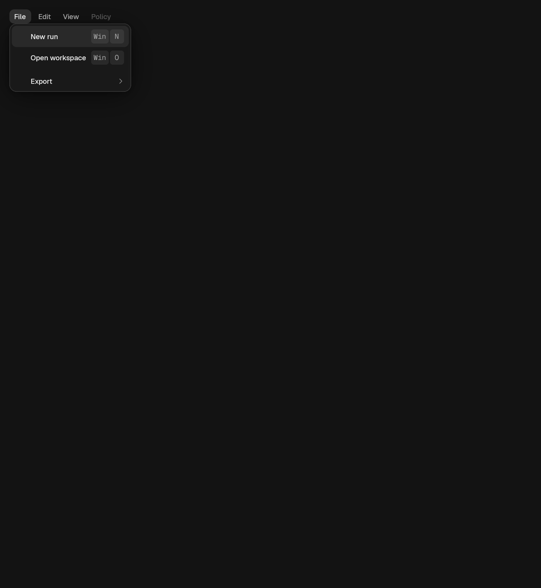
A row of menus, at most one of them open.
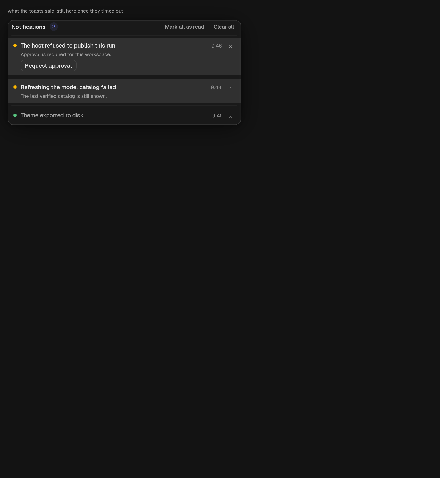
The list of notifications a window has accumulated.
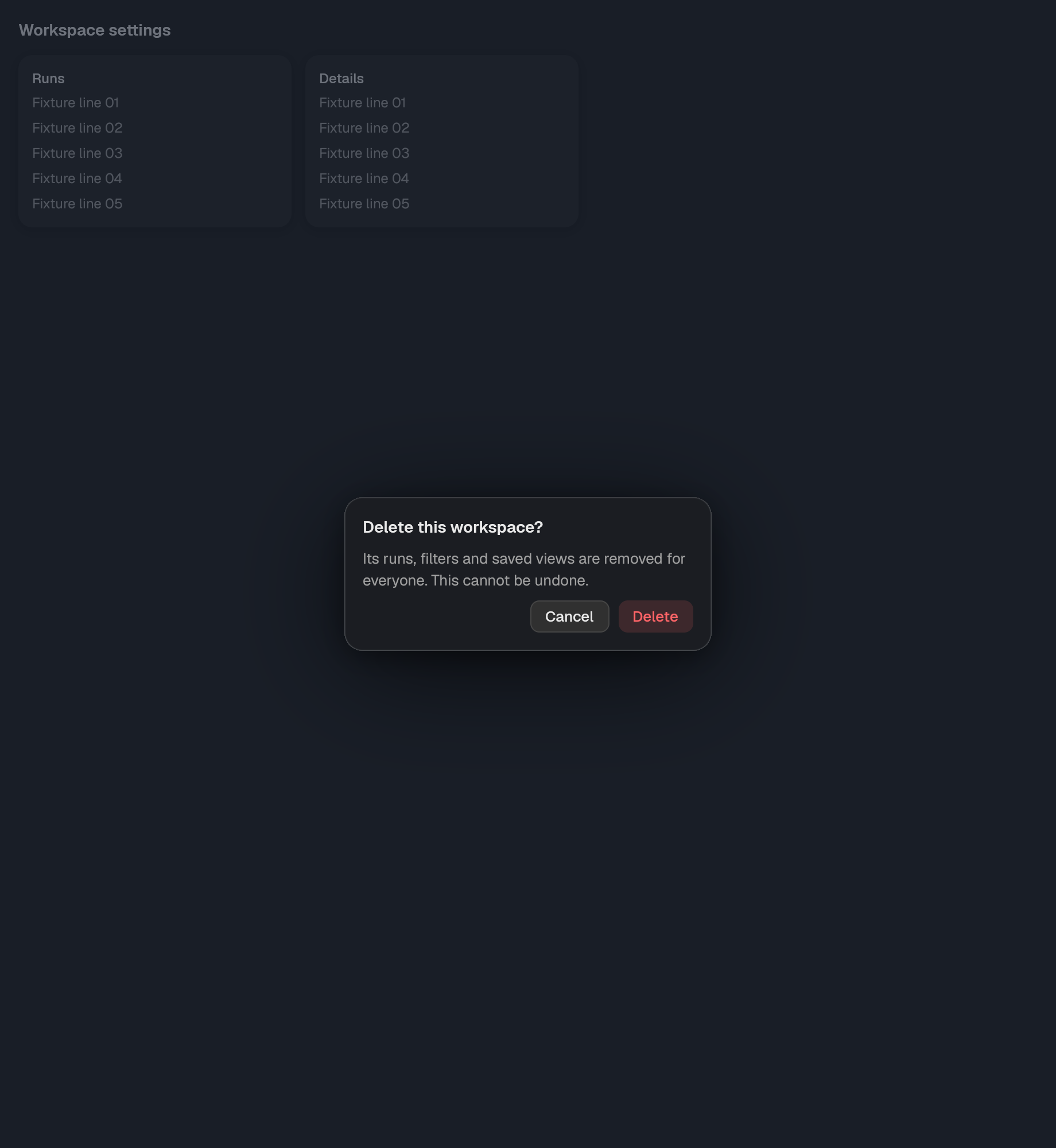
A floating surface.
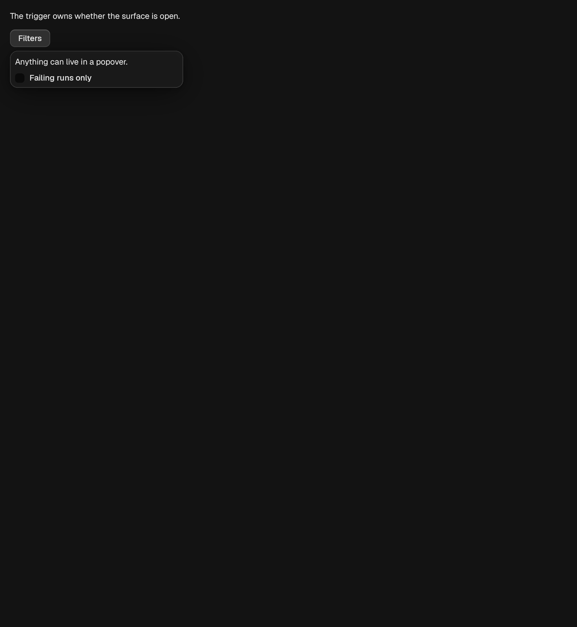
A surface anchored to a trigger, holding whatever the caller puts in it.
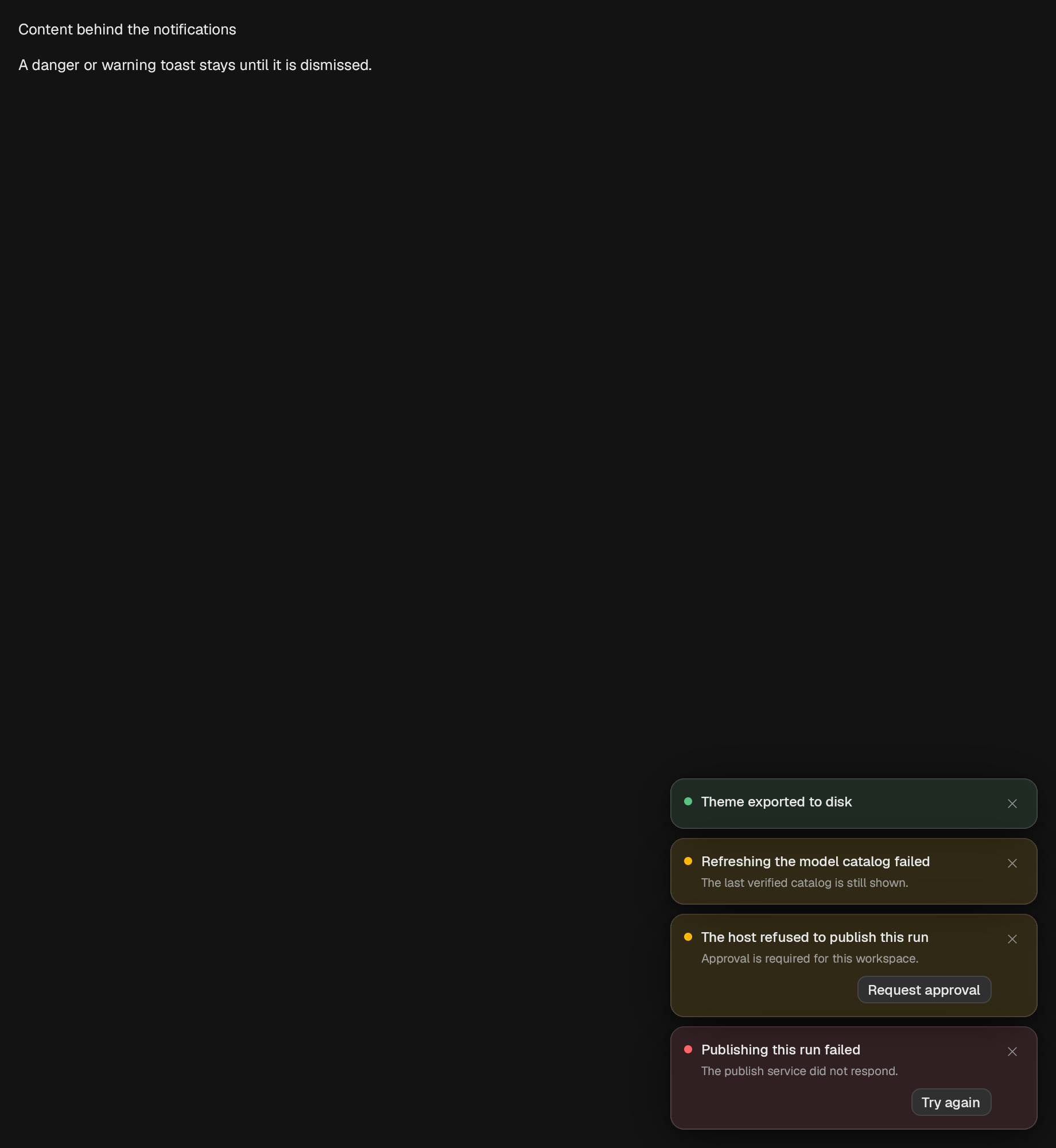
The stack of notifications for one window.

A themed help surface.