Components / controls
Button builder
A labeled action.
A builder is RenderOnce. Construct and mount it in one expression.
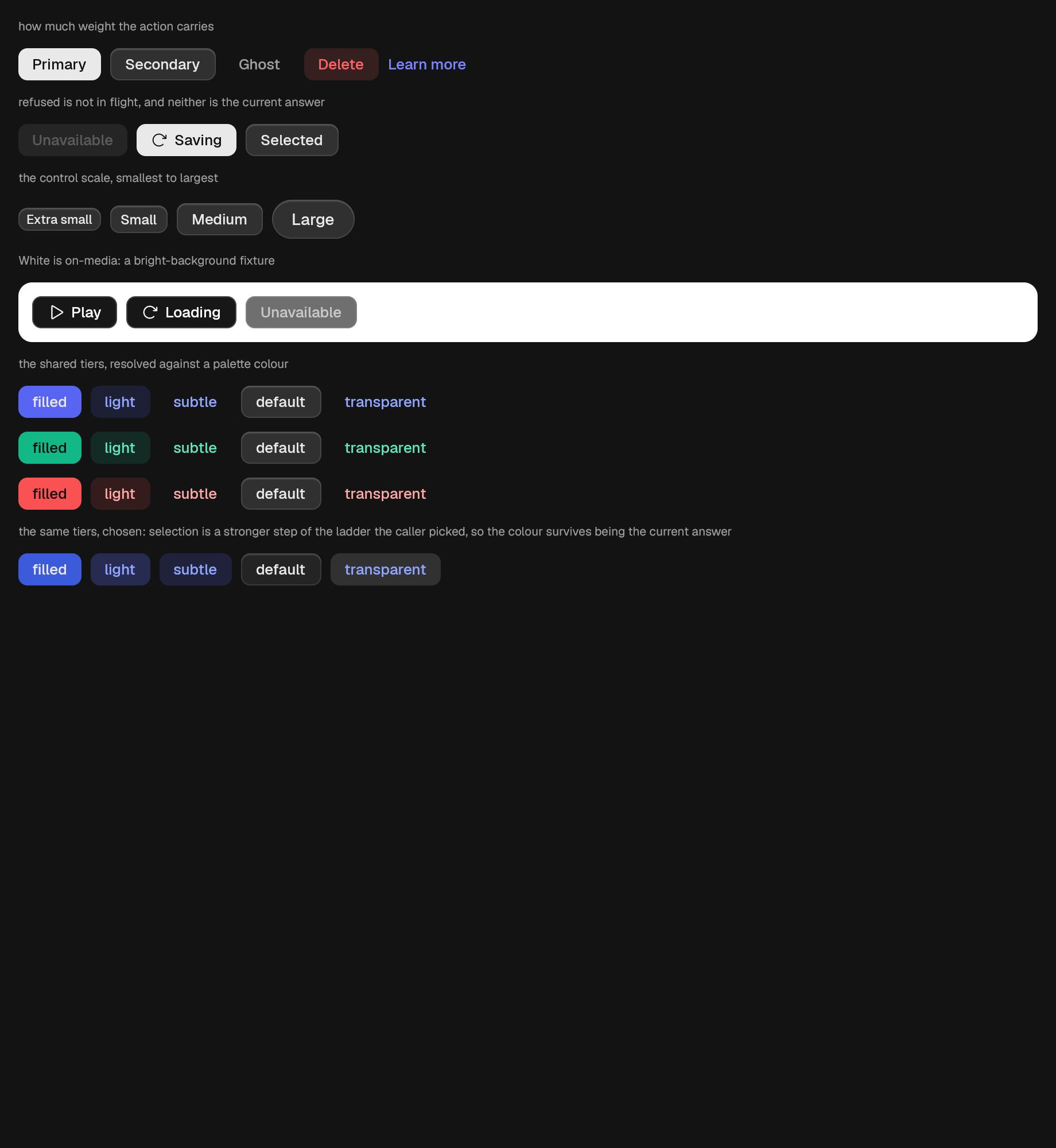
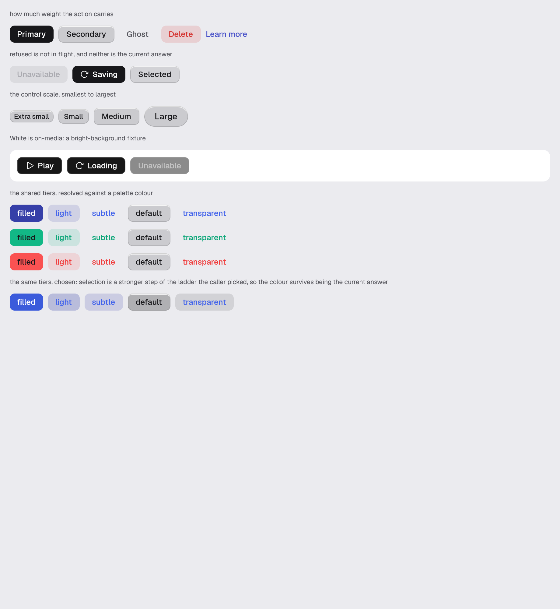
use gpui_kit::controls::button::Button;Reviewed in button.
Also drawn by media-caption motion-flip flip-configuration motion-state motion-primitives deferred-drop translation-packs reading-direction, which arranges components rather than reviewing them.
Construct
new(ident: impl Into<Ident>) -> SelfOptions
Chain onto the value.
label(label: impl Into<SharedString>) -> Self
accessible_name(name: impl Into<SharedString>) -> Self
accessible_description(description: impl Into<SharedString>) -> Self
icon_only(glyph: Icon, name: impl Into<SharedString>) -> Self
join(join: ButtonJoin) -> Self
semantic_parent(parent: impl Into<SharedString>) -> Self
icon(glyph: Icon) -> Self
icon_position(position: IconPosition) -> Self
variant(variant: impl Into<ButtonStyle>) -> Self
color(color: impl Into<ColorChoice>) -> Self
ground(ground: Surface) -> Self
primary() -> Self
secondary() -> Self
ghost() -> Self
danger() -> Self
link() -> Self
loading(loading: bool) -> Self
full_width(full_width: bool) -> Self
track_focus(handle: &FocusHandle) -> Self
on_click(handler: impl Fn(&mut Window, &mut App) + 'static) -> Self
checked_state(checked: bool) -> Self
Example · button
fn button(_window: &mut Window, cx: &mut App) -> AnyElement {
    let theme = cx.theme().clone();
    stack(&theme)
        .child(caption(&theme, "how much weight the action carries"))
        .child(
            row(&theme)
                .child(
                    Button::new("scene.button.primary")
                        .label("Primary")
                        .primary()
                        .on_click(|_, _| {}),
                )
                .child(
                    Button::new("scene.button.secondary")
                        .label("Secondary")
                        .secondary()
                        .on_click(|_, _| {}),
                )
                .child(
                    Button::new("scene.button.ghost")
                        .label("Ghost")
                        .ghost()
                        .on_click(|_, _| {}),
                )
                .child(
                    Button::new("scene.button.danger")
                        .label("Delete")
                        .danger()
                        .on_click(|_, _| {}),
                )
                .child(
                    Button::new("scene.button.link")
                        .label("Learn more")
                        .link()
                        .on_click(|_, _| {}),
                ),
        )
        .child(caption(
            &theme,
            "refused is not in flight, and neither is the current answer",
        ))
        .child(
            row(&theme)
                .child(
                    Button::new("scene.button.disabled")
                        .label("Unavailable")
                        .primary()
                        .disabled(true)
                        .on_click(|_, _| {}),
                )
                .child(
                    Button::new("scene.button.loading")
                        .label("Saving")
                        .primary()
                        .loading(true)
                        .on_click(|_, _| {}),
                )
                .child(
                    Button::new("scene.button.selected")
                        .label("Selected")
                        .secondary()
                        .selected(true)
                        .on_click(|_, _| {}),
                ),
        )
        .child(caption(&theme, "the control scale, smallest to largest"))
        .child(
            row(&theme)
                .child(
                    Button::new("scene.button.xs")
                        .label("Extra small")
                        .secondary()
                        .xs(),
                )
                .child(
                    Button::new("scene.button.sm")
                        .label("Small")
                        .secondary()
                        .small(),
                )
                .child(
                    Button::new("scene.button.md")
                        .label("Medium")
                        .secondary()
                        .medium(),
                )
                .child(
                    Button::new("scene.button.lg")
                        .label("Large")
                        .secondary()
                        .large(),
                ),
        )
        .child(caption(
            &theme,
            "White is on-media: a bright-background fixture",
        ))
        .child(
            row(&theme)
                .p(px(theme.spacing.md))
                .radius(&theme, Radius::Card)
                .bg(theme.colors.on_media_foreground)
                .child(
                    Button::new("scene.button.media")
                        .label("Play")
                        .icon(Icon::Play)
                        .variant(Variant::White)
                        .on_click(|_, _| {}),
                )
                .child(
                    Button::new("scene.button.media-busy")
                        .label("Loading")
                        .variant(Variant::White)
                        .loading(true),
                )
                .child(
                    Button::new("scene.button.media-disabled")
                        .label("Unavailable")
                        .variant(Variant::White)
                        .disabled(true),
                ),
        )
        .child(caption(
            &theme,
            "the shared tiers, resolved against a palette colour",
        ))
        .children(["indigo", "teal", "red"].map(|group| {
            row(&theme).children(
                [
                    Variant::Filled,
                    Variant::Light,
                    Variant::Subtle,
                    Variant::Default,
                    Variant::Transparent,
                ]
                .map(|tier| {
                    Button::new(format!("scene.button.{group}.{}", tier.name()))
                        .label(tier.name())
                        .variant(tier)
                        .color(SharedString::from(group))
                        .on_click(|_, _| {})
                }),
            )
        }))
        .child(caption(
            &theme,
            "the same tiers, chosen: selection is a stronger step of the ladder the \
             caller picked, so the colour survives being the current answer",
        ))
        .child(
            row(&theme).children(
                [
                    Variant::Filled,
                    Variant::Light,
                    Variant::Subtle,
                    Variant::Default,
                    Variant::Transparent,
                ]
                .map(|tier| {
                    Button::new(format!("scene.button.chosen.{}", tier.name()))
                        .label(tier.name())
                        .variant(tier)
                        .color(SharedString::from("indigo"))
                        .selected(true)
                        .on_click(|_, _| {})
                }),
            ),
        )
        .into_any_element()
}